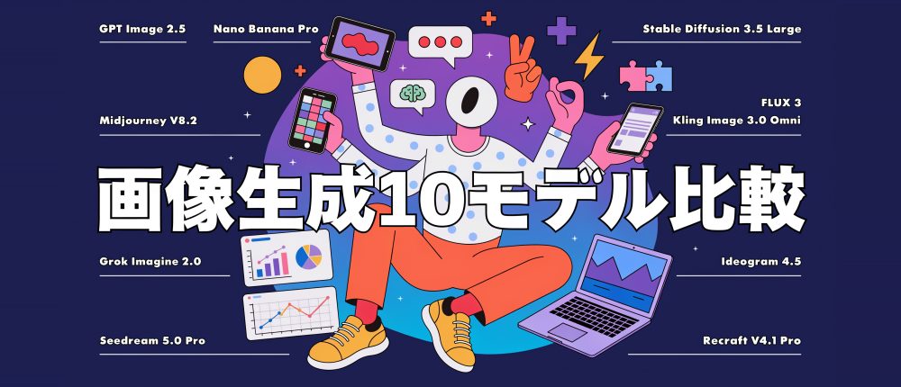
画像生成 AI、どれを使えばいいのか迷っていませんか?
モデルごとにくせがあるのは何となく分かっていても、全部に課金して試すのは大変だと思います。そこで、私のクレジットを使って主要な画像生成 AI 10 モデルに同じお願いをして比べる記事を書いてみました。
とにかく画像をざーっと並べていくので、気になったモデルがあれば、それぞれの画像をクリックして拡大して見てみてください。
先にお断りしておくと、この記事の画像はどれも1 回目に出てきたものをそのまま載せています。いい画像が出るまで何回も生成し直す、いわゆる「ガチャ」はしていません(Midjourney だけは 1 回の生成で 4 枚出てくるので、その中から 1 枚を私が選んでいます)。全部の画像で当たりが出るまで回していたら、さすがにクレジットが底をついてしまうので……。
なので、たまたま 1 枚目がいまいちだっただけ、という可能性は十分にあります。プロンプトも、モデルごとにもっとうまい言い方に変えれば、ちゃんとした結果になるかもしれません。修正も同じで、本来は「ここがうまくいっていない」と伝えてもう一度お願いすれば、思い通りに直せることも多いと思います。今回はどれも最初の 1 回の結果だと思って見てください。
迷っている方の参考になれば目減りしたクレジット残高も報われます
目次
比べたモデル
2026 年 10 月時点で、それぞれの会社の最新モデルの最上位グレードを使っています。
| モデル | 提供元 | 使った場所・設定 | 出てきたサイズ | 1 枚あたりの料金 |
|---|---|---|---|---|
| GPT Image 2.5 Sunburst | OpenAI | Comfy Cloud・品質 max | 1536×1024 | 約 50 credits(約 $0.24) |
| Nano Banana Pro | Comfy Cloud・1K | 1264×848 | 約 35 credits(約 $0.17) | |
| Midjourney V8.2 | Midjourney | Midjourney 本体・HD | 2688×1792 | 月額のサブスクリプション内 |
| Grok Imagine 2.0 | xAI | Comfy Cloud・品質 medium・2K | 2496×1664 | 約 17 credits(約 $0.08) |
| Seedream 5.0 Pro | ByteDance | Comfy Cloud・2K | 2496×1664 | 約 19 credits(約 $0.09) |
| Stable Diffusion 3.5 Large | Stability AI | Comfy Cloud(ComfyUI 公式テンプレート) | 1248×832 | GPU 約 11〜13 秒ぶん |
| FLUX 3 | Black Forest Labs | Comfy Cloud・2K | 2512×1664 | 約 30 credits(約 $0.14) |
| Kling Image 3.0 Omni | Kuaishou | Comfy Cloud・4K | 4992×3328 | 約 12 credits(約 $0.06) |
| Ideogram 4.5 | Ideogram | Comfy Cloud・品質 high・Magic Prompt オフ | 2496×1664 | 約 60 credits(約 $0.29) |
| Recraft V4.1 Pro | Recraft | Comfy Cloud・Pro | 2560×1664 | 約 63 credits(約 $0.30) |
- ※料金は Comfy Cloud の課金履歴の実績です(1 ドル = 211 クレジット)。各社のサービスを直接使った場合の料金とは異なります。
- ※Stable Diffusion 3.5 Large は GPU の使用時間で課金されます。
生成した画像のスタイル
5 つのスタイルで、全モデルに同じプロンプトを投げています。次に、それぞれのモデルが得意なものを個別にお願いしました。
同様に重要だと思うのが修正がちゃんとできるかだと思うので、修正の比較のセクションも用意しています。
最後におまけでこの記事のサムネイルも作ってもらいました。
- 実写:漁港の老漁師
- イラスト:夏祭りの浴衣の少女
- 絵画:朝霧の川辺の村(印象派の油絵)
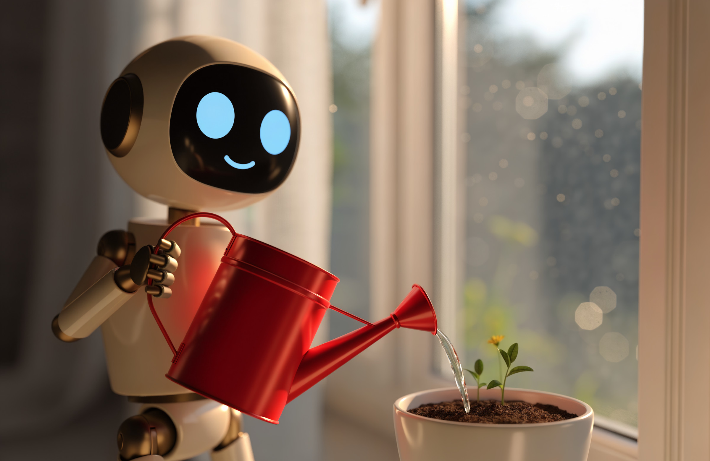
- 3DCG:植木鉢に水をやる小さなロボット
- グラフィックデザイン:架空の音楽フェスのポスター(スイススタイル)
- それぞれのモデルが得意なもの:各社の説明や評価を調べて、モデルごとに 3 作ずつ
- 修正:同じ写真を全モデルに渡して、8 種類の修正を 1 つずつ
- サムネイル:この記事のサムネイルを、全モデルに作ってもらう
比べ方のルール
- 同じスタイルの中では、全モデルにまったく同じプロンプトを使う(英語)
- 縦横比はだいたい 3:2 の横長にそろえる。プロンプトには書かず、各モデルの設定で指定する
- 解像度は、それぞれのモデルが拡大処理なしで出せる推奨・最大のサイズにする
- 生成した画像には手を加えない(切り抜きや描き直しをしない)
- Midjourney は、好みを学習する「Personalization」をオフにして生成する
- ネガティブプロンプトは使わない(使えないモデルが多く、条件をそろえるため)
- ※記事に載せている画像は、表示を軽くするために JPEG(品質 90)に変換し、長い辺が 2400px を超えるものは縮小しています。
実写:漁港の老漁師
まずは実写です。どのモデルも結構きちんとプロンプトを読み取って作ってくれてますね。Midjourneyがやはり雰囲気を作るのが上手いなぁと思います。「第三福丸」の文字を指定に入れてますが、ぼやかしてたりはするもののちゃんとかけてるモデルが多くて意外でした
使ったプロンプト(英語)
A fisherman in his 70s mending a net at a fishing harbor in the early morning. He is placed in the right third of the frame, shown from the waist up. His body is turned slightly to the left, and his gaze is lowered to the net in his hands.
He has short white hair and white stubble, and wears a navy knit cap. He wears a yellow rubber bib apron over a gray sweater.
He holds an orange fishing net with both hands, and grips a wooden netting needle in his right hand. A silver ring on the ring finger of his left hand.
On the left side of the background, two small fishing boats with white hulls and blue stripes, heavily blurred. The hull of the nearer boat has the red Japanese text "第三福丸" written on it.
Low golden light just after sunrise comes in from the left of the frame, lighting the left half of his face while the right half falls into shadow. A faint morning mist.
Documentary photograph shot with an 85mm lens at f/2.0. Strong background blur. Realistic skin texture.
日本語の意味
早朝の漁港で、網を繕っている70代の男性漁師。画面の右3分の1に配置し、腰から上を写す。体はやや左を向き、視線は手元の網に落としている。
白髪の短髪に白い無精ひげ、紺色のニット帽をかぶっている。グレーのセーターの上に、胸当て付きの黄色いゴム製エプロンを着ている。
両手でオレンジ色の漁網を持ち、右手には木製の網針を握っている。左手の薬指に銀色の指輪。
背景の左側に、白い船体に青いラインの入った小型漁船が2隻、大きくぼけて写っている。手前の船の船体には赤い文字で「第三福丸」と書かれている。
日の出直後の低い金色の光が画面左から差し込み、顔の左半分が照らされ、右半分は影になっている。朝もやがうっすらとかかっている。
85mmレンズ、F2.0で撮影したドキュメンタリー写真。背景は大きくぼける。リアルな肌の質感。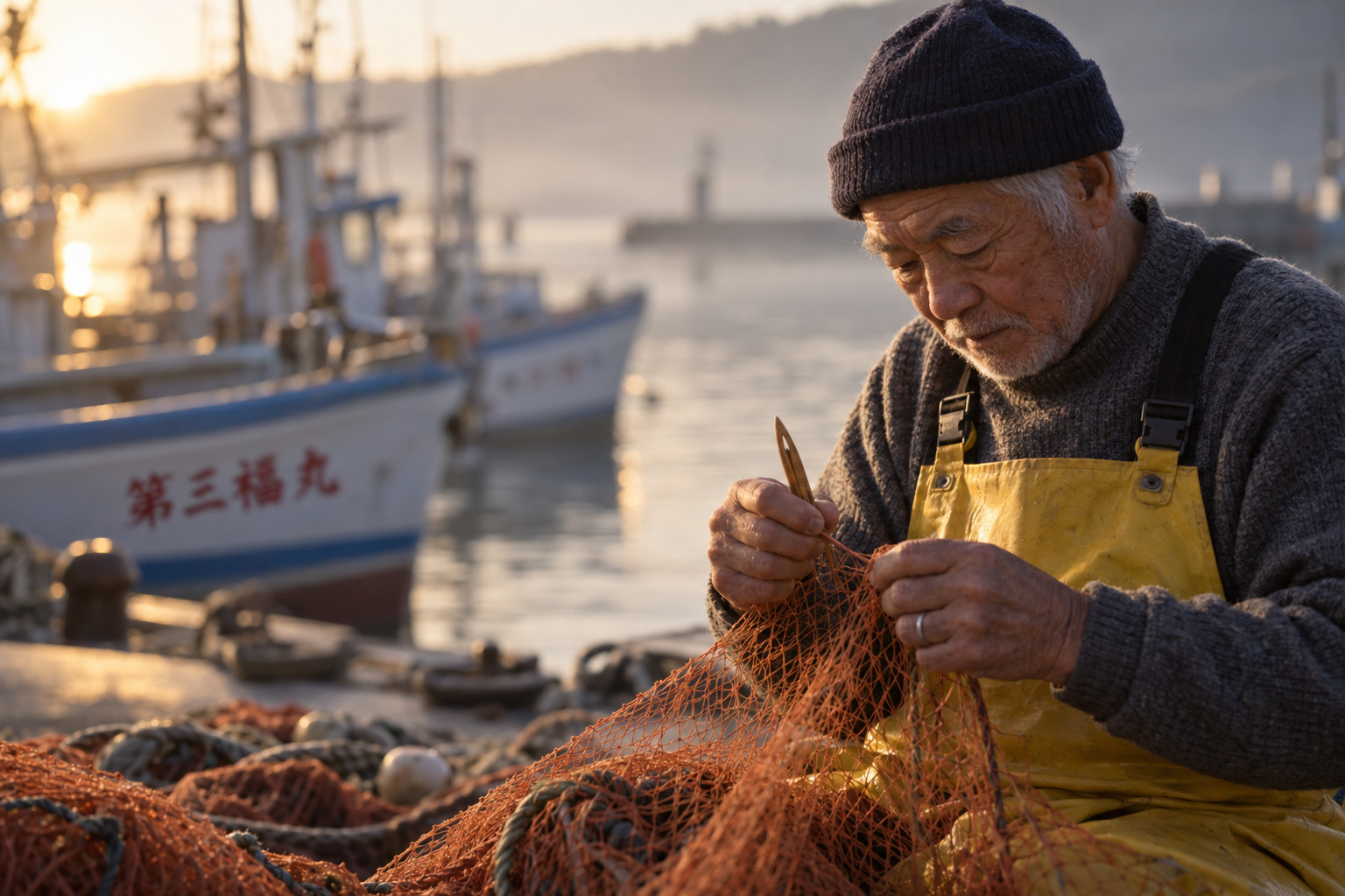
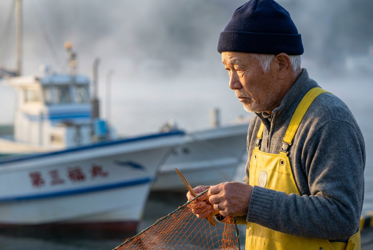
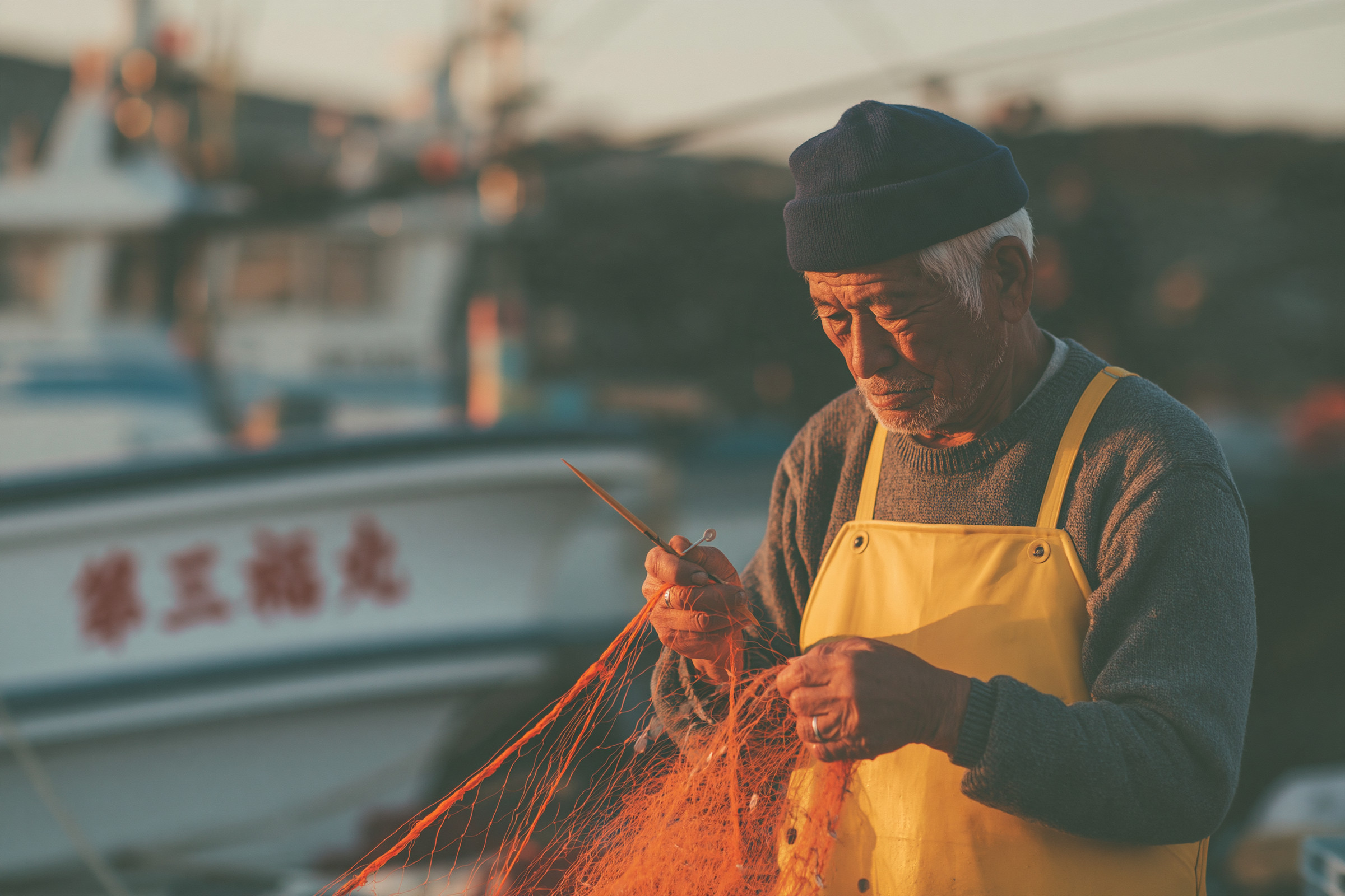
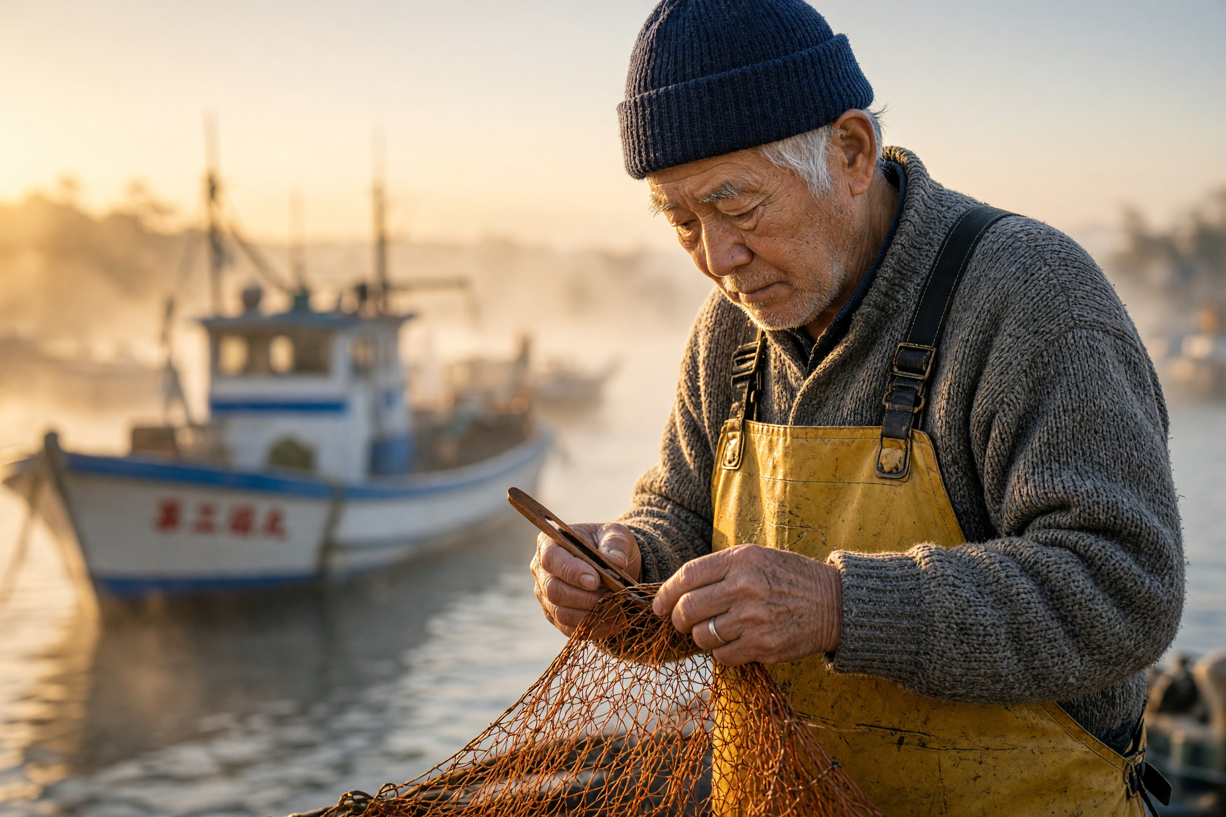
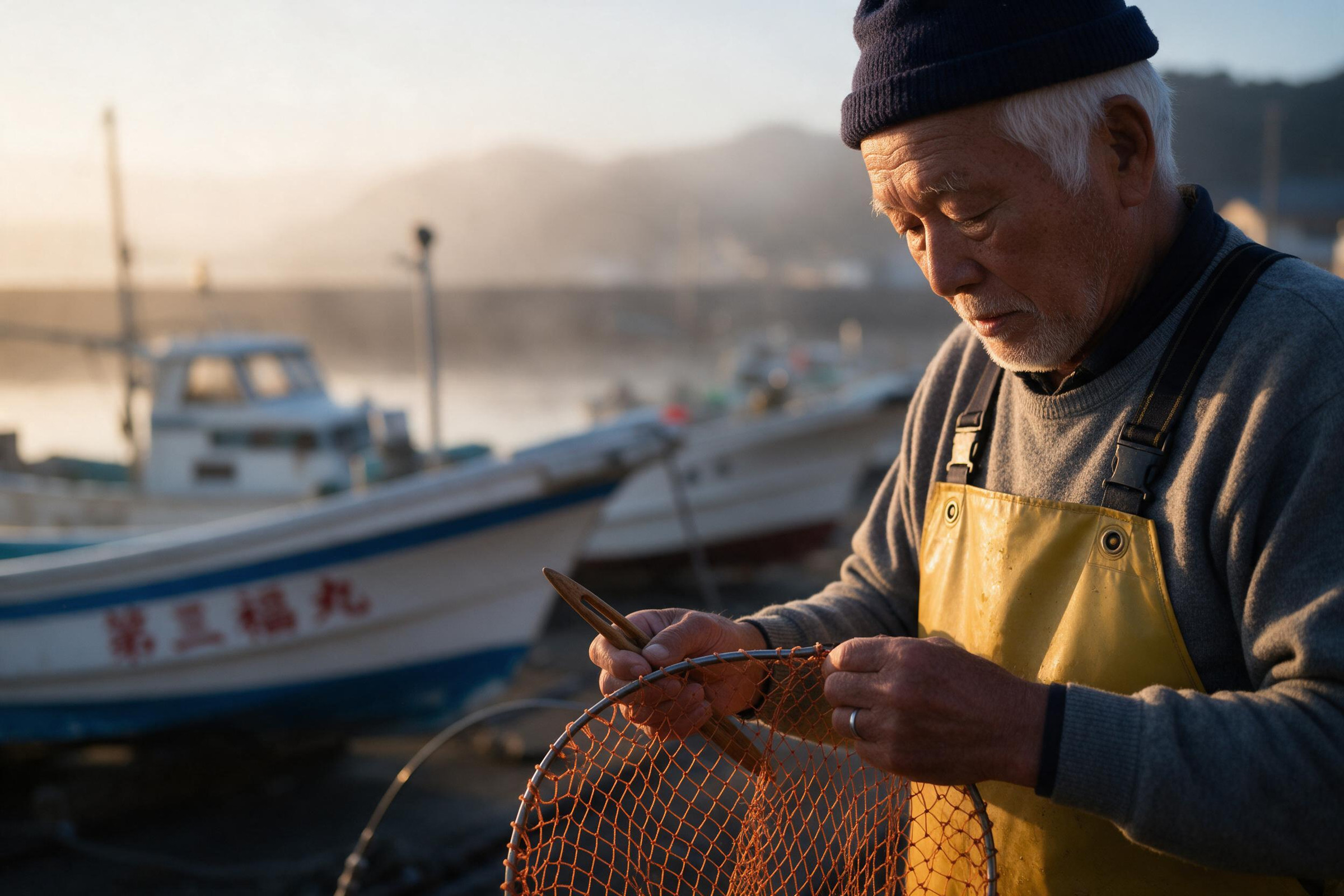
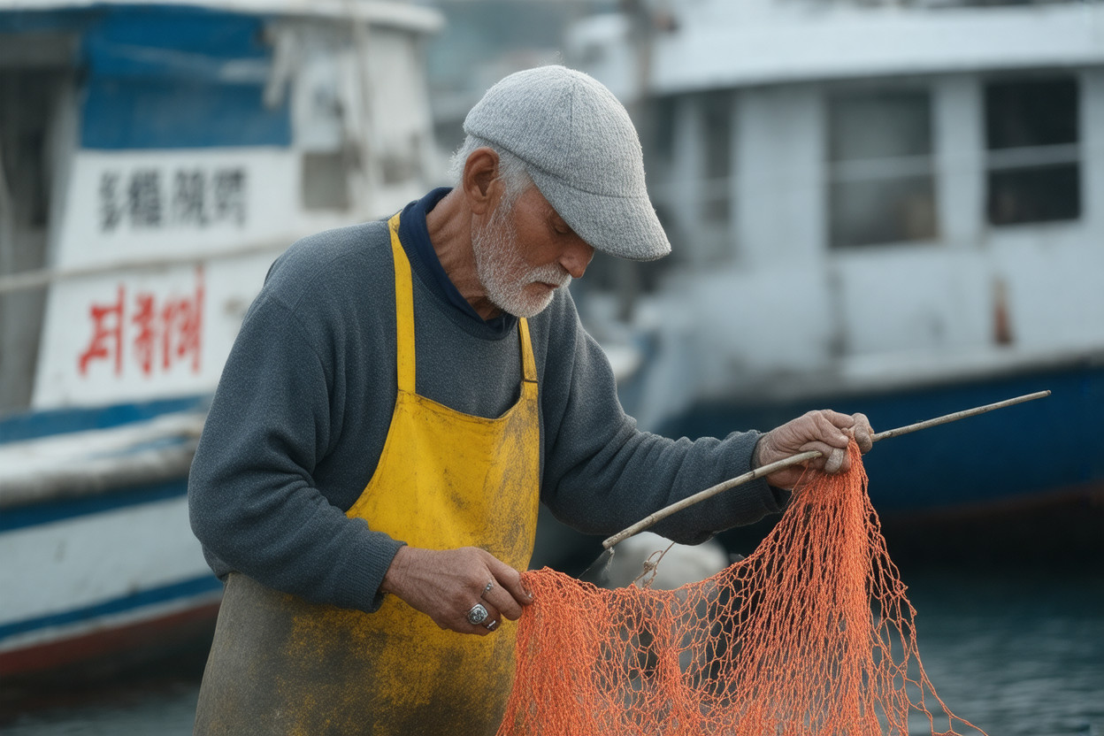
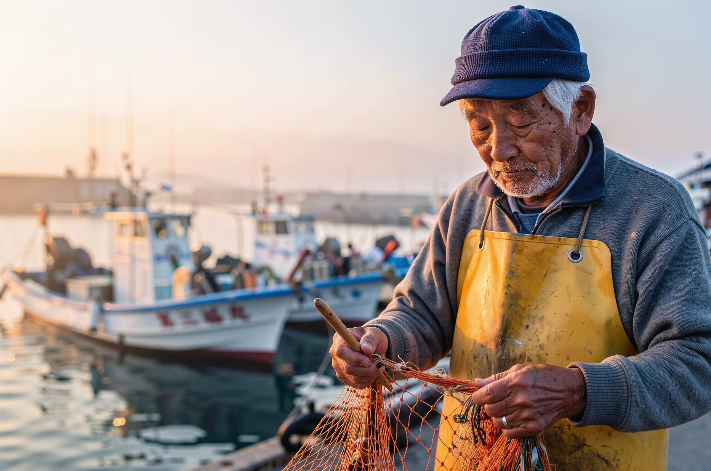
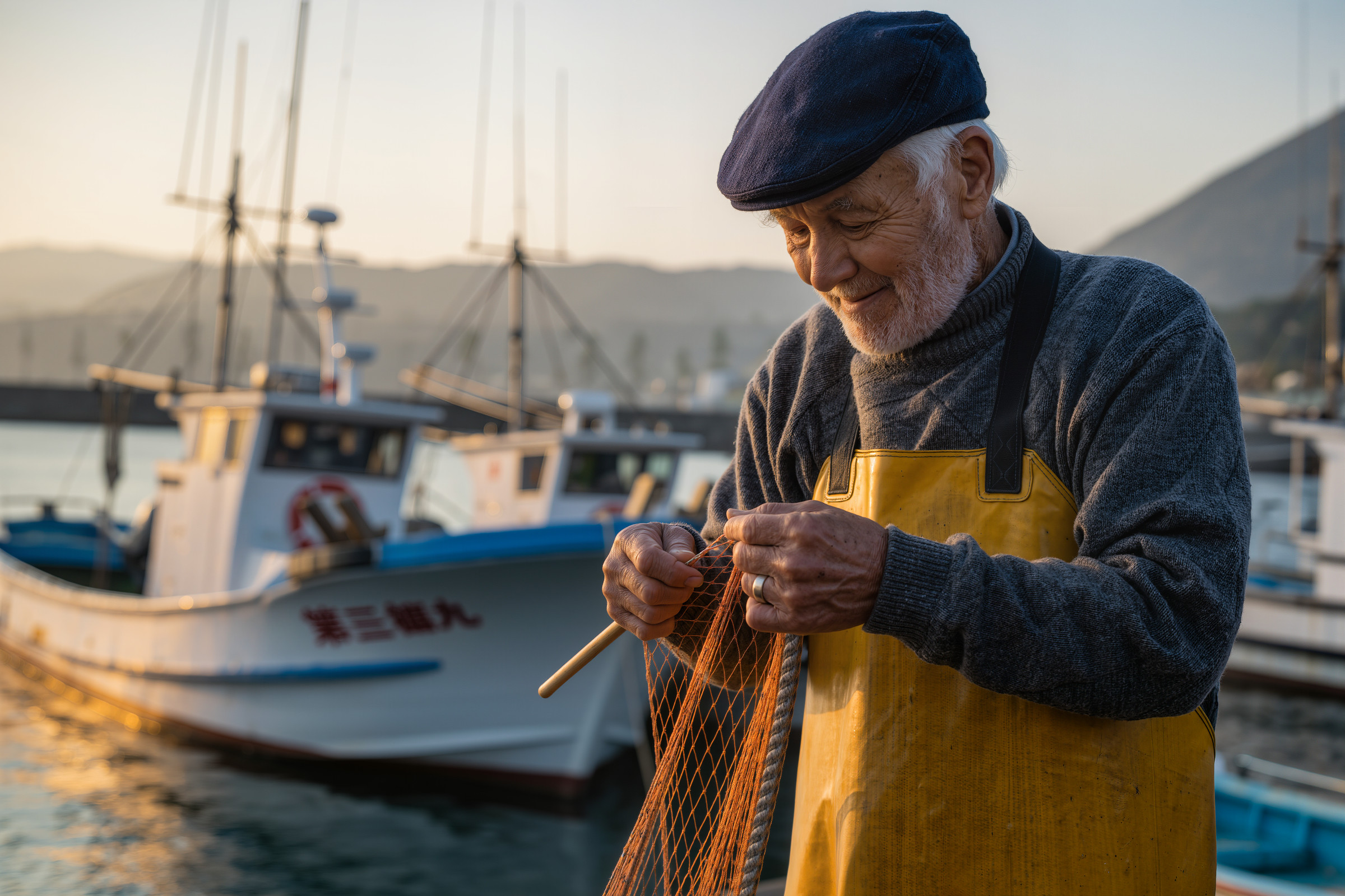
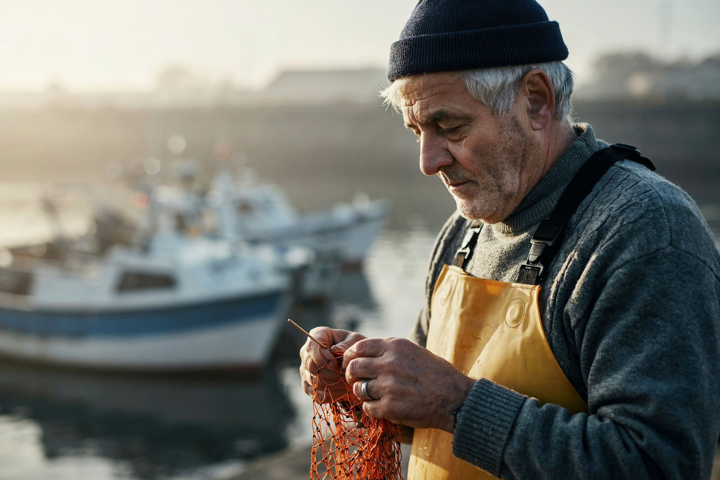
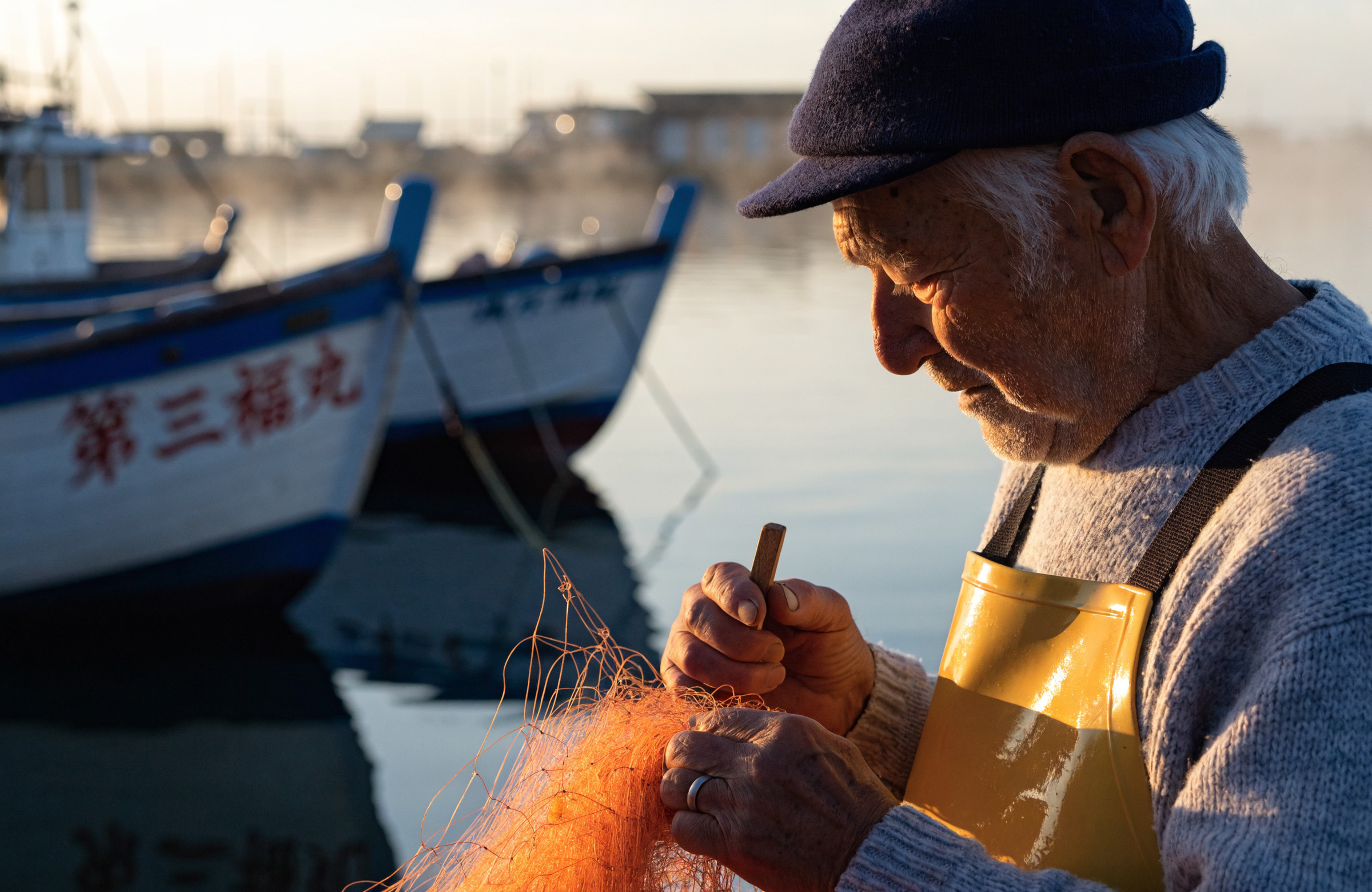
イラスト:夏祭りの浴衣の少女
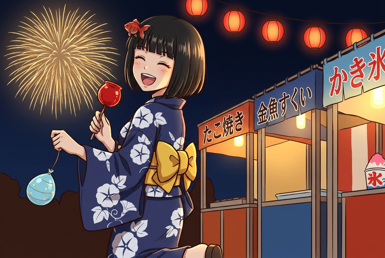
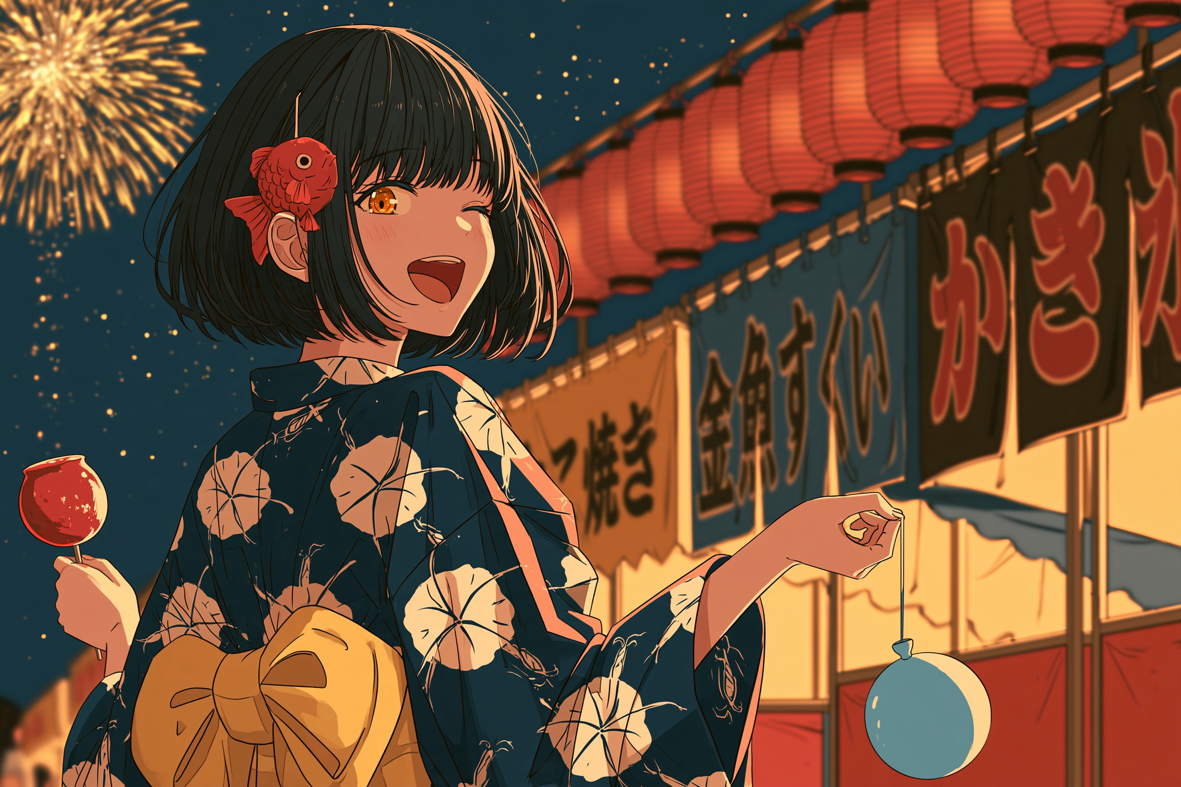
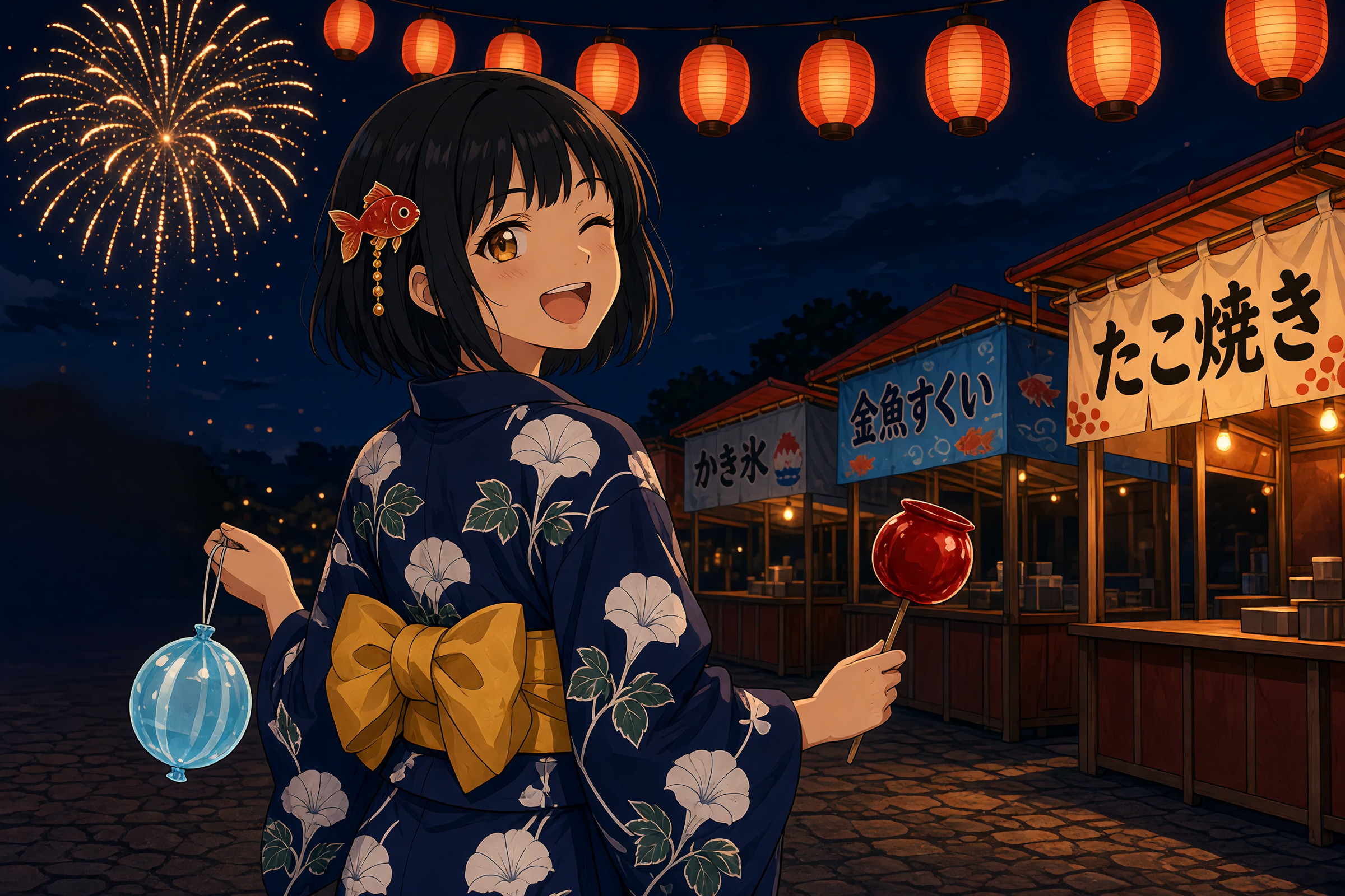
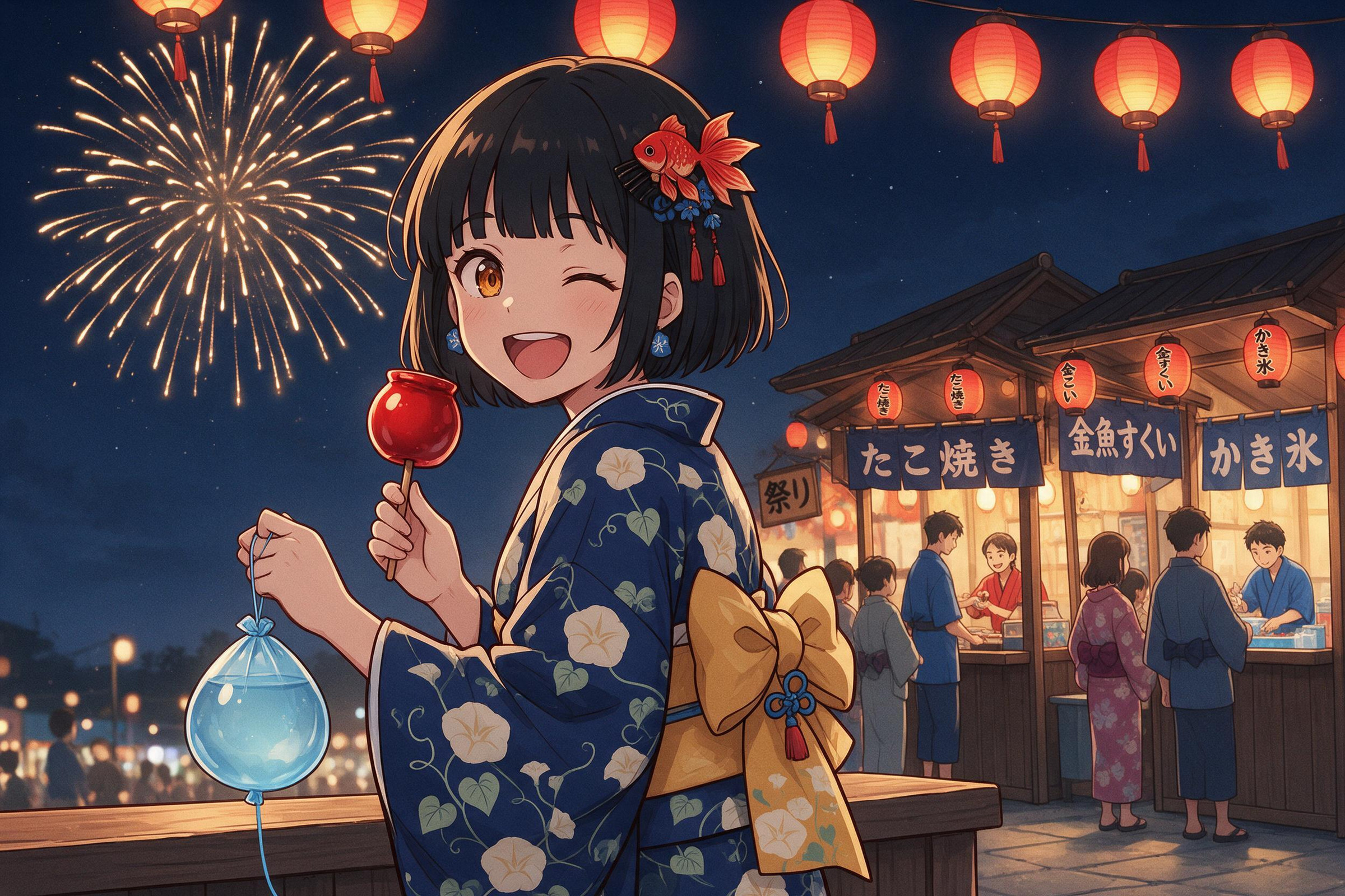
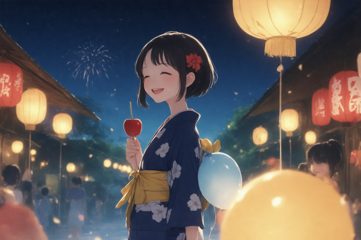
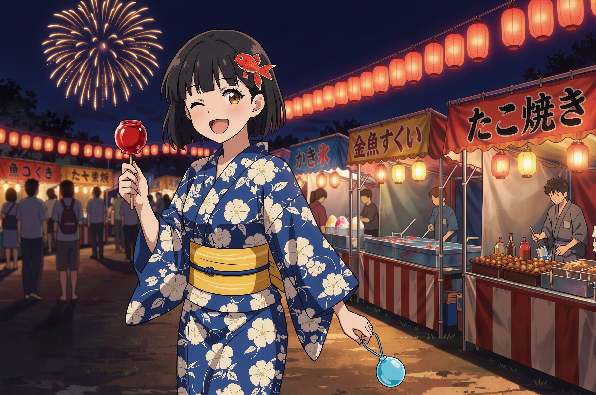
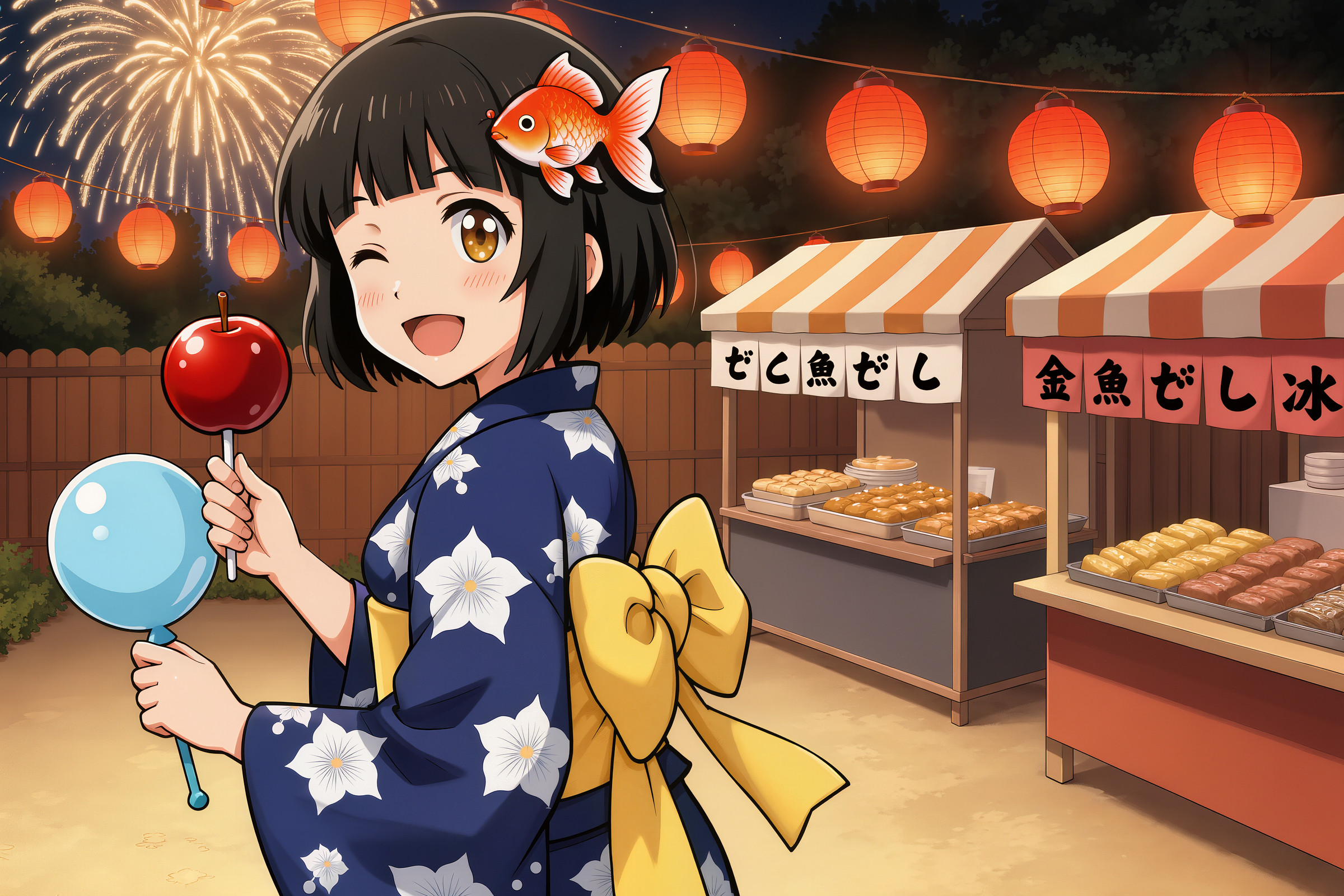
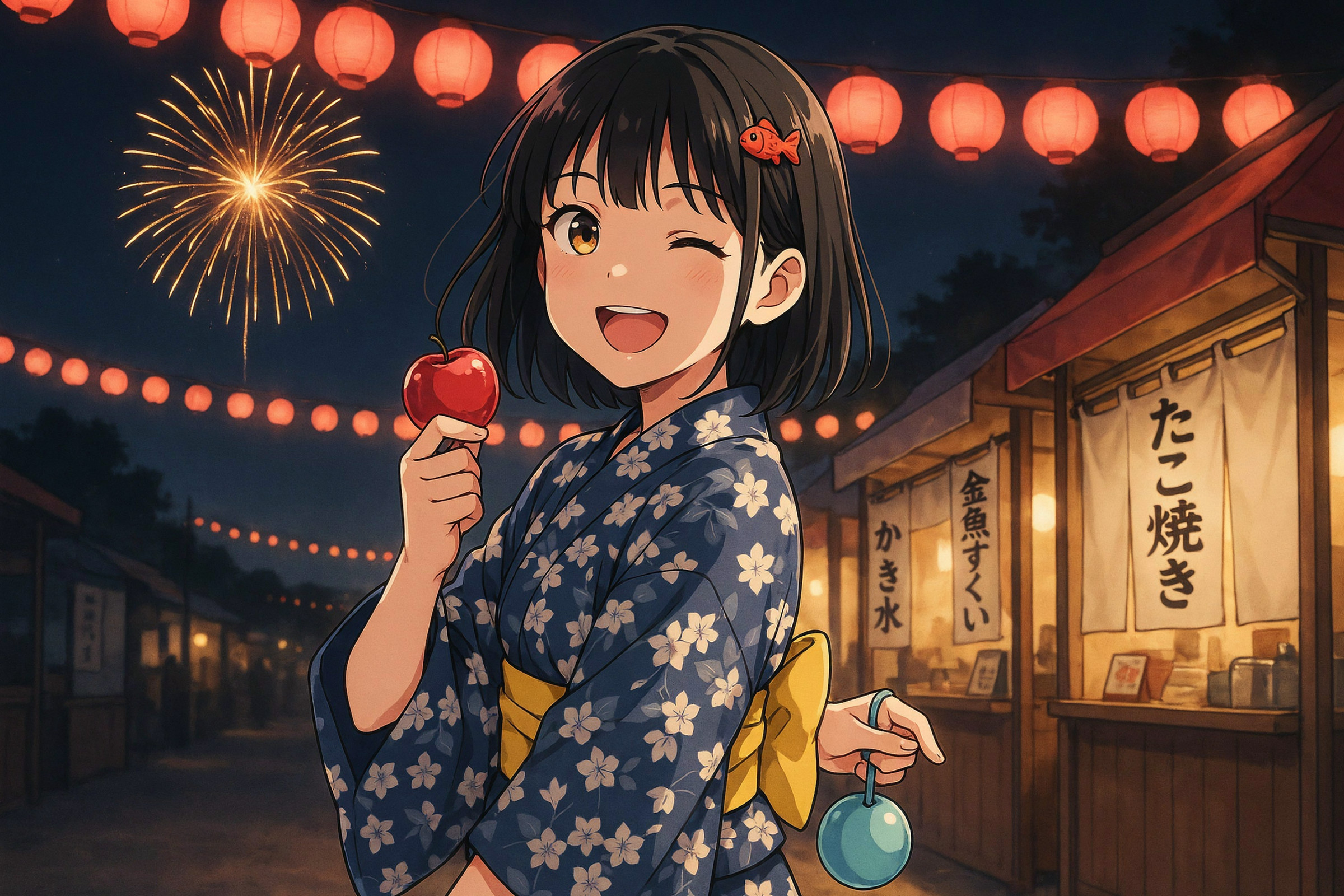
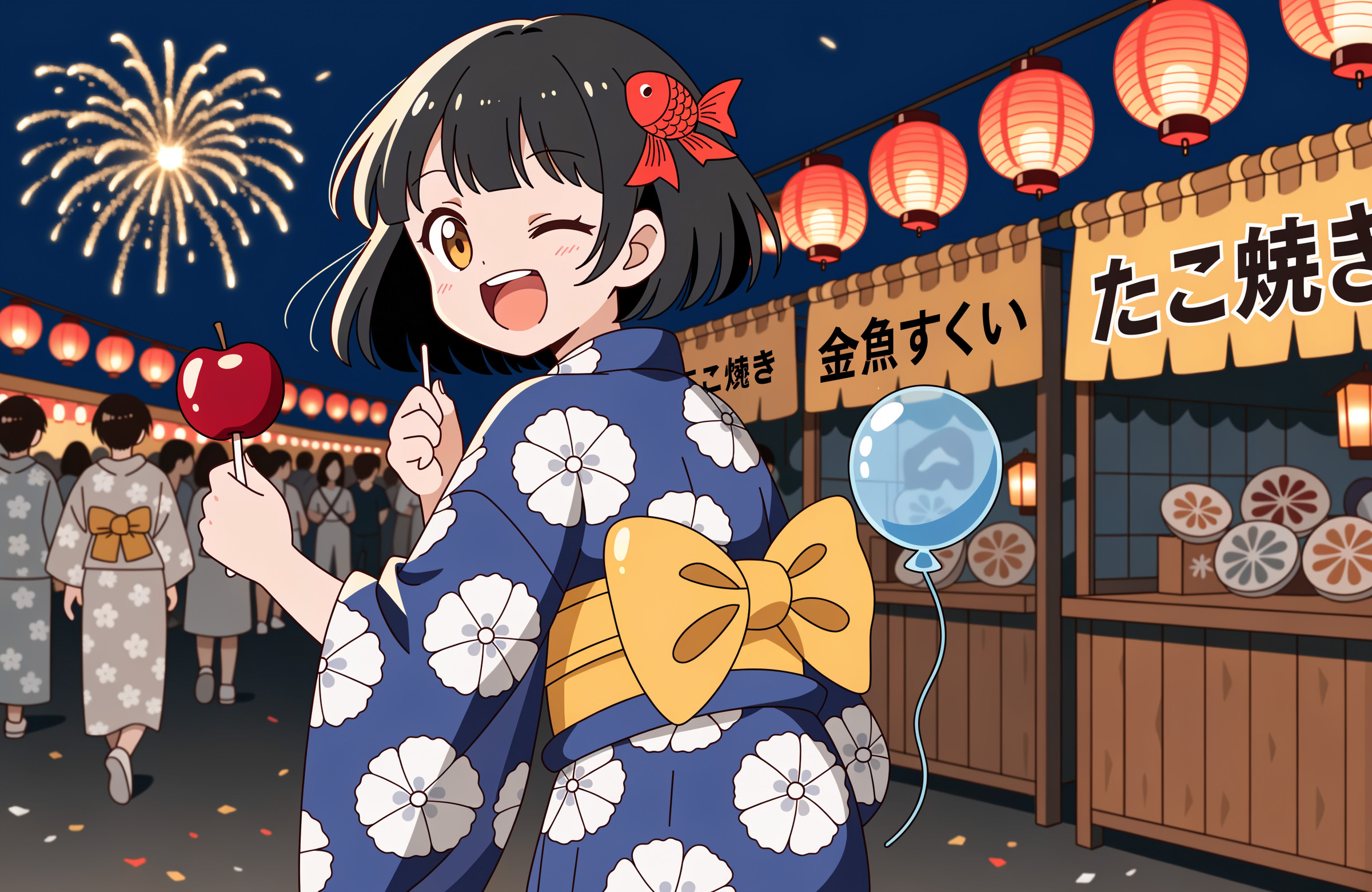
二つ目はイラストです。光るGPT Image 2.5の優等生感。本当にGPT Image 2.5は指示を守ってくれるイメージです。ただやはりMidjourneyが好きだなぁと思います。ただし、Midjourneyは結構体が崩壊していたりします。今回は運が良かった。
使ったプロンプト(英語)
A girl of about 16 in a yukata on a summer festival night. She is placed slightly left of center, drawn from the knees up. Her body faces right, and only her face turns back to look at the viewer.
She has a black bob haircut with straight-cut bangs. A red goldfish hair ornament on the left side of her hair. Amber eyes. She is laughing with her mouth open and winking with her right eye closed.
Her yukata is navy blue with a white morning glory pattern. Her obi is yellow, tied in a bunko bow at her back.
She holds one red candy apple in her right hand and a light blue water balloon yo-yo in her left hand.
On the right side of the background, three food stalls in a row, with noren curtains reading, from front to back, "たこ焼き", "金魚すくい", and "かき氷". A row of red paper lanterns across the top of the frame. In the upper left of the night sky, a single large golden firework is bursting.
Warm lantern light illuminates the right side of her face.
Japanese anime style, cel-shaded. Dark brown outlines, two-tone shading.
日本語の意味
夏祭りの夜、浴衣姿の16歳くらいの少女。画面中央よりやや左に配置し、膝から上を描く。体は右を向いていて、顔だけ振り返ってこちらを見ている。
黒髪のボブで前髪はぱっつん。左側の髪に赤い金魚の髪飾り。瞳は琥珀色。口を開けて笑いながら、右目を閉じてウインクしている。
浴衣は紺色の地に白い朝顔の柄。帯は黄色で、背中で文庫結びにしている。
右手に赤いりんご飴を1本、左手に水色の水風船ヨーヨーを持っている。
背景の右側に屋台が3軒並び、手前から「たこ焼き」「金魚すくい」「かき氷」と書かれたのれんが下がっている。画面上部に赤い提灯が一列に並ぶ。夜空の左上に、大きな金色の花火がひとつだけ開いている。
提灯の暖かい光が、少女の顔の右側を照らしている。
日本のアニメ風、セル画調。輪郭線は濃い茶色、影は2段階の塗り分け。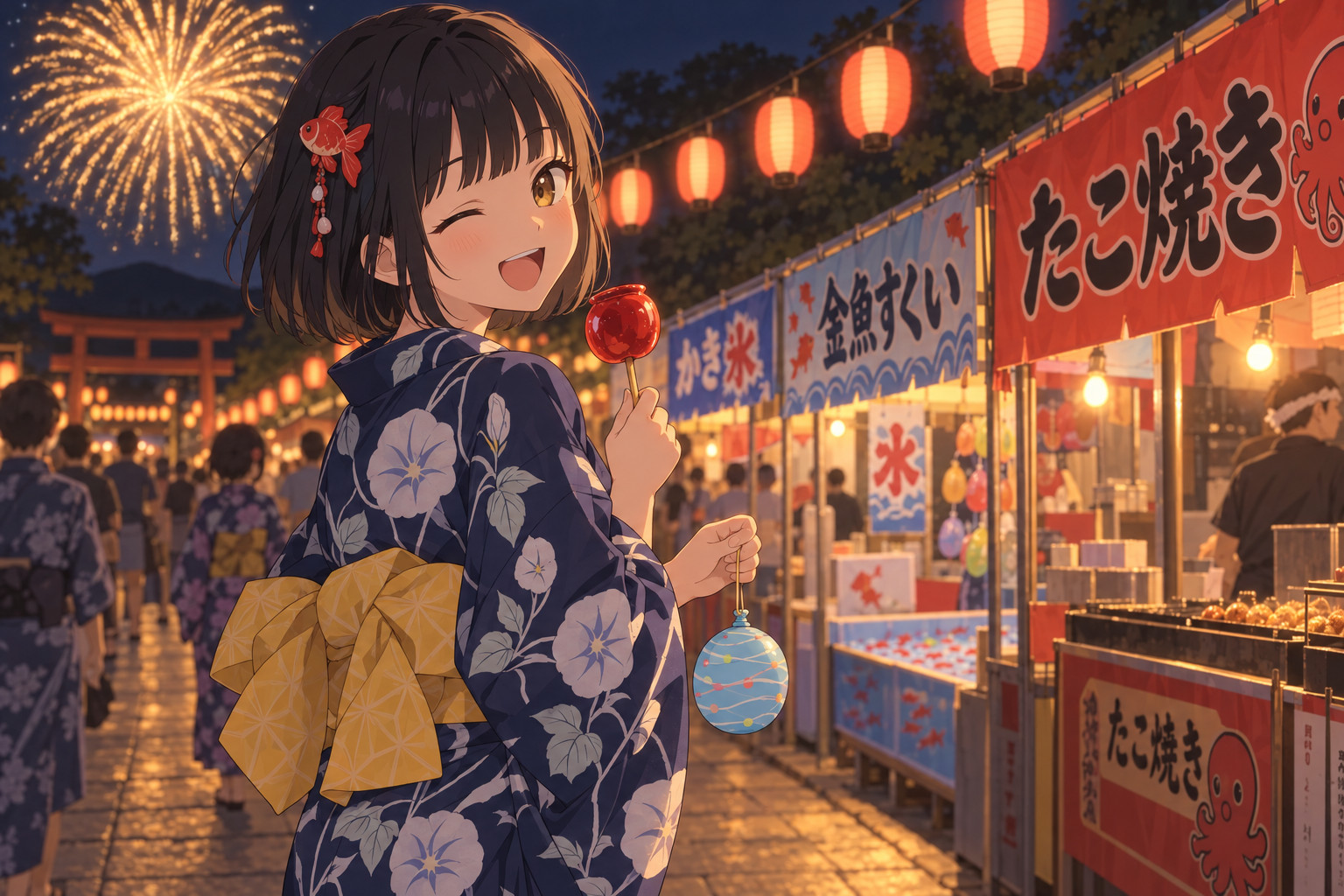
絵画:朝霧の川辺の村(印象派の油絵)
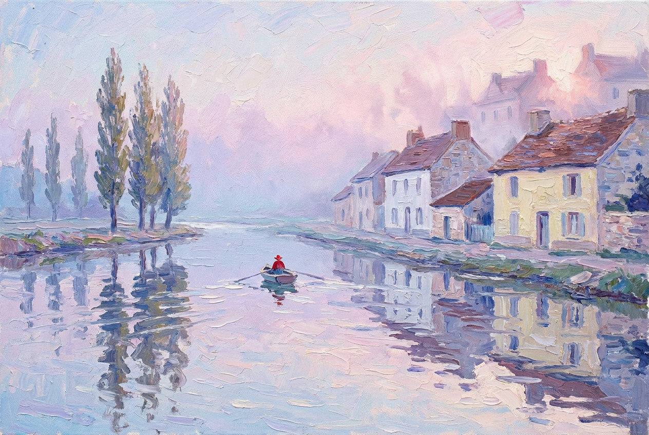
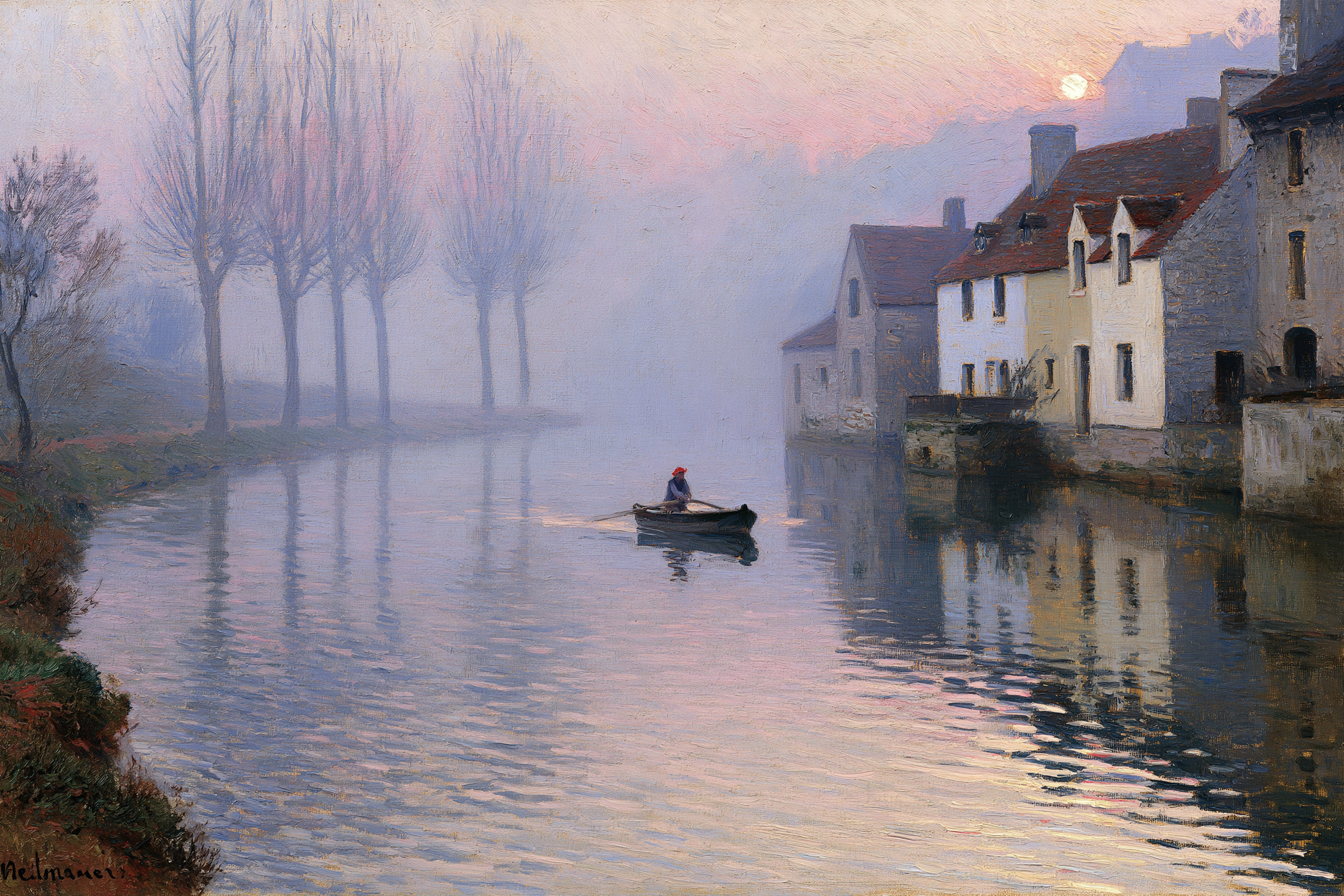
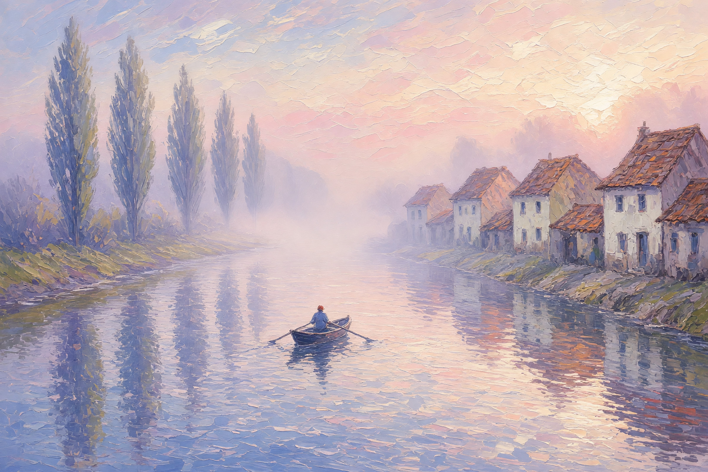
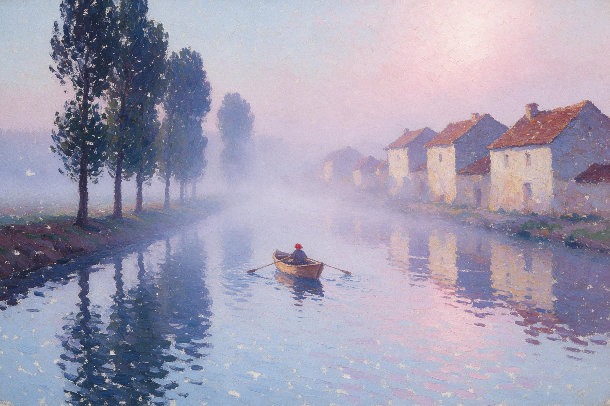
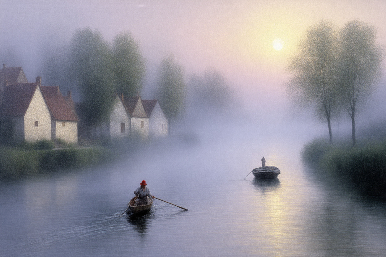
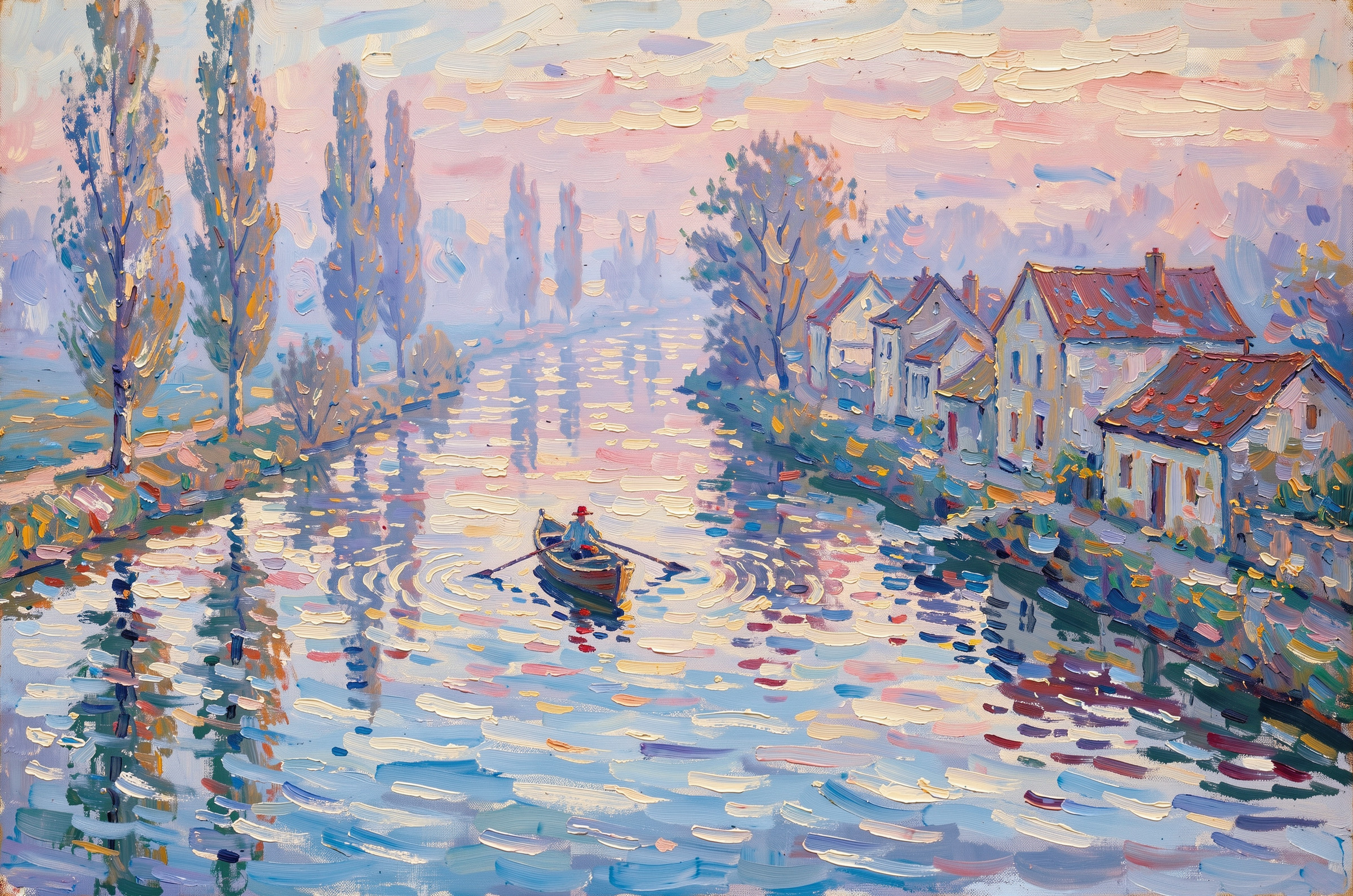
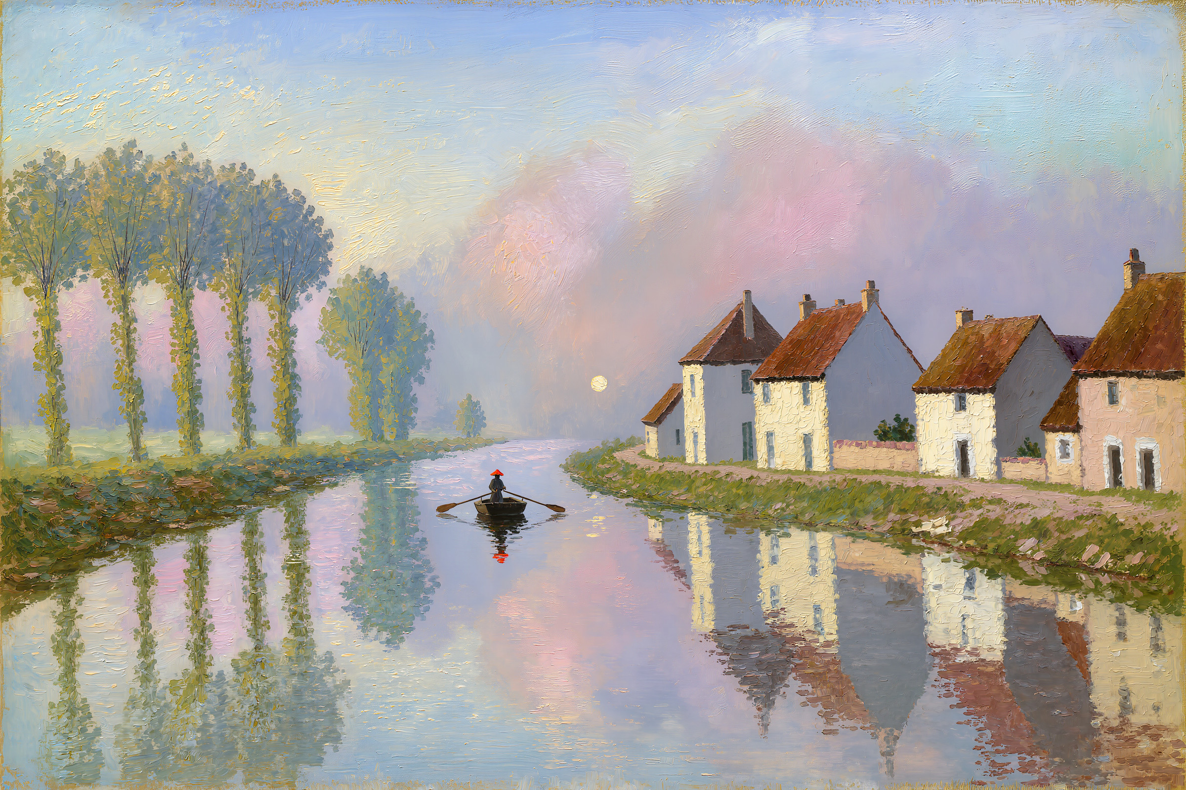
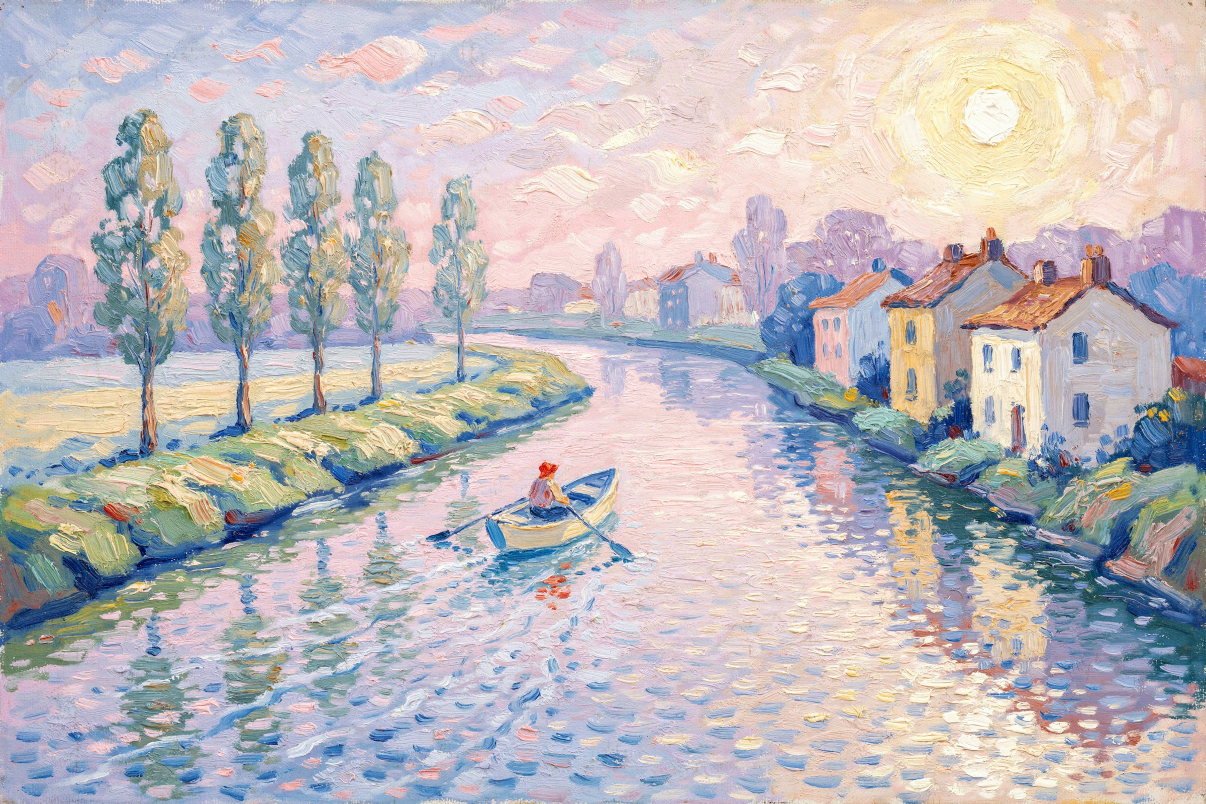
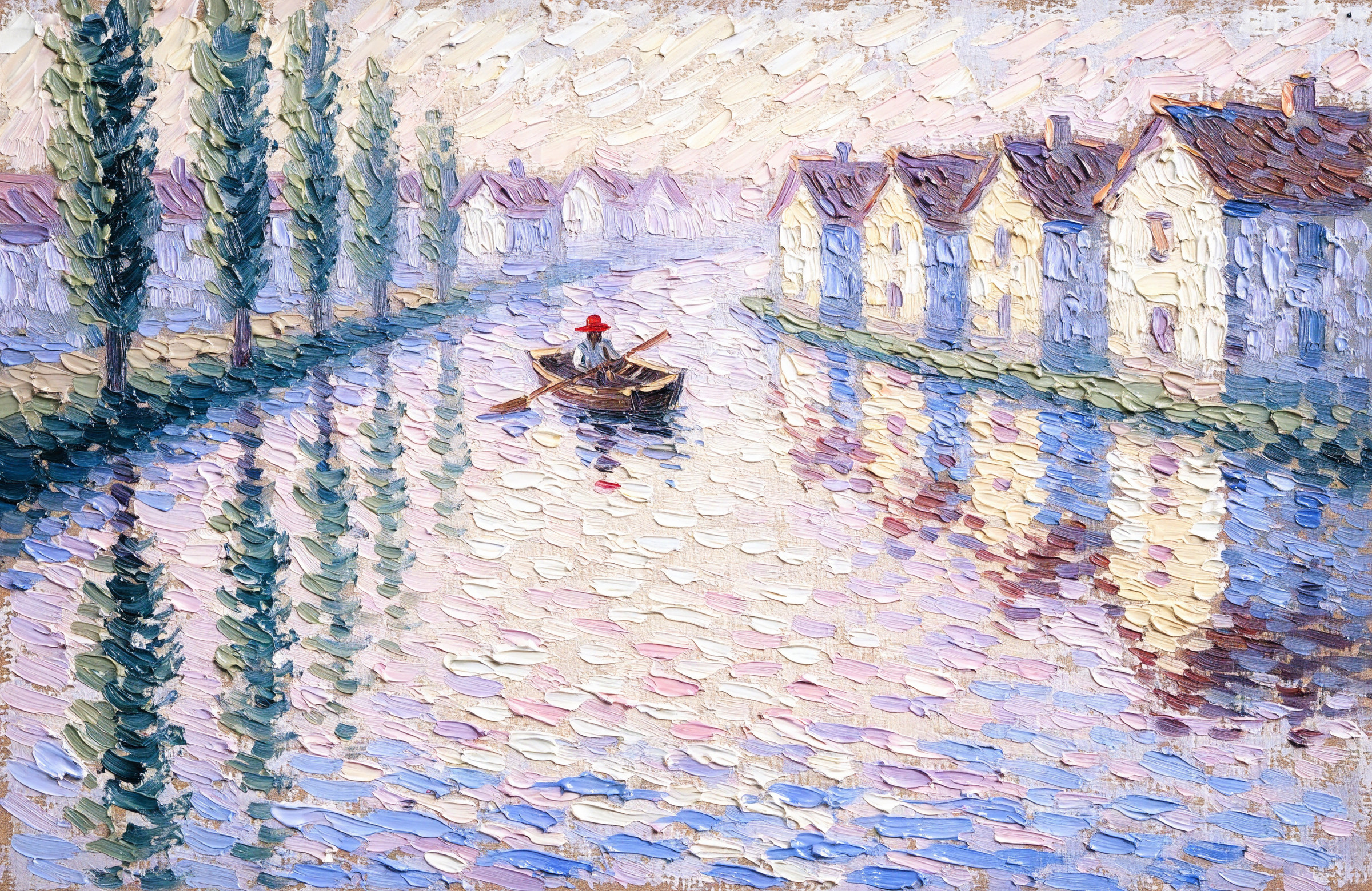
続いて絵画です。これに関してはどのモデルもそれぞれ良い感じですね
使ったプロンプト(英語)
A small riverside village wrapped in morning mist. The river flows diagonally from the lower left foreground toward the upper right background.
On the right bank, four stone houses stand in a row, with white and pale yellow walls and reddish-brown tiled roofs. On the left bank, five poplar trees stand in a single line.
One small boat floats in the middle of the river, with a single figure in a red hat rowing with oars. The houses and trees are reflected on the water, rippling.
It is just after sunrise, and the sun is outside the frame at the upper right. The mist is pink and pale purple, and in the upper third of the frame the outlines of the houses fade into the mist.
The palette centers on pale blue, lavender, pink, and cream. No black is used; shadows are rendered in blue-violet.
Impressionist oil painting. Thick impasto applied in short, side-by-side brushstrokes, with bits of bare canvas showing through.
日本語の意味
朝霧に包まれた川辺の小さな村。川は画面の左下手前から右奥へ斜めに流れている。
右岸に石造りの家が4軒並び、壁は白と淡い黄色、屋根は赤茶色の瓦。左岸にはポプラの木が5本、一列に立っている。
川の中央に小舟が1艘浮かび、赤い帽子をかぶった人物が1人、オールを漕いでいる。水面には家と木の影が揺らぎながら映っている。
日の出直後で、太陽は画面の外の右上にある。霧はピンクと淡い紫色で、画面の上3分の1では家の輪郭が霧にかすんでいる。
色は淡い青、ラベンダー、ピンク、クリーム色を中心にし、黒は使わず、影は青紫で表現する。
印象派の油絵。短い筆触を並べるような厚塗りのタッチで、ところどころキャンバス地が見えている。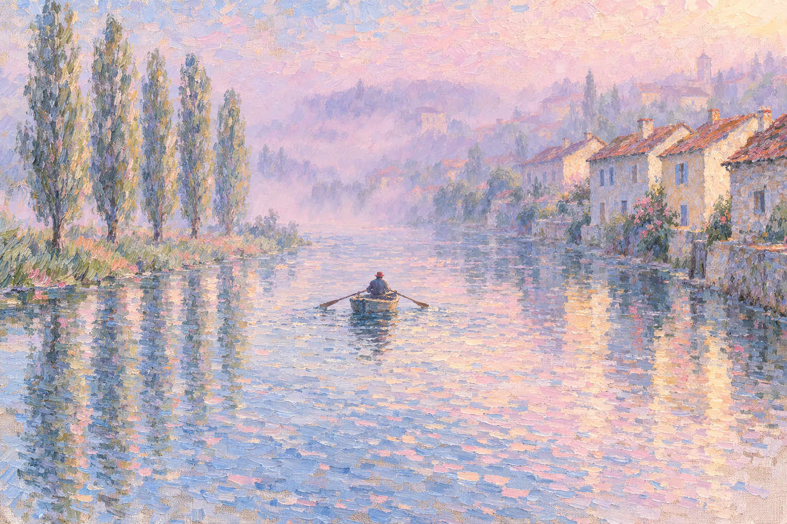
3DCG:植木鉢に水をやる小さなロボット
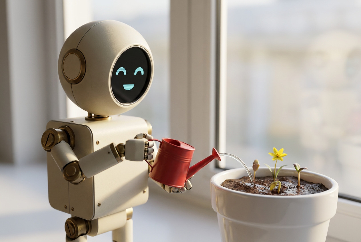
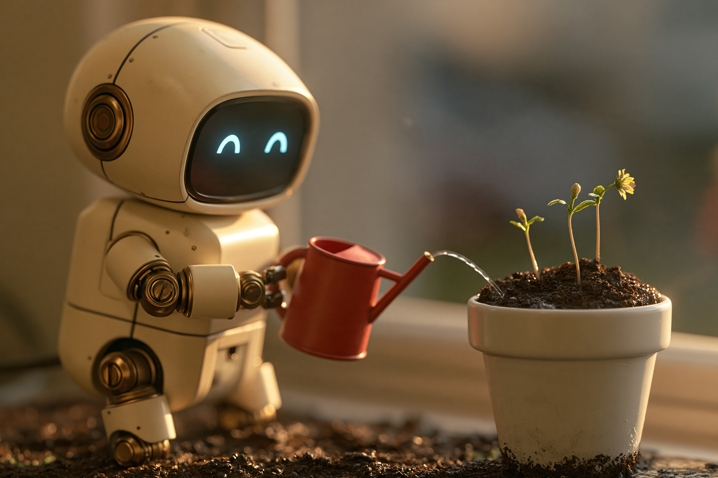
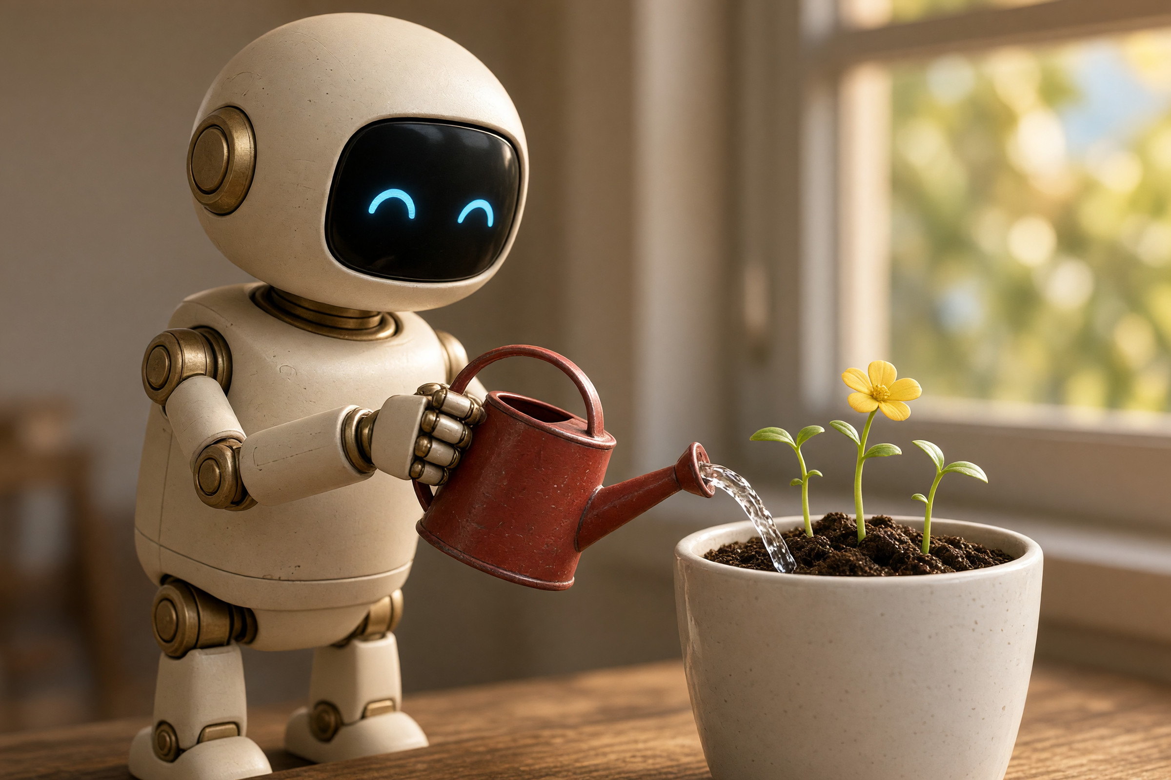
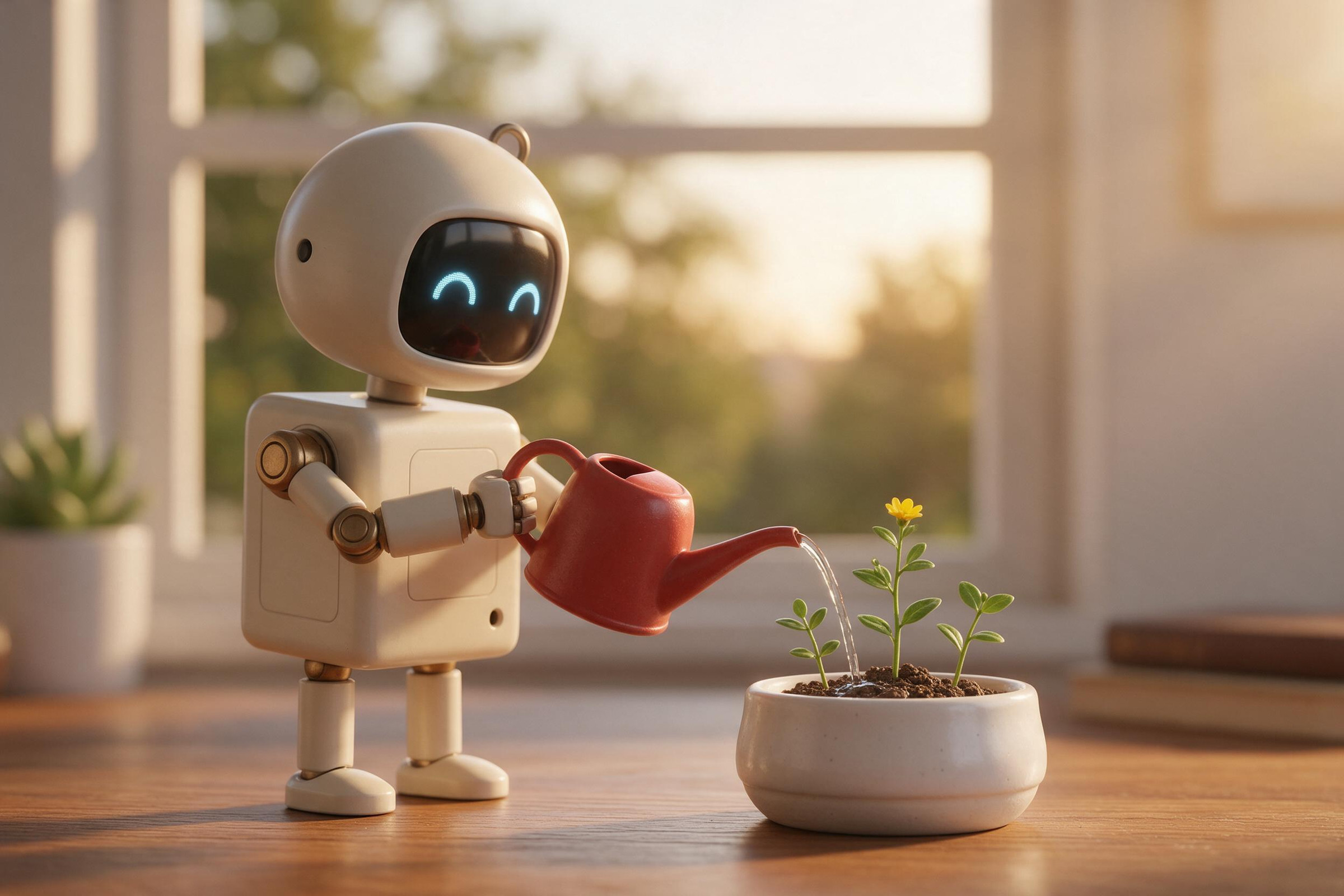
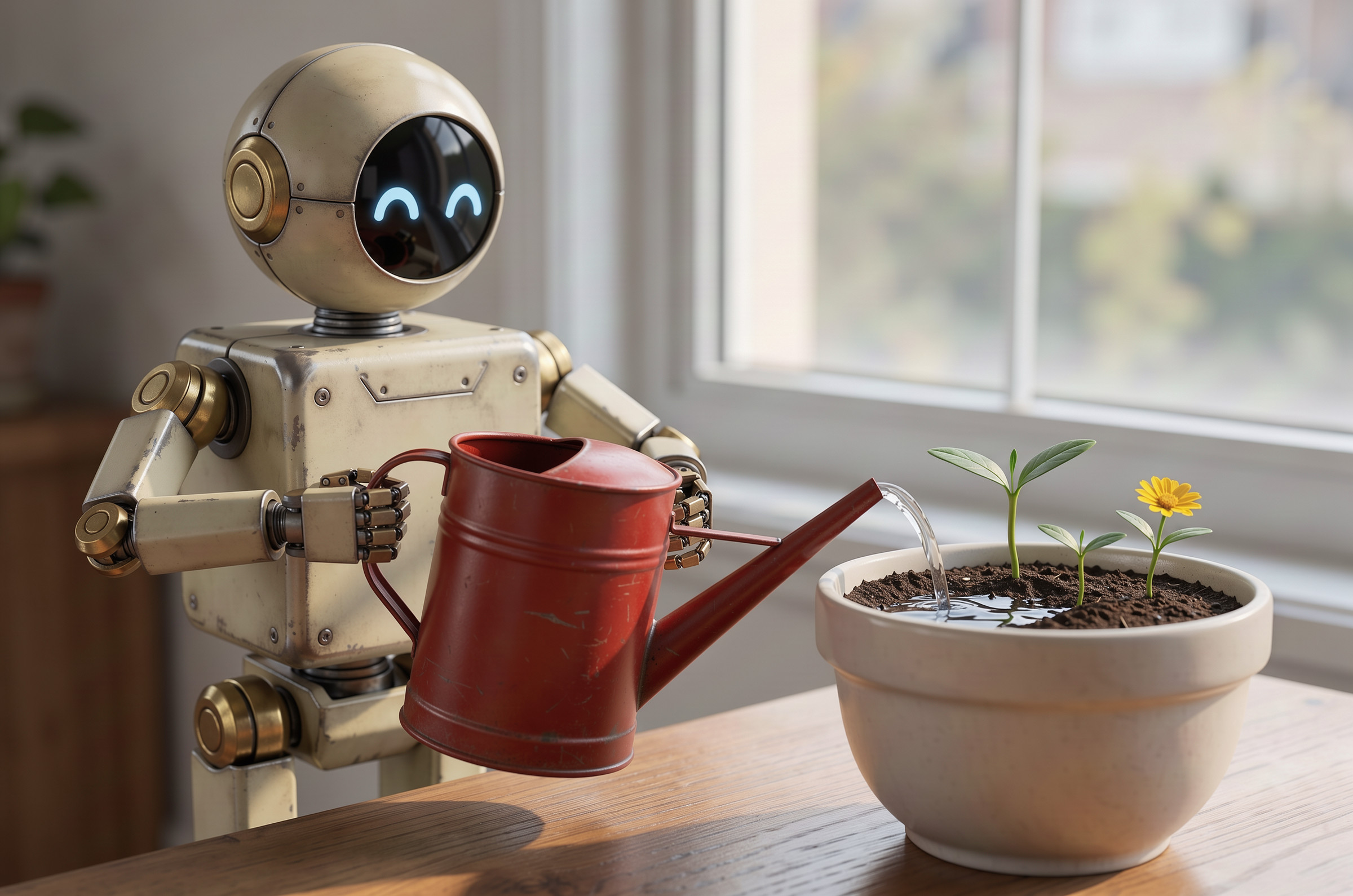
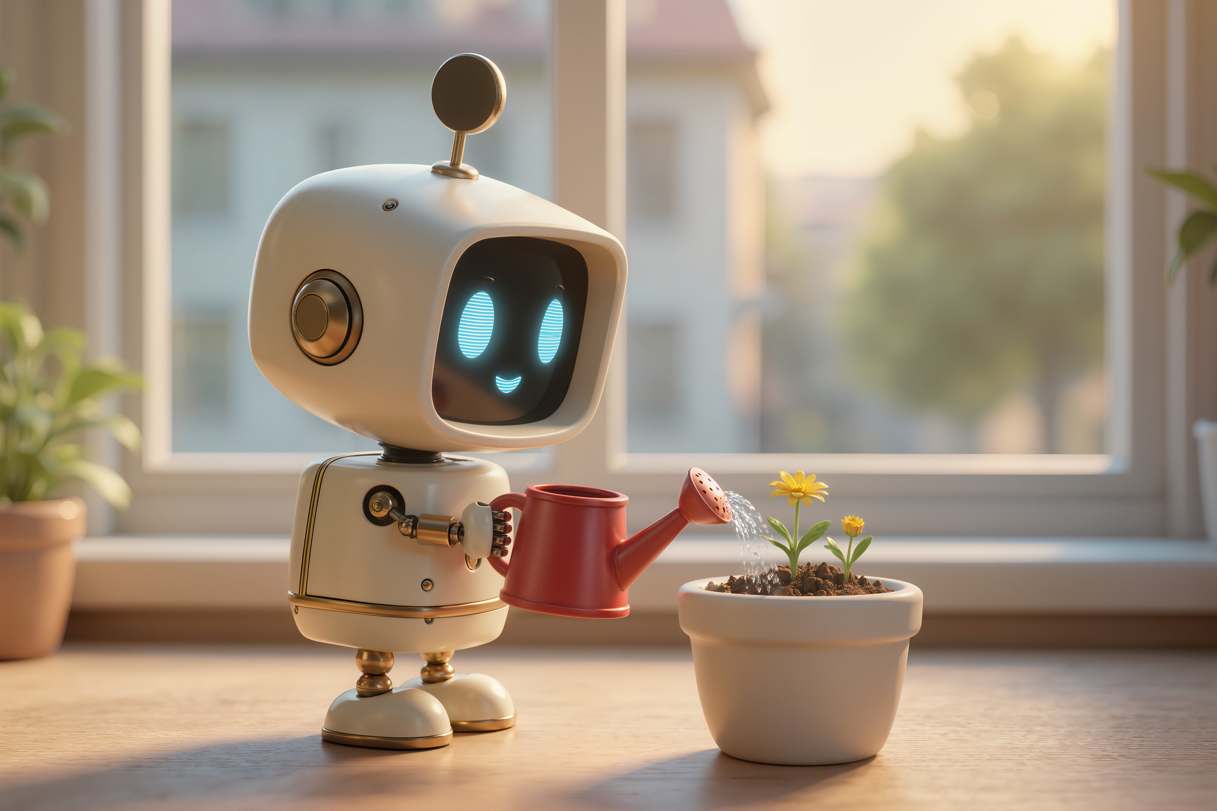
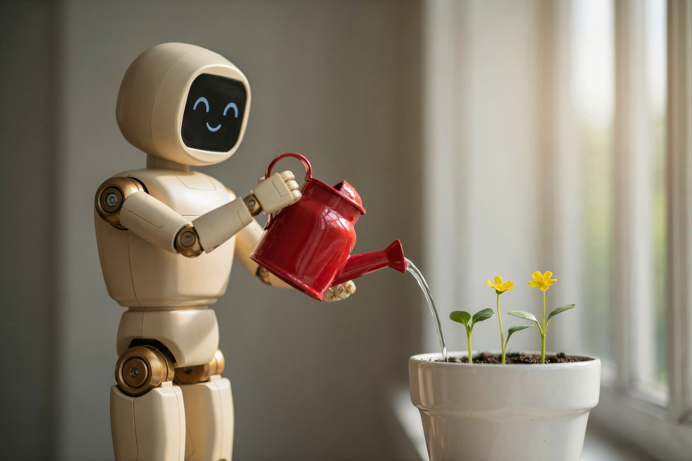
3DCGです。やはりGPT Image 2.5は絵作りの安定感を感じます。ただGPT Image 2.5は手堅く90点を取ってくるイメージで100点以上を出すのは実は他のモデルだったりもする気がします。
使ったプロンプト(英語)
A 3D CG render of a small robot watering a potted plant by a window. The robot is placed on the left side of the frame, its body facing right.
The robot has a round head and a boxy body. Its body is matte cream-colored metal, with only the joints in brass. Its face is a black display showing two smiling eyes in light blue light.
The robot holds a red watering can with both hands, and a thin stream of water flows from the spout.
On the right side of the frame, one white ceramic flower pot. Three small sprouts grow in the pot, and only one of them has a small yellow flower. The soil in the pot is damp and dark brown.
Soft afternoon light comes in through the window in the background, lighting the right edge of the robot. The background is blurred.
A high-quality 3D CG render. Realistic material textures, shallow depth of field.
日本語の意味
窓辺で植木鉢に水をやる小さなロボットの3DCG。ロボットは画面の左側に配置し、体は右を向いている。
ロボットの頭は丸く、胴体は四角い。ボディはつや消しのクリーム色の金属で、関節部分だけが真鍮色。顔は黒いディスプレイになっていて、そこに水色の光で笑った目が2つ表示されている。
ロボットは両手で赤いじょうろを持ち、注ぎ口から水が細く流れている。
画面の右側に、白い陶器の植木鉢が1つ。鉢には小さな芽が3本生えていて、そのうち1本だけに小さな黄色い花が咲いている。鉢の土は湿って濃い茶色になっている。
背景の窓からは、午後のやわらかい光が差し込み、ロボットの右側の輪郭を照らしている。背景はぼけている。
上質な3DCGレンダリング。リアルな素材の質感、浅い被写界深度。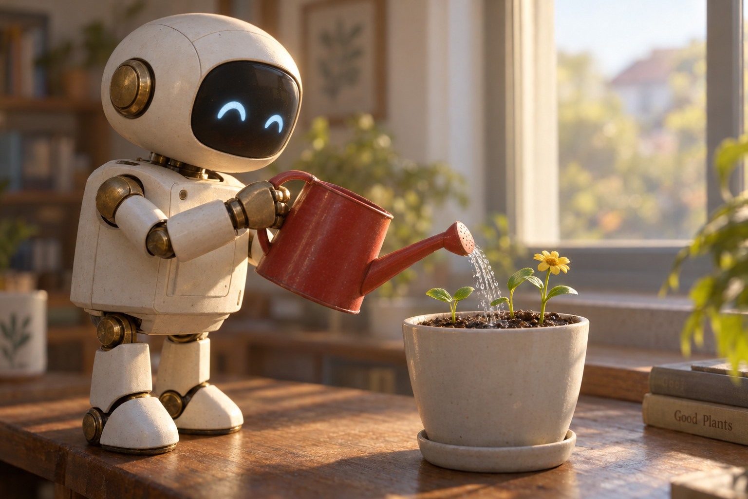

グラフィックデザイン:架空の音楽フェスのポスター(スイススタイル)
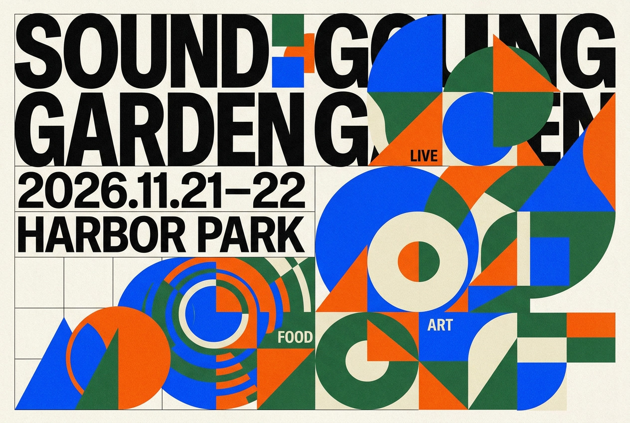
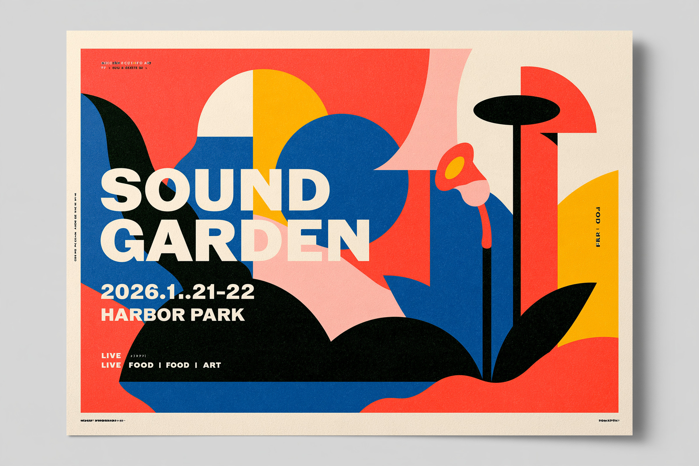
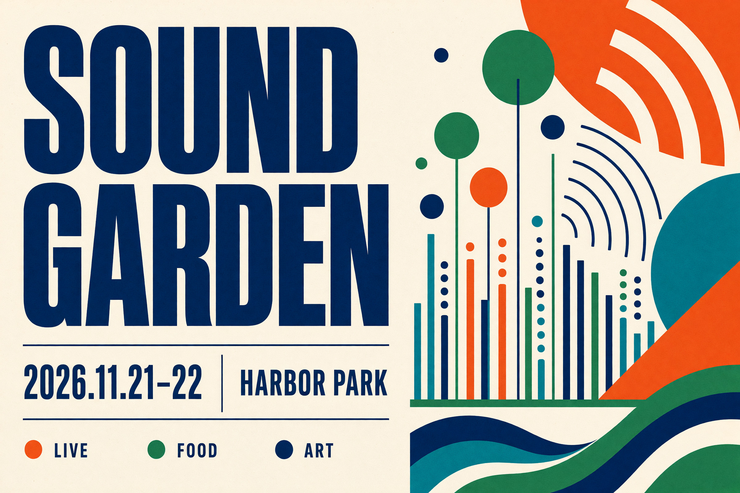
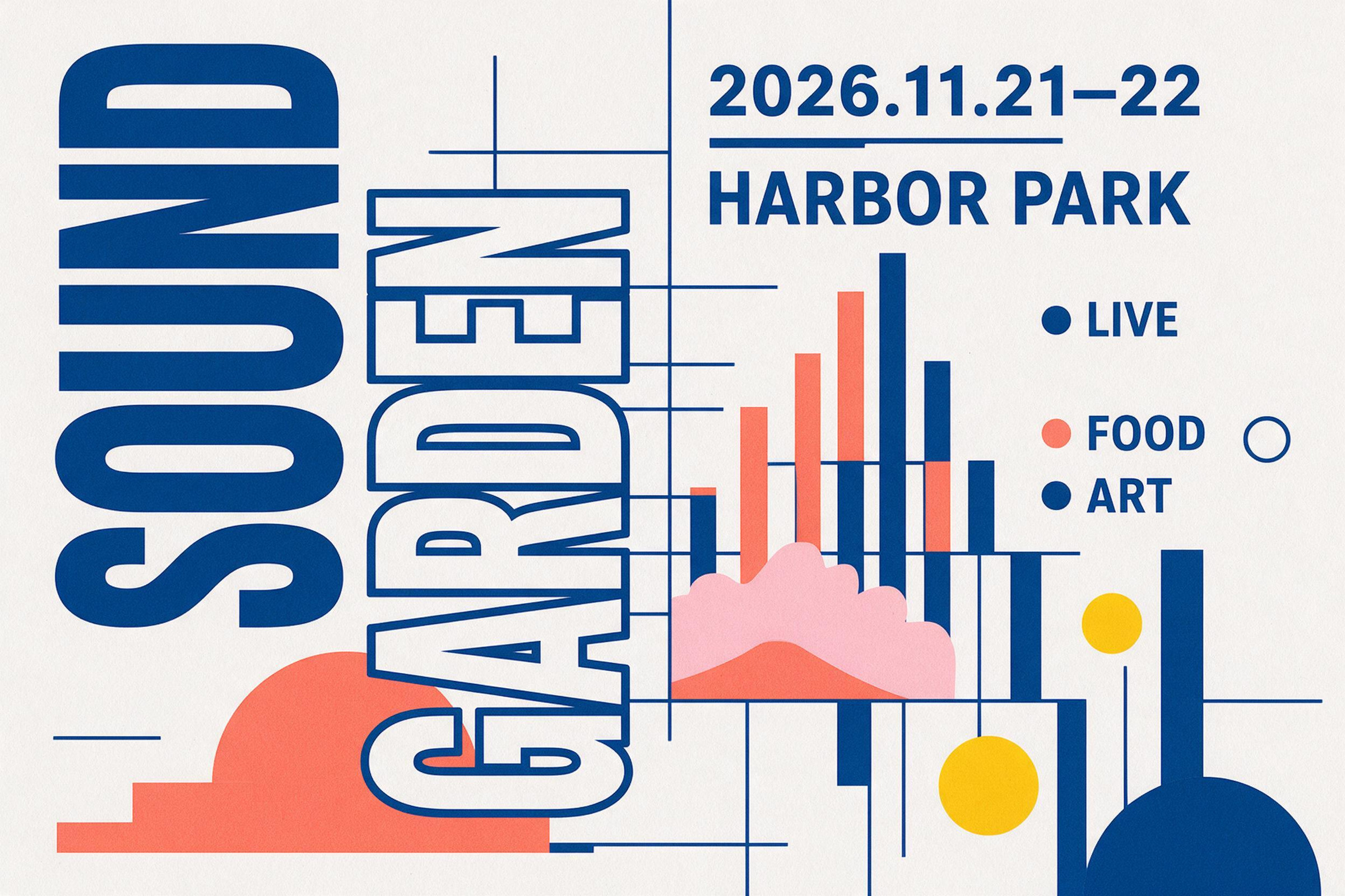
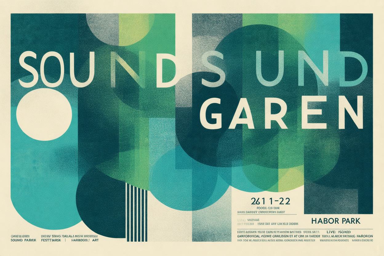
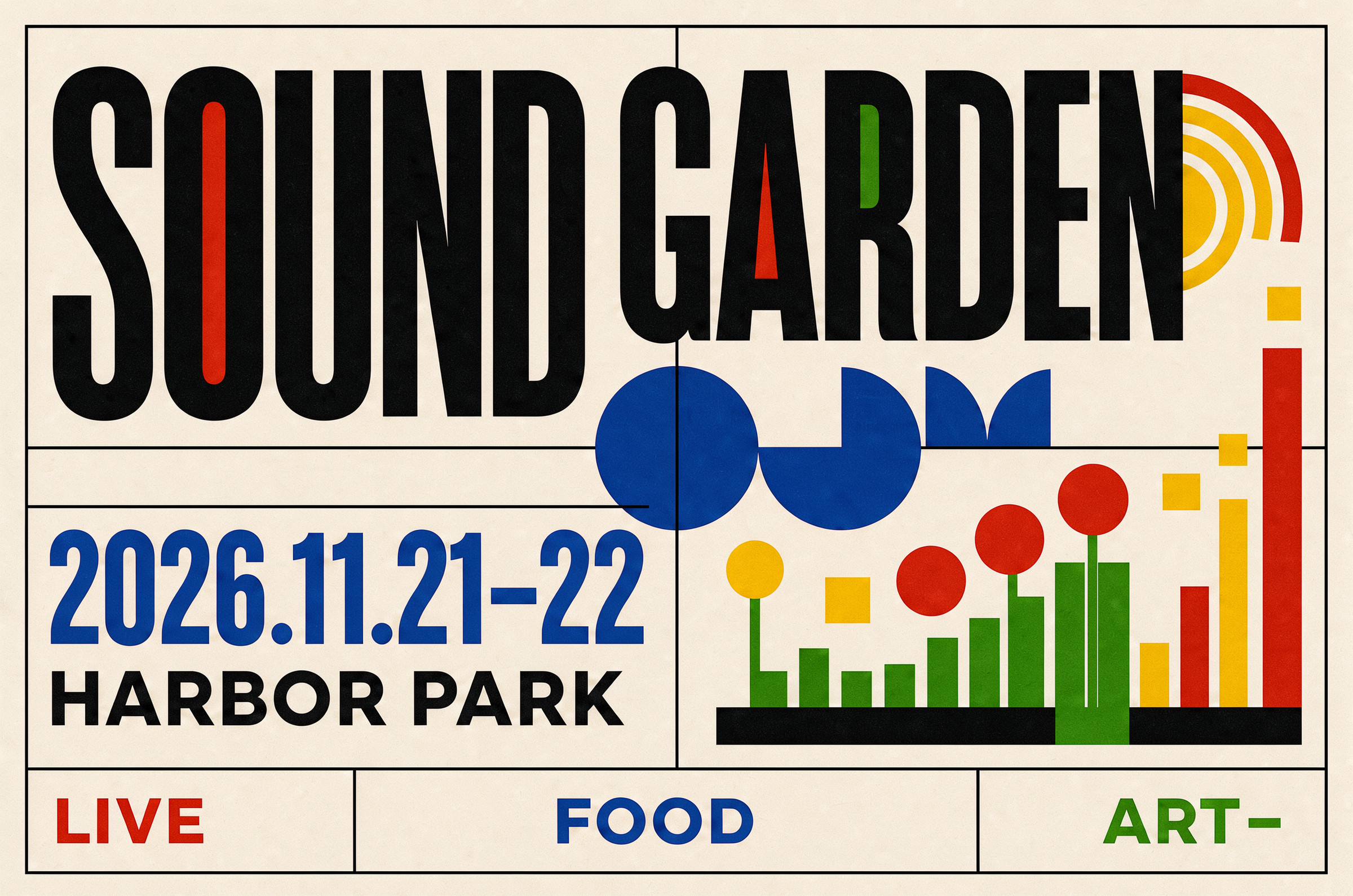
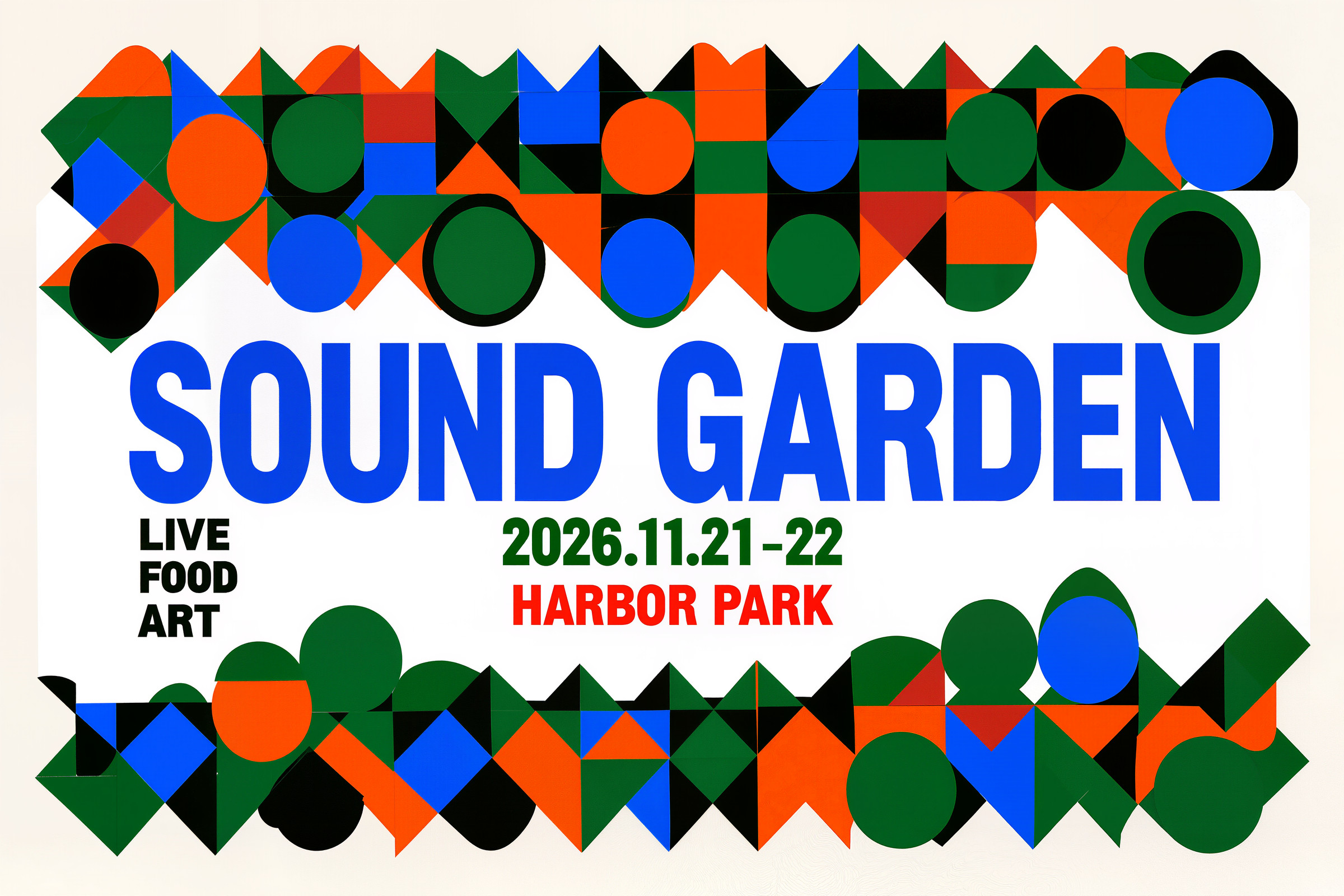
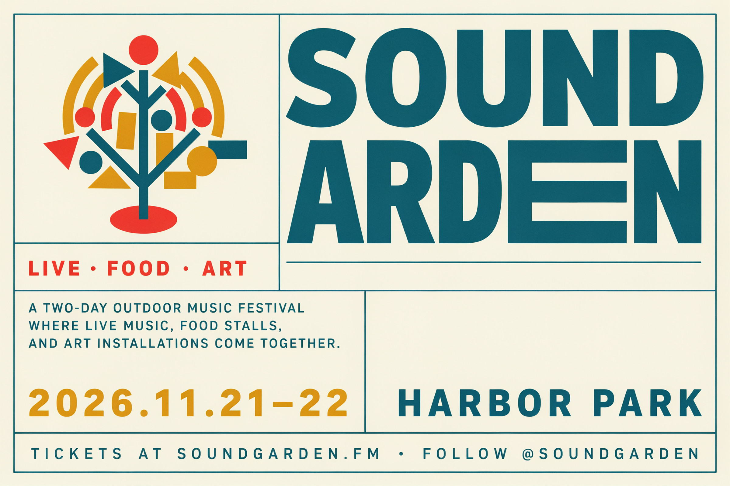
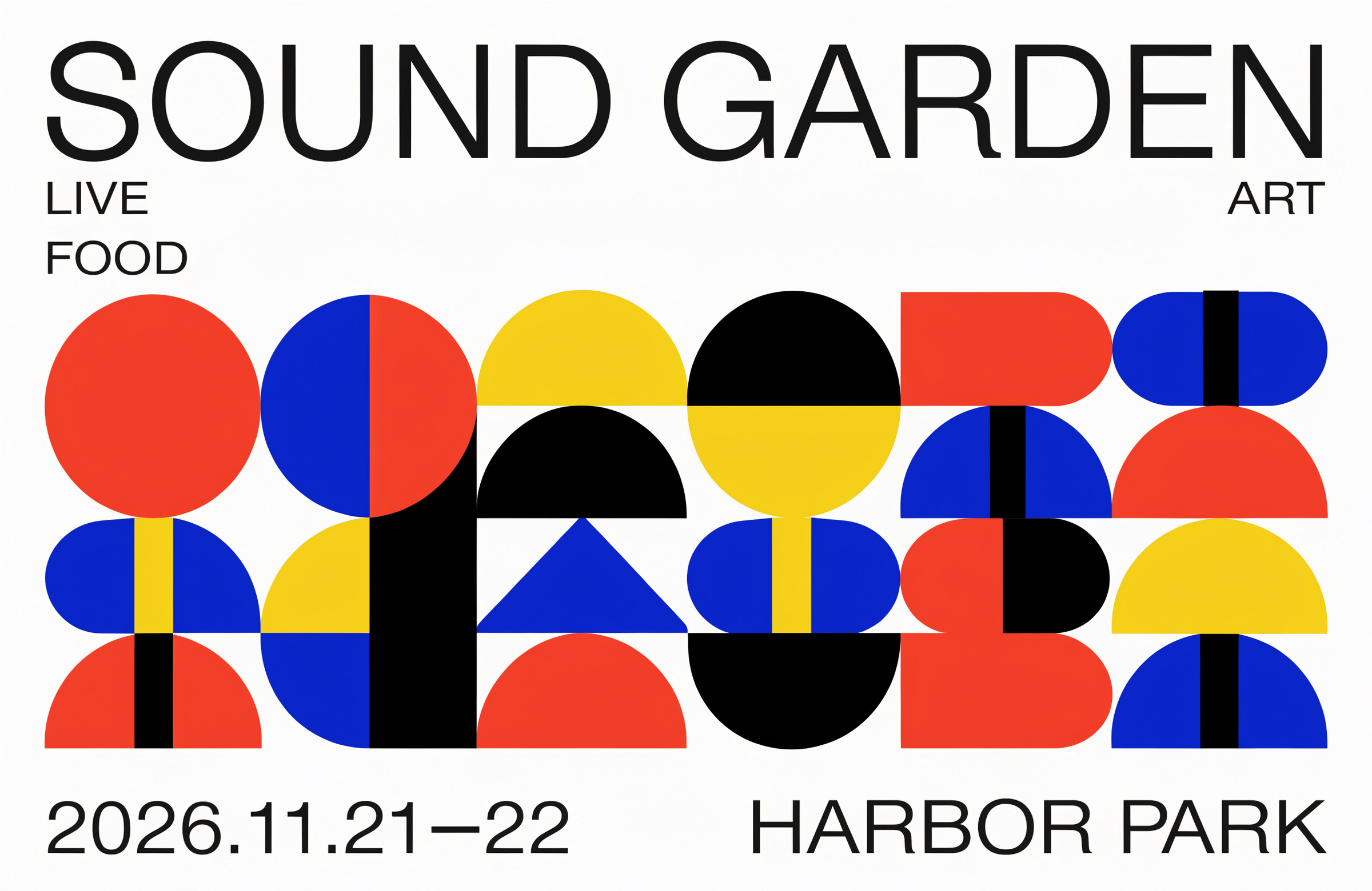
最後にグラフィックデザインです。文字を指定したことにより、得意不得意のはっきり出る結果となりました。個人的にGrok Imagineは意外とちゃんとしたもの出してくれる印象だったんですが、ここでも証明された形かなと思います。結構自由度の高いプロンプトにしたのでモデルごとの差が出て面白い結果になりました。
使ったプロンプト(英語)
Design a Swiss-style poster for "SOUND GARDEN", a two-day outdoor music festival held in a park by the harbor, where live music, food stalls, and art installations come together.
It should look like a real, professionally designed festival poster: bold, confident, and full of energy, with typography as the main visual element.
The title "SOUND GARDEN" is the most prominent element. The dates "2026.11.21–22" and the venue "HARBOR PARK" are clearly readable but secondary. The words "LIVE", "FOOD", and "ART" appear as small supporting text.
Create an original abstract graphic that expresses the idea of sound growing like a garden, using geometric shapes, a strong grid, and flat, bold colors. The composition, shapes, and color palette are up to you.
Only the text in quotation marks appears on the poster, spelled exactly as written.
日本語の意味
「SOUND GARDEN」のスイススタイルのポスターをデザインしてください。港のそばの公園で開かれる2日間の屋外音楽フェスで、ライブ音楽、屋台、アート展示が一緒に楽しめる。
プロがデザインした本物のフェスのポスターに見えるように。大胆で自信があり、エネルギーに満ちていて、文字が主役。
タイトル「SOUND GARDEN」が一番目立つ要素。日付「2026.11.21–22」と会場「HARBOR PARK」ははっきり読めるが二番手。「LIVE」「FOOD」「ART」は小さな補助の文字。
「音が庭のように育っていく」というイメージを表す、オリジナルの抽象的なグラフィックを、幾何学的な形・強いグリッド・平らで大胆な色で作ってください。構図、形、配色はお任せします。
ポスターに載る文字は、引用符で囲んだものだけ。書いたとおりの綴りで。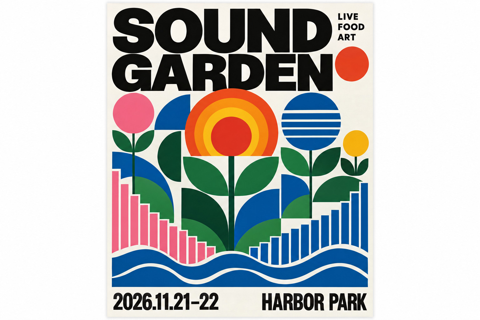
それぞれのモデルが得意なものをお願いしてみた
同じプロンプトで比べると、どうしても得意・不得意が出ます。そこで各社の公式の説明や使っている人たちの評価を調べて、それぞれのモデルが得意そうなジャンルを 3 つずつお願いしてみました。
こちらはプロンプトをモデルごとに変えているので、比較ではなく「代表作」として見てください。
GPT Image 2.5 Sunburst
1 作目は広告キャンペーンのビジュアル。OpenAI は Sunburst の用途を「production-ready campaign creative or polished product imagery」と紹介しています。
2 作目はアニメ調のキービジュアル。海外のレビュー記事の対決で、空の描き込みが高く評価されていました。
3 作目は記念切手のシート。公式の発表記事の作例に、切手やビンテージポスターがあります。
使ったプロンプト(英語と日本語の意味)
1 作目:広告キャンペーンのビジュアル
A premium advertising campaign visual for a fictional wireless headphone brand called "AURA".
A pair of matte sand-colored over-ear headphones floats at a slight angle above perfectly still water at dawn, with soft mist drifting across the surface and a clean mirror reflection below.
Clean editorial studio-quality lighting, precise product detail on the stitched leather ear cushions and brushed aluminum hinges.
In the upper left, the headline "Hear the quiet." in an elegant thin serif. In the lower right, the small brand wordmark "AURA".
It should look like production-ready, magazine-quality campaign creative. Only the text in quotation marks appears in the image.
日本語の意味
架空のワイヤレスヘッドホンのブランド「AURA」の、上質な広告キャンペーンのビジュアル。
マットなサンドカラーのオーバーイヤーヘッドホンが、夜明けの完全に静かな水面の上に少し傾いて浮かんでいる。水面には薄い霧が流れ、下にはくっきりとした鏡のような映り込み。
スタジオ品質の雑誌広告のような整った照明。縫い目のある革のイヤークッションと、ヘアライン仕上げのアルミのヒンジまで精密に描く。
左上に見出し「Hear the quiet.」を上品な細いセリフ体で。右下に小さなブランドロゴ「AURA」。
そのまま使える雑誌品質のキャンペーン広告に見えるように。画像に入る文字は、引用符で囲んだものだけ。
2 作目:アニメ調のキービジュアル
An anime key visual for a fictional original TV series about one unforgettable summer.
A high school girl stands on the rooftop of a seaside school, her white sailor uniform and hair moving in the wind, looking toward the viewer with a determined smile.
Behind her, an enormous towering cumulus cloud glows in the afternoon sun over a deep blue sea, and a small two-car train crosses a long bridge far below.
Vivid saturated colors, crisp cel shading, a luminous sky with richly detailed clouds, and a feeling of nostalgia and possibility. Theatrical poster-quality artwork where the sky is the hero.
日本語の意味
忘れられないひと夏を描く、架空のオリジナルテレビアニメのキービジュアル。
海辺の学校の屋上に女子高生が立ち、白いセーラー服と髪が風になびく。決意のこもった笑顔でこちらを見ている。
背後には、深い青の海の上で午後の日差しに輝く巨大な入道雲。はるか下では、2 両編成の小さな電車が長い橋を渡っている。
鮮やかな色、くっきりしたセル塗り、細かく描き込まれた雲が光る空、懐かしさと可能性を感じる雰囲気。空が主役の、劇場ポスター品質のアートワーク。
3 作目:記念切手のシート
A sheet of six commemorative postage stamps for a fictional series called "BIRDS OF THE NORTHERN COAST", arranged in two rows of three on a cream sheet with perforated edges.
Each stamp shows a different seabird in a refined engraved-illustration style with limited ink colors, and carries its own small text: the bird's English name, the denomination "84", and the word "POST".
Across the top margin of the sheet, the series title "BIRDS OF THE NORTHERN COAST" in elegant serif capitals, and in the bottom margin the small line "FIRST ISSUE 2026".
Precise, print-ready philatelic design with crisp small text and consistent styling across all six stamps.
日本語の意味
架空の記念切手シリーズ「BIRDS OF THE NORTHERN COAST」の、6 枚つづりの切手シート。目打ちのあるクリーム色のシートに、3 枚 × 2 段で並ぶ。
それぞれの切手に、限られたインクの色による上品な版画風のイラストで違う海鳥を描き、小さな文字(鳥の英語名・額面「84」・「POST」の文字)を入れる。
シートの上の余白にシリーズ名「BIRDS OF THE NORTHERN COAST」を上品なセリフ体の大文字で、下の余白に小さく「FIRST ISSUE 2026」。
小さな文字までくっきりした、6 枚すべてのスタイルがそろった、そのまま印刷できる精密な切手のデザイン。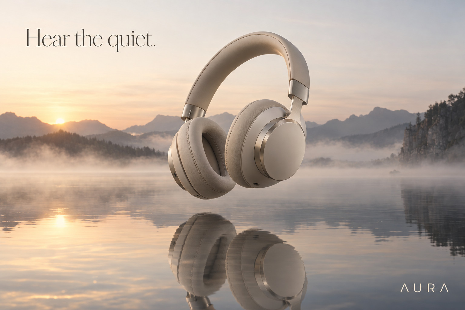
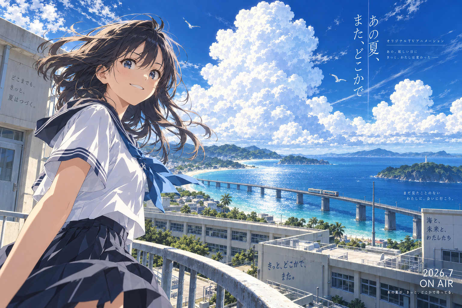
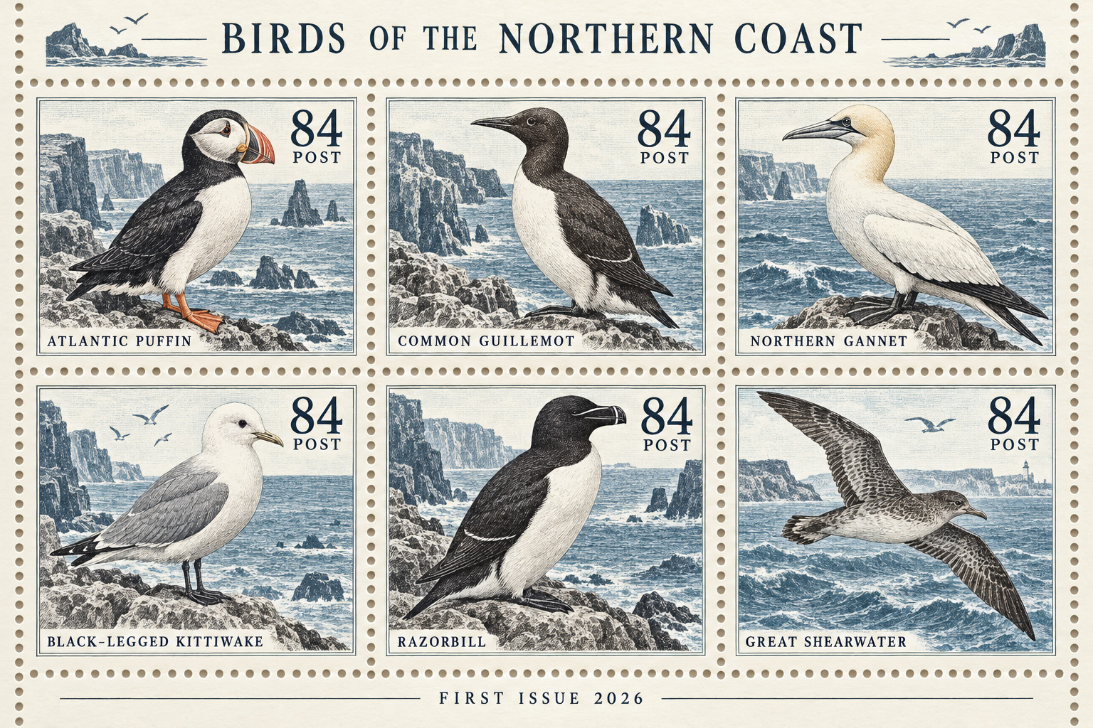
個人的にGPT Image 2.5 は本当に優等生です。こちらの指示もちゃんと反映してくれるし、一番使い勝手が良いと思ってます。キャラクターの同一性もかなり保ってくれますし。ただ、世の中でよく見るせいかAI感が出やすいモデルだったりもするかもなと思います
Nano Banana Pro
1 作目は日本語の文字が多いインフォグラフィック。Google は「文字を正しく読める形で描けるモデル」として、インフォグラフィックを筆頭に挙げています。
2 作目は5 人の顔を描き分けた集合写真。公式に「最大 5 人の見た目を一貫して保てる」とあります。
3 作目は江戸時代の日本橋の再現。公式のモデルページに「historically accurate scenes(時代考証の正しい場面)」とあります。
使ったプロンプト(英語と日本語の意味)
1 作目:日本語の文字が多いインフォグラフィック
A beautifully designed Japanese-language infographic poster titled "和菓子の四季".
Four columns for spring, summer, autumn, and winter. Each column shows a realistic illustration of one seasonal wagashi with its name in Japanese: "桜餅", "水まんじゅう", "栗きんとん", and "椿餅", followed by two short lines of Japanese explanation about its main ingredients and the season it represents.
Across the bottom, a timeline ribbon with the twelve months in Japanese, and small icons for the ingredients.
Soft washi paper texture, a refined seasonal color palette, and elegant Japanese typography with a clear hierarchy of title, headings, and body text. All Japanese text is correctly written and easy to read.
日本語の意味
「和菓子の四季」というタイトルの、美しくデザインされた日本語のインフォグラフィックのポスター。
春・夏・秋・冬の 4 列。各列に季節の和菓子を 1 つずつ写実的なイラストで描き、日本語の名前「桜餅」「水まんじゅう」「栗きんとん」「椿餅」と、主な材料と表している季節についての日本語の短い説明を 2 行添える。
下部には 12 か月を日本語で並べた年表の帯と、材料の小さなアイコン。
やわらかな和紙の質感、季節を感じる上品な配色、タイトル・見出し・本文の階層がはっきりした美しい日本語の文字組み。日本語はすべて正しく、読みやすく書く。
2 作目:5 人の顔を描き分けた集合写真
A fashion magazine group portrait of five distinct friends in their twenties posing together inside a sunlit vintage furniture shop. Each person has a clearly different face, hairstyle, and outfit: a tall man in a camel coat, a woman with short silver hair in a black turtleneck, a man with curly hair in a striped knit sweater, a woman in a yellow raincoat holding a film camera, and a woman with long braids in denim overalls.
Natural window light, warm color grading, a balanced editorial composition, realistic skin texture, and natural, relaxed expressions.
日本語の意味
日の差すビンテージ家具の店の中で、20 代の個性の違う友人 5 人が一緒にポーズをとる、ファッション誌の集合写真。顔・髪型・服装がはっきり違う 5 人: キャメルのコートの背の高い男性、黒いタートルネックのシルバーのショートヘアの女性、ボーダーのニットを着た巻き毛の男性、フィルムカメラを持った黄色いレインコートの女性、デニムのオーバーオールを着た長い三つ編みの女性。
窓からの自然光、温かみのある色調、バランスのとれた雑誌らしい構図、リアルな肌の質感、自然でリラックスした表情。
3 作目:江戸時代の日本橋の再現
A historically accurate, photorealistic reconstruction of the Nihonbashi bridge area in Edo (Tokyo) around 1830, seen from the riverbank on a busy spring morning.
The wooden arched Nihonbashi bridge crowded with merchants, porters carrying goods on shoulder poles, samurai, and townspeople in period-accurate clothing; boats unloading fish and goods along the river; rows of merchant houses with tiled roofs and noren curtains; Mount Fuji visible in the distance.
Accurate architecture, clothing, and everyday details of the late Edo period, natural morning light, and the depth and realism of a documentary photograph.
日本語の意味
1830 年ごろの江戸(東京)の日本橋界隈を、春のにぎやかな朝に川岸から見た、時代考証の正しい写実的な再現。
木造の太鼓橋の日本橋は、商人、天秤棒で荷を担ぐ人足、武士、当時の正しい装いの町人でにぎわう。川沿いでは魚や荷を下ろす舟。瓦屋根とのれんの商家が並び、遠くに富士山。
江戸後期の建物・服装・暮らしの細部を正確に、自然な朝の光、記録写真のような奥行きとリアルさで。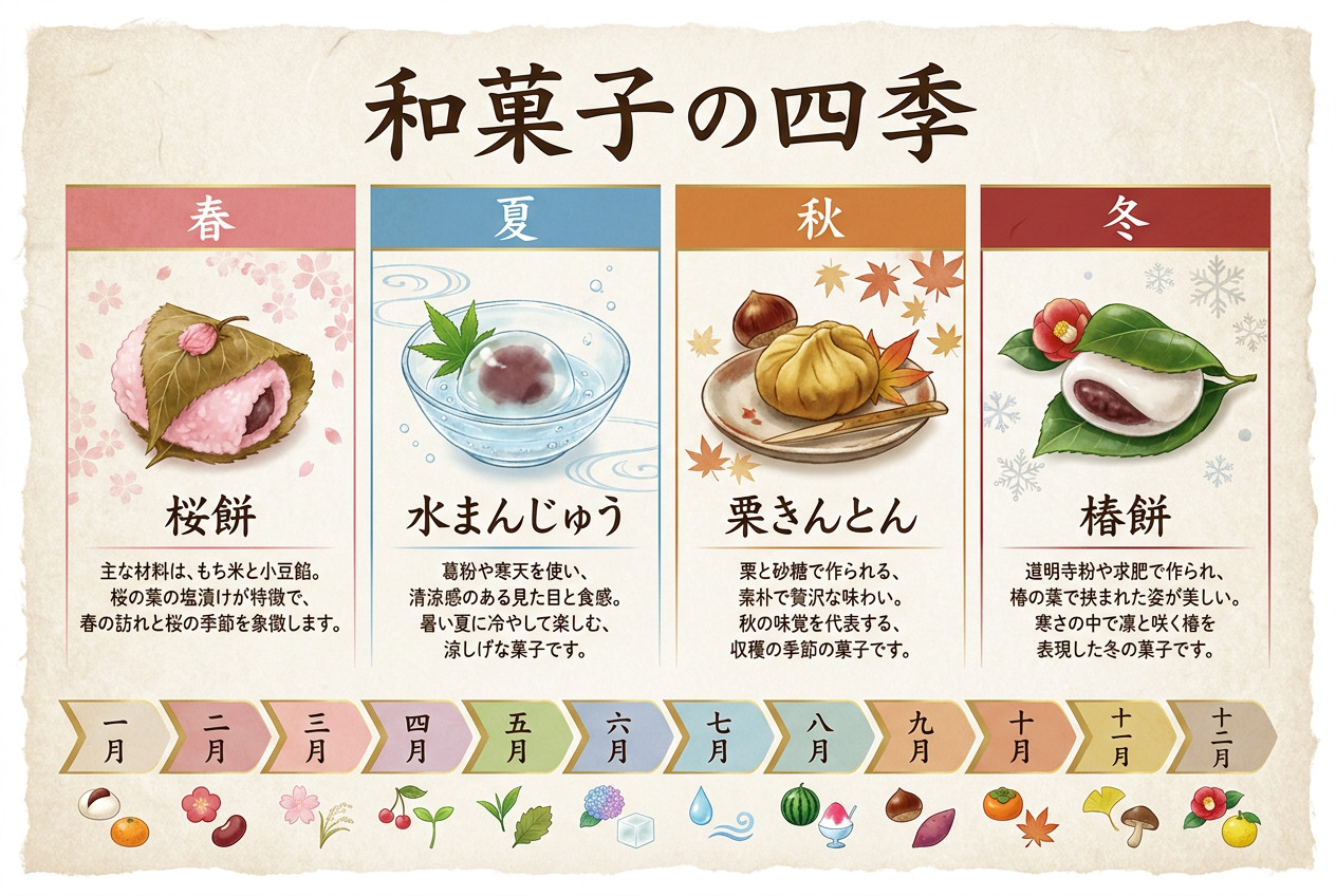
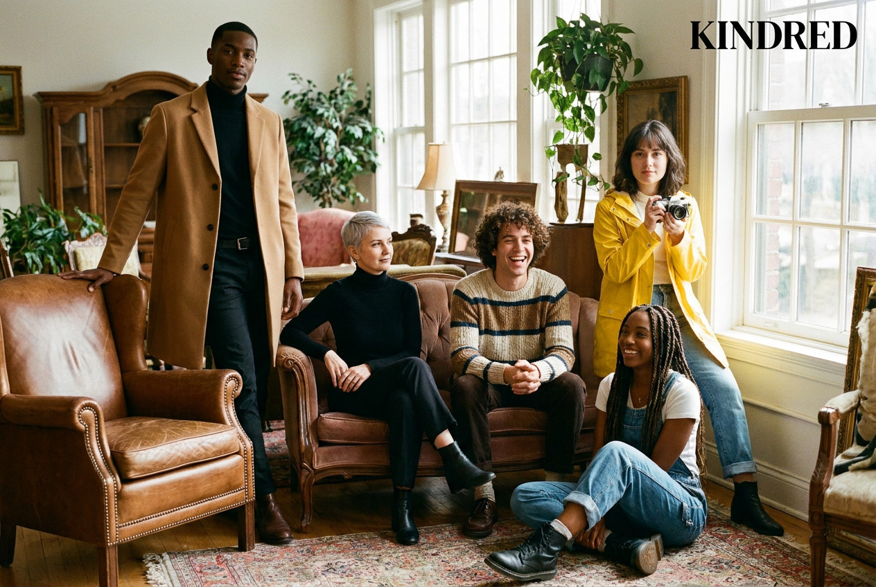
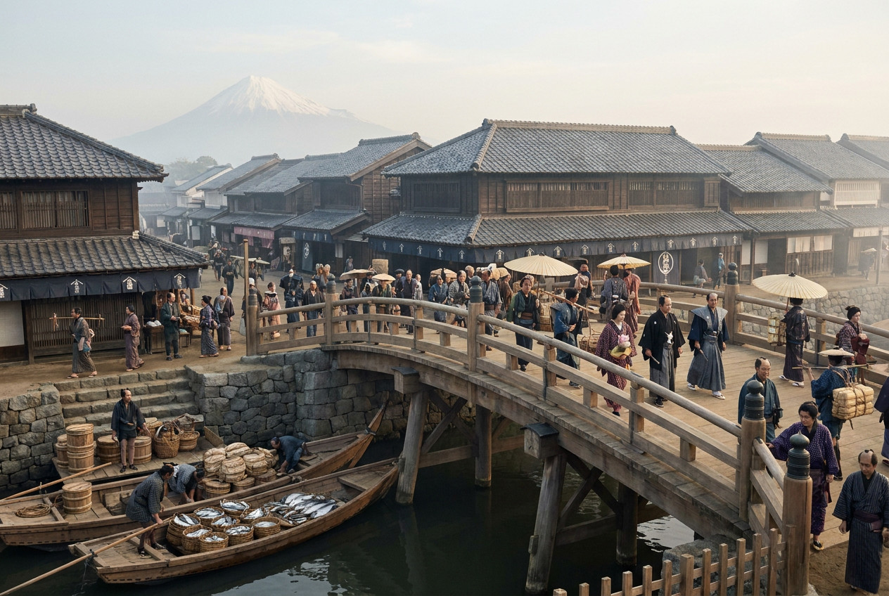
Nano Banana も結構優等生のイメージがあります。人物の崩壊が少ない気がしますね。結構こちらの指示を理解してくれないことも多かったりもするのですが、GPT Image 2.5 でうまくできなかったことがNano Bananaだとできたということもあるのでいろんなモデルを試してみるのは重要かなと思います。1作目はAI感は強いですが、中身はしっかりしてます。2作目の画像はかなりいい感じですね。
Midjourney V8.2
1 作目は文字を入れない、雰囲気で見せる 1 枚。V8.2 の発表では「bold, sophisticated, edgy」と、美しさを前面に出しています。
2 作目は雲海に浮かぶ山寺の幻想的な情景。海外の掲示板で「雲や霧、伝統的な楼閣の長い描写がうまい」という声がありました。
3 作目は雲のクジラが浮かぶ港町。1 作目と同じく、雰囲気で見せる空想の 1 枚です。
使ったプロンプト(英語と日本語の意味)
1 作目:文字を入れない、雰囲気で見せる 1 枚
Editorial fashion photograph in a flooded marble hall at blue hour, a model in a flowing crimson gown standing knee-deep in still water, mirror reflections, drifting mist, a single shaft of cold light from a high window, dreamlike and sophisticated, cinematic color grading, medium format film texture --ar 3:2日本語の意味
青い夕暮れどき、水に浸かった大理石の広間でのファッション誌の写真。流れるような深紅のドレスのモデルが、静かな水に膝まで浸かって立っている。鏡のような映り込み、漂う霧、高い窓から差す冷たい一筋の光。夢のようで洗練された雰囲気、映画のような色調、中判フィルムの質感。(--ar 3:2 = 縦横比 3:2)2 作目:雲海に浮かぶ山寺の幻想的な情景
Ancient mountain temple pavilions rising from a sea of clouds at sunrise, layered rooftops with curved eaves stacked along a sheer cliff, mist flowing between them like a slow river, tiny lanterns glowing, cranes flying through golden light, vast scale, serene and majestic, painterly atmosphere --ar 3:2日本語の意味
朝日の中、雲海からそびえ立つ古い山寺の楼閣。反り返った軒をもつ屋根が切り立った崖に沿って幾重にも重なり、そのあいだを霧がゆっくりした川のように流れる。小さな提灯が灯り、金色の光の中を鶴が飛ぶ。壮大なスケール、穏やかで荘厳、絵画のような雰囲気。(--ar 3:2 = 縦横比 3:2)3 作目:雲のクジラが浮かぶ港町
a colossal whale made of soft clouds drifting slowly over a quiet seaside town at dusk, warm window lights glowing below, long pastel shadows, tiny figures on a grassy hill looking up, surreal and dreamlike, painterly cinematic atmosphere --ar 3:2日本語の意味
夕暮れの静かな港町の上を、やわらかな雲でできた巨大なクジラがゆっくり漂っていく。下では窓の灯りが暖かく光り、パステル調の長い影が伸び、草の丘の上で小さな人影が見上げている。シュールで夢のような、絵画的で映画のような雰囲気。(--ar 3:2 = 縦横比 3:2)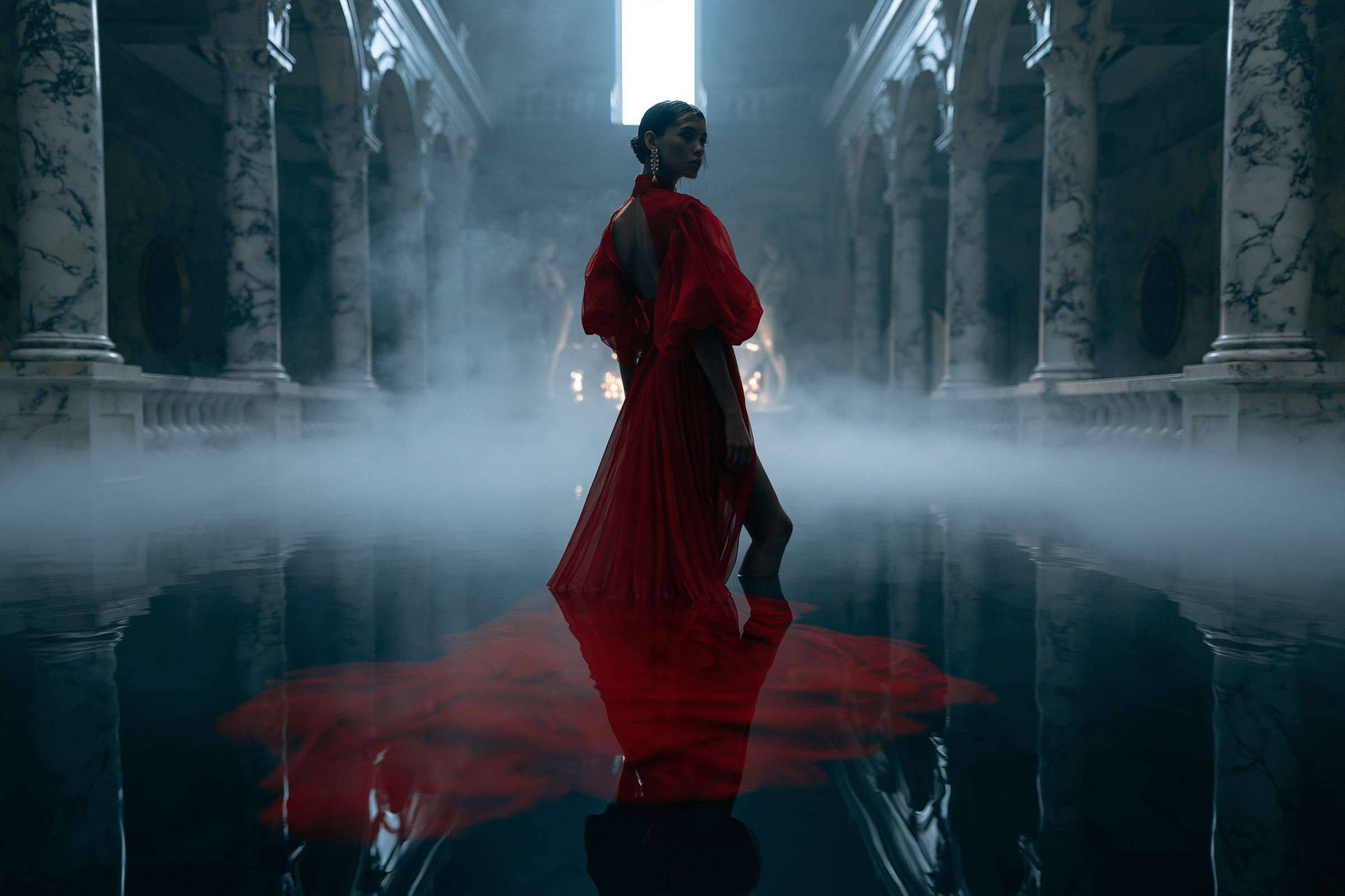
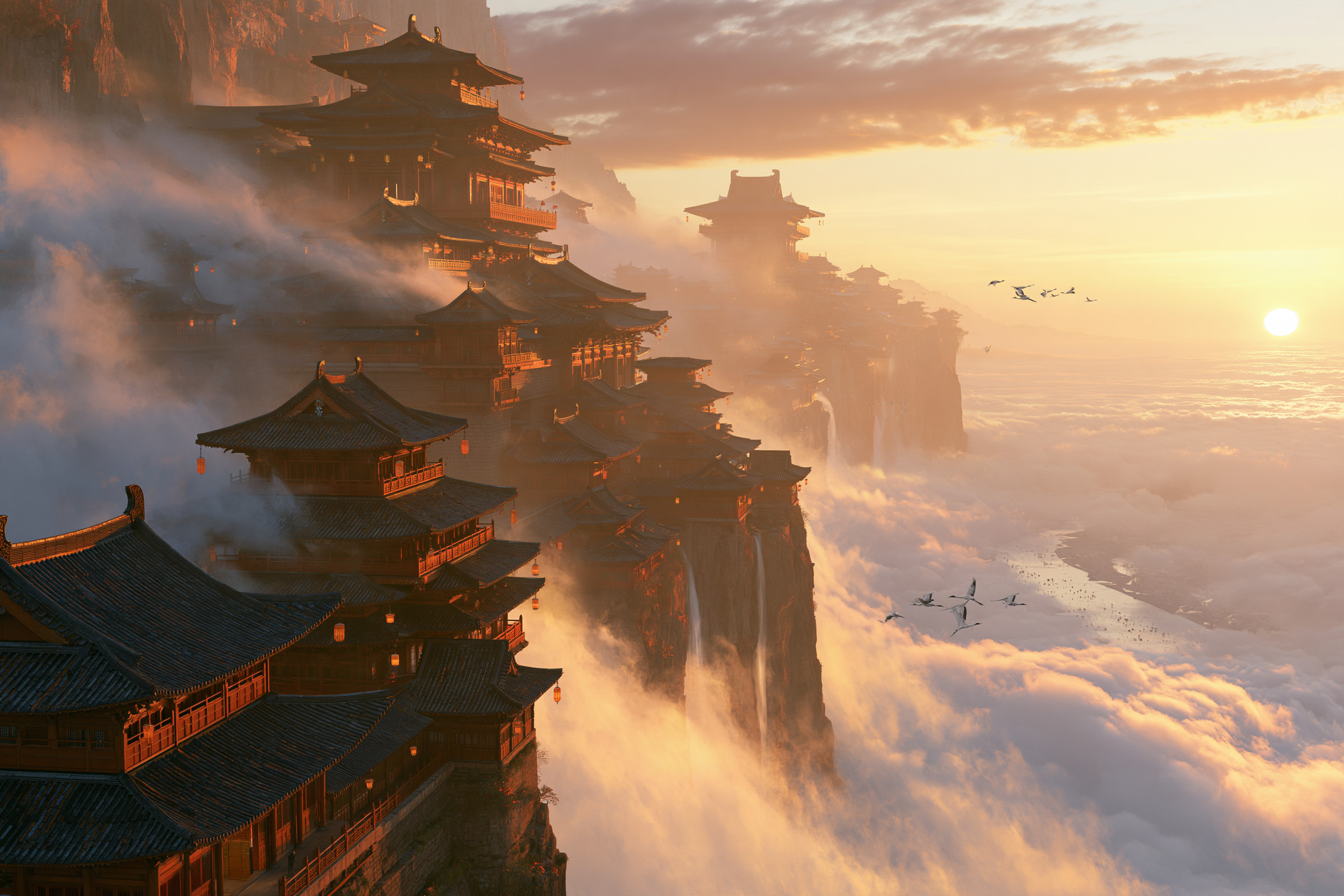
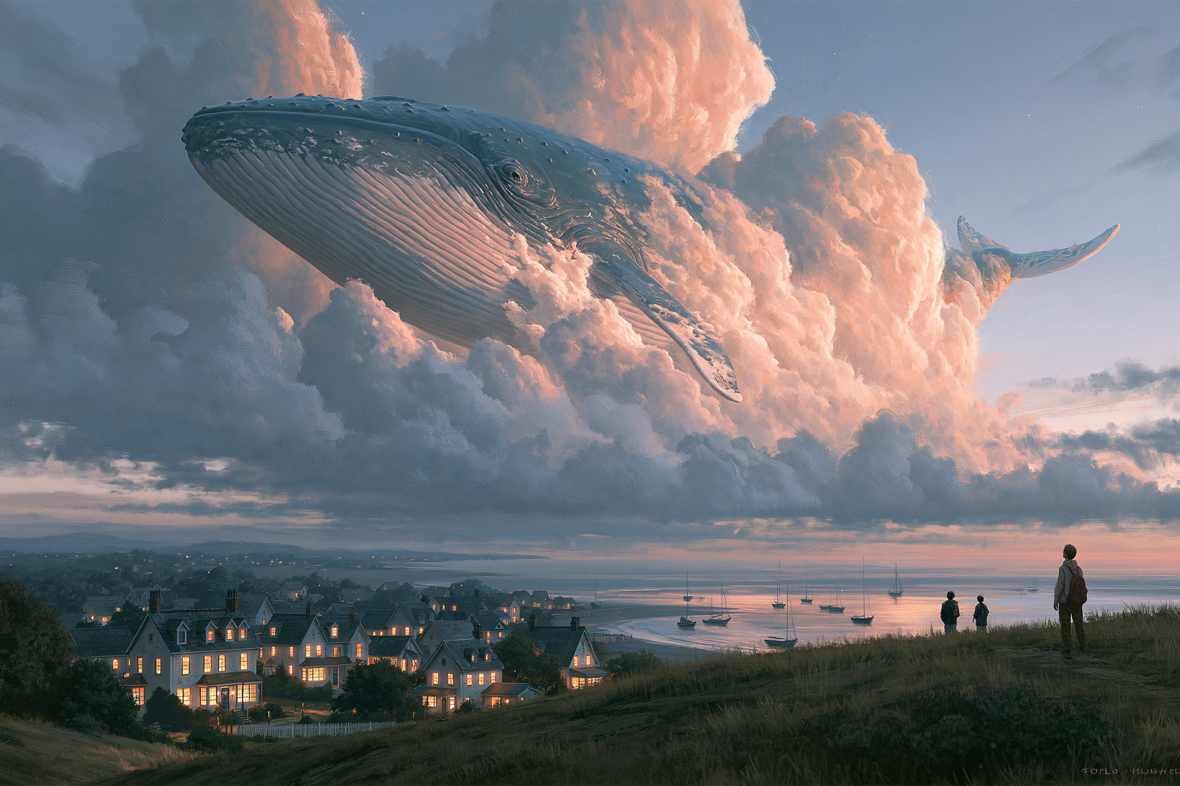
私はMidjourneyが好きです。自分の好みをプロファイルとして設定できたりできるのですが、本当に好きな感じの画像を出してくれたりします。ただし、Midjourneyは0→1が素晴らしいのであって、細かい指示や、修正は本当に苦手です。下手に修正させるより、ガチャを回した方が早かったりします。バージョン8になって仕様が変わり、かなり修正もできるようにはなってきましたがやはり細かい指定がある場合の活用は結構厳しいと思います。いまだに手の生成苦手だし、結構崩壊した体を出してきたりもします。Midjourneyには細かいことは言わずに自由に作らせるのです。
Grok Imagine 2.0
1 作目は見出し入りのレトロなポスター。xAI は「デザイナーのように文字組みとレイアウトを考える」と説明していて、公式の例もコンサートポスターです。
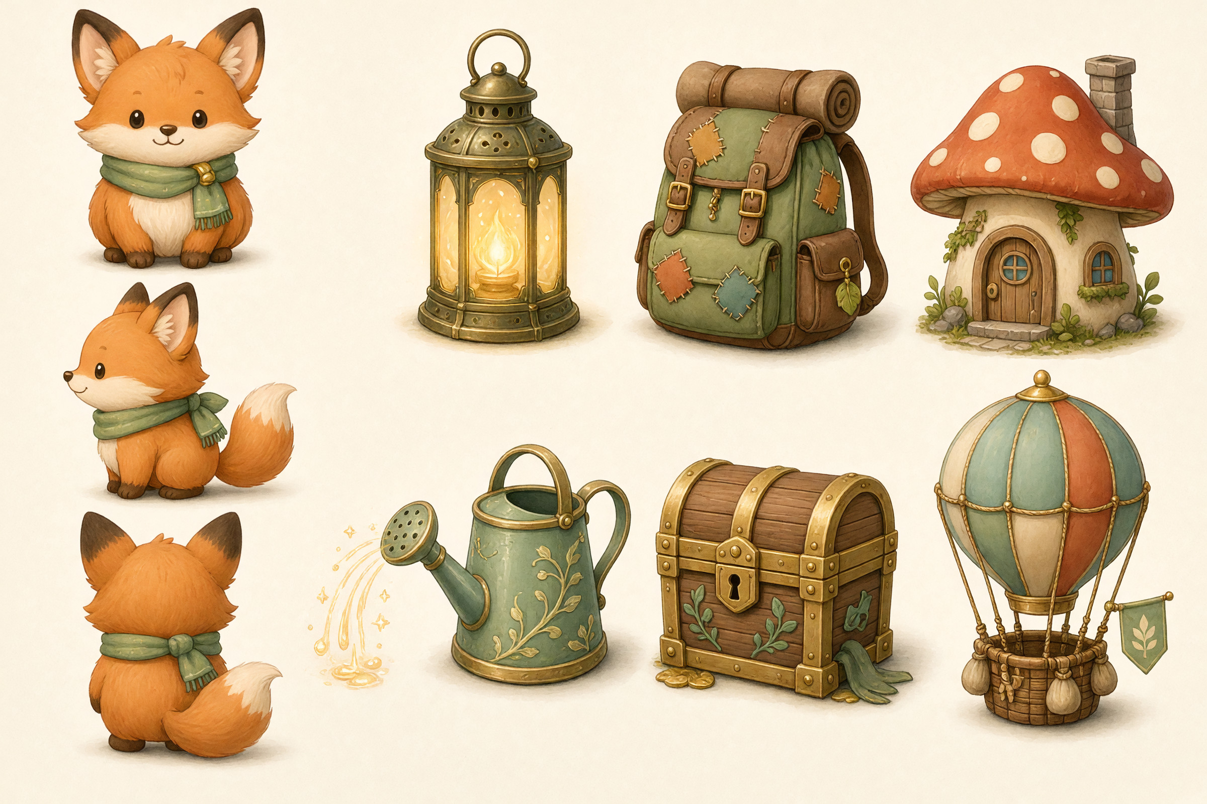
2 作目はゲームのキャラクターと小道具の設定画。公式のテンプレートに、マスコットやゲーム素材を同じ画風でそろえる例があります。
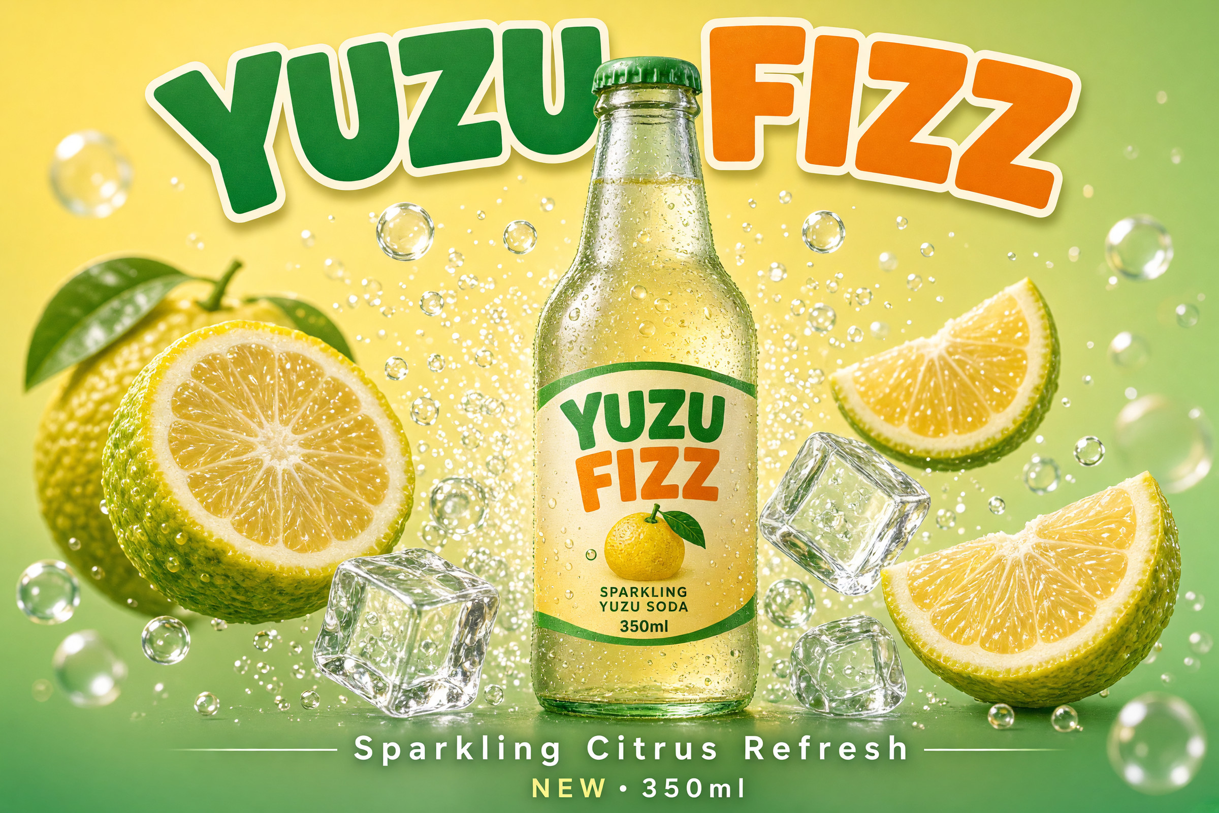
3 作目は商品の広告ポスター。公式のテンプレートに、商品のポスターがあります。
使ったプロンプト(英語と日本語の意味)
1 作目:見出し入りのレトロなポスター
A retro synthwave concert poster for a fictional band called "NEON TIDE".
A striped chrome sun sinks into a glowing grid ocean, with palm tree silhouettes and a magenta-to-cyan sky.
At the top, the band name "NEON TIDE" in bold chrome retro lettering with a neon glow. Below it, "LIVE AT THE PIER". At the bottom, sharp small print: "AUG 14 · DOORS 7PM · ALL AGES".
Polished, print-ready poster design with crisp typography and a carefully planned layout.
日本語の意味
架空のバンド「NEON TIDE」の、レトロなシンセウェーブ風のコンサートポスター。
縞模様のクロームの太陽が、光るグリッドの海に沈んでいく。ヤシの木のシルエットと、マゼンタからシアンへの空。
上部にバンド名「NEON TIDE」を、ネオンの光をまとった太いクロームのレトロな文字で。その下に「LIVE AT THE PIER」。下部に小さくくっきりと「AUG 14 · DOORS 7PM · ALL AGES」。
文字組みがくっきりして、レイアウトがよく練られた、そのまま印刷できる仕上がりのポスター。
2 作目:ゲームのキャラクターと小道具の設定画
A character and prop design sheet for a fictional cozy fantasy game, all in one consistent hand-painted style on a clean light background.
On the left, a round, fox-like mascot character shown from the front, the side, and the back.
On the right, six props arranged in a neat grid: a glowing lantern, a patched travel backpack, a mushroom house, a magic watering can, a small treasure chest, and a hot air balloon.
Consistent colors, line weight, and lighting across every item, like polished, ready-to-use game art.
日本語の意味
架空の、ほっこり系ファンタジーゲームのキャラクターと小道具の設定画。すべて同じ手描き風の画風で、明るく無地の背景に。
左側に、丸っこいキツネのようなマスコットキャラクターを正面・横・後ろから。
右側に、6 つの小道具をきれいに格子状に並べる: 光るランタン、継ぎはぎの旅のリュック、キノコの家、魔法のじょうろ、小さな宝箱、熱気球。
すべての物で色・線の太さ・光の当たり方をそろえ、そのまま使える完成度の高いゲームアートのように。
3 作目:商品の広告ポスター
A product poster for a fictional sparkling yuzu soda called "YUZU FIZZ".
A chilled glass bottle with condensation droplets stands at the center, surrounded by sliced yuzu fruit, ice cubes, and a burst of bubbles against a bright citrus-yellow and mint-green gradient background.
At the top, the product name "YUZU FIZZ" in bold, playful lettering. At the bottom, the tagline "Sparkling Citrus Refresh" and the small text "NEW · 350ml".
Crisp commercial product photography combined with a clean, well-planned advertising layout.
日本語の意味
架空の柚子の炭酸飲料「YUZU FIZZ」の商品ポスター。
水滴のついた冷えたガラス瓶が中央に立ち、まわりに輪切りの柚子・氷・はじける泡。背景は明るい柚子の黄色からミントグリーンへのグラデーション。
上部に商品名「YUZU FIZZ」を太く遊び心のある文字で。下部にキャッチコピー「Sparkling Citrus Refresh」と、小さく「NEW · 350ml」。
くっきりした広告の商品写真と、すっきりよく練られた広告のレイアウトの組み合わせ。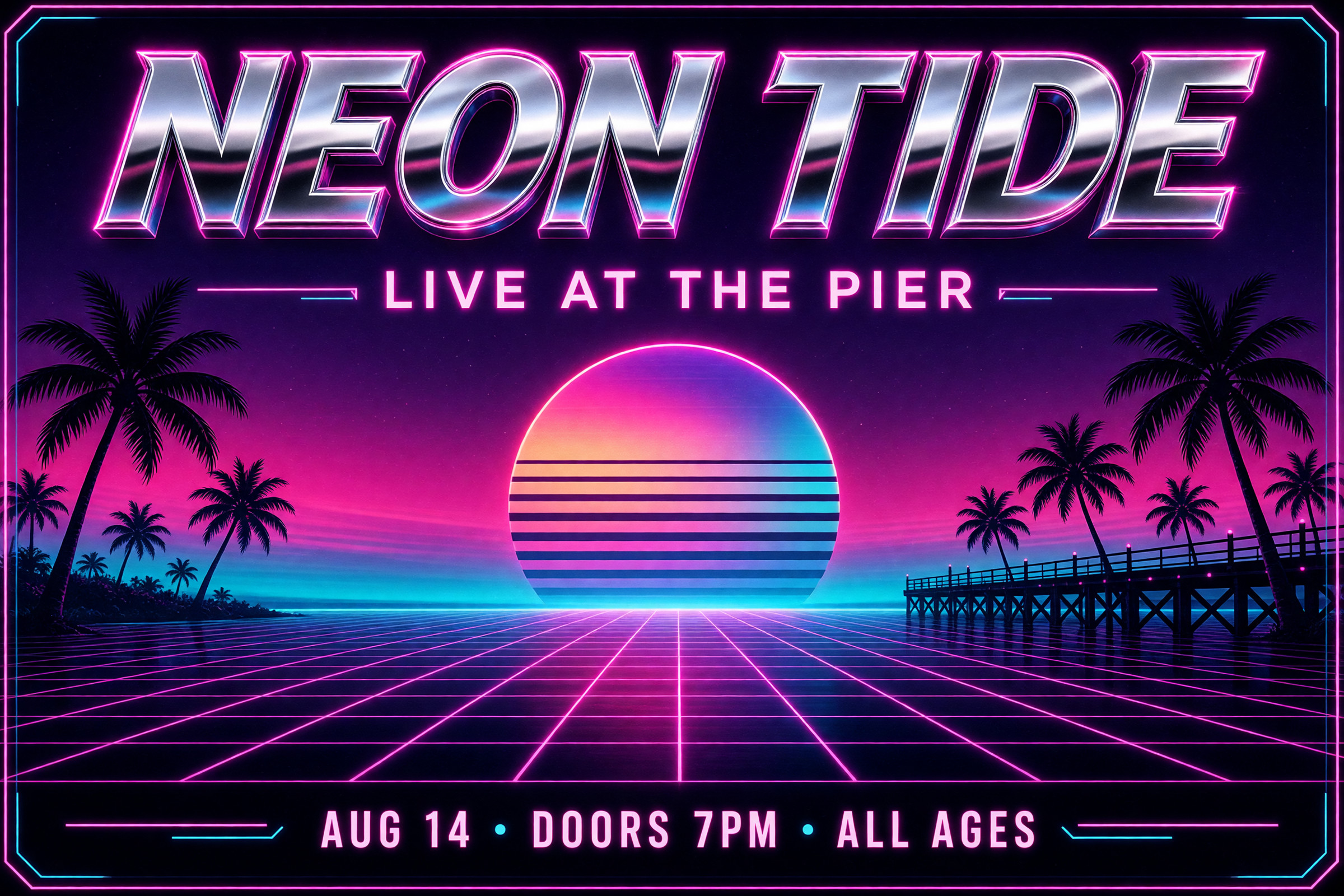
意外とやる子、Grokです。え、お前これできるんだ!? みたいなことが結構あります。意外と他のモデルでうまくいかない時にGrokを試してみるのはありなんじゃないかと思っています。隠れ優等生。
Seedream 5.0 Pro
1 作目は日本語のセリフ入りの漫画。公式ページの作例に、日本語の 6 コマ漫画があります。
2 作目は英語の技術図解。公式ページの最初の見出しが「High-Density Infographics(情報量の多い図解)」です。
3 作目は大家族の食卓の写真。公式ページの作例に、人物写真があります。
使ったプロンプト(英語と日本語の意味)
1 作目:日本語のセリフ入りの漫画
A black-and-white Japanese manga page with six panels in two rows of three, read from right to left.
Story: a high school girl runs to catch the last train; the doors close right in front of her; she sighs alone on the empty night platform; a stray cat appears and sits beside her; she smiles and shares half of her onigiri with it; in the last panel, the girl and the cat look up at the starry sky together.
Speech bubbles with short Japanese dialogue: "待って!", "…行っちゃった", "あ、ネコ", "はんぶんこね", "きれいだね".
Clean professional manga linework, screentone shading, dynamic panel composition, expressive faces, and correctly written Japanese text.
日本語の意味
右から左に読む、3 コマ × 2 段の計 6 コマの白黒の日本の漫画のページ。
お話: 女子高生が終電に向かって走る。目の前でドアが閉まる。夜の誰もいないホームで一人ため息をつく。野良猫が現れて隣に座る。彼女は笑って、おにぎりを半分猫に分ける。最後のコマで、女の子と猫が一緒に星空を見上げる。
吹き出しに短い日本語のセリフ:「待って!」「…行っちゃった」「あ、ネコ」「はんぶんこね」「きれいだね」。
プロの漫画のきれいな線、スクリーントーンの陰影、動きのあるコマ割り、表情豊かな顔、正しく書かれた日本語。
2 作目:英語の技術図解
A detailed technical blueprint infographic of a fictional futuristic electric motorcycle called "VOLT RIDER".
In the center, an exploded-view drawing shows the battery pack, motor, frame, wheels, and handlebars separated, each with leader lines and labels.
Around it: dimension lines with measurements in millimeters, a small specification table with range, top speed, weight, and charging time, and three numbered callouts explaining key features.
White and cyan lines on a deep navy blueprint background, precise engineering typography, and high information density with a clear, readable hierarchy.
日本語の意味
架空の未来の電動バイク「VOLT RIDER」の、細かな設計図風のインフォグラフィック。
中央に、バッテリー・モーター・フレーム・車輪・ハンドルをばらした分解図。それぞれに引き出し線とラベル。
まわりに、ミリ単位の寸法線、航続距離・最高速度・重量・充電時間の小さな仕様表、主な特徴を説明する番号つきの注記 3 つ。
深い紺の設計図の背景に白とシアンの線、精密な工業系の文字組み、情報量が多いのに読みやすい、はっきりした階層。
3 作目:大家族の食卓の写真
A warm, candid documentary-style photograph of a big Japanese family of eleven people around a long dinner table at home on New Year's Day: grandparents, parents, aunts, uncles, teenagers, and two small children.
Everyone is laughing and talking at the same time, passing dishes of osechi and hot pot, with steam rising from the pot.
Natural indoor light from a ceiling lamp and a window at dusk, realistic skin textures, natural expressions, and believable everyday details like mismatched cups, a TV in the background, and a cat under the table.
日本語の意味
元日、家で長い食卓を囲む 11 人の日本の大家族の、温かくありのままのドキュメンタリー風の写真。祖父母、両親、おじ・おば、10 代の子どもたち、小さな子ども 2 人。
みんなが同時に笑ったり話したりしながら、おせちや鍋の皿を回している。鍋からは湯気が立つ。
天井の照明と夕暮れの窓からの自然な室内光、リアルな肌の質感、自然な表情、そろっていない湯のみ・奥のテレビ・テーブルの下の猫といった、ありそうな日常の細部。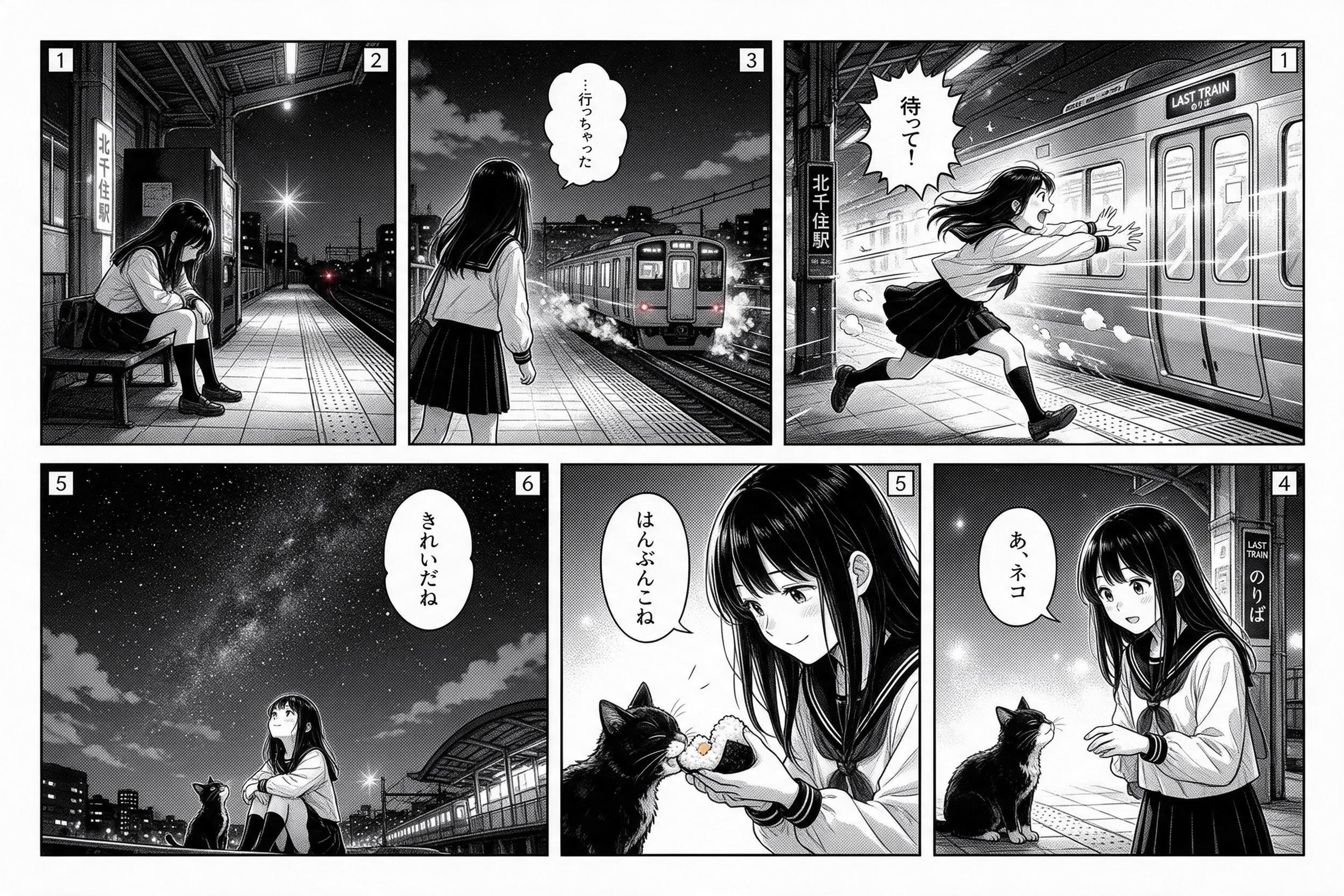
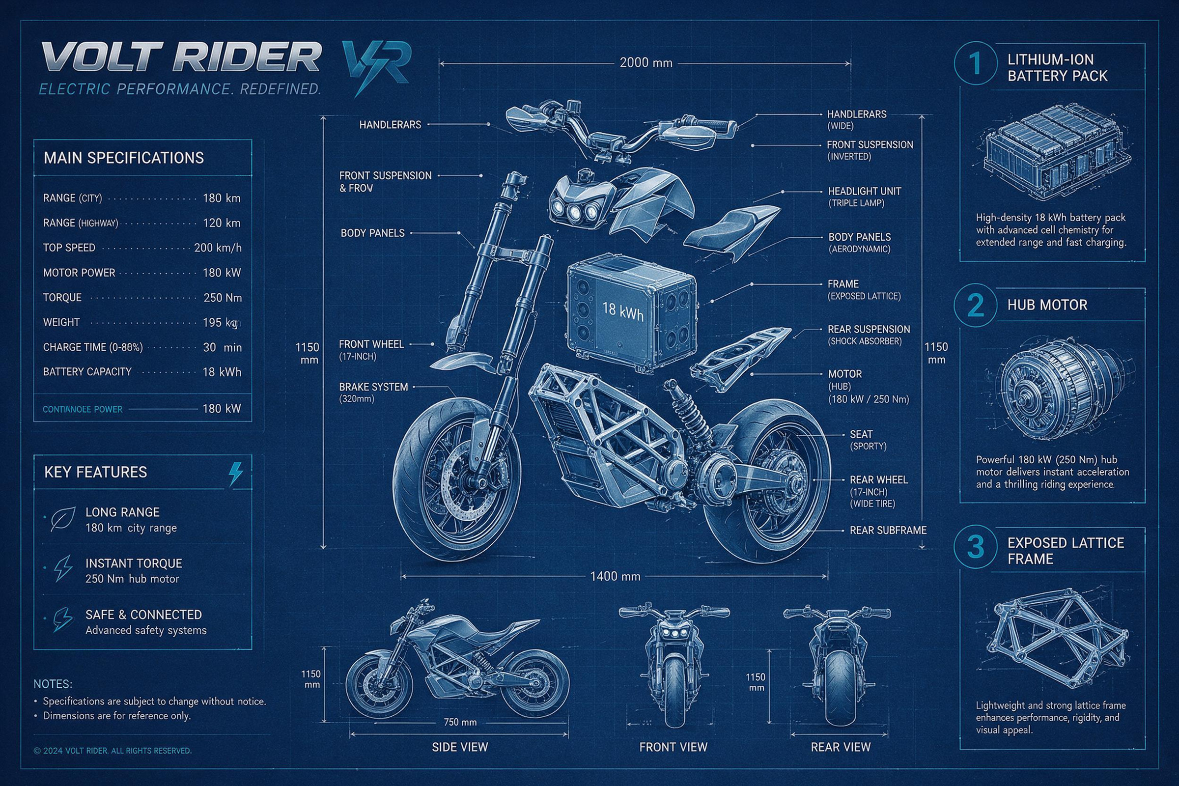
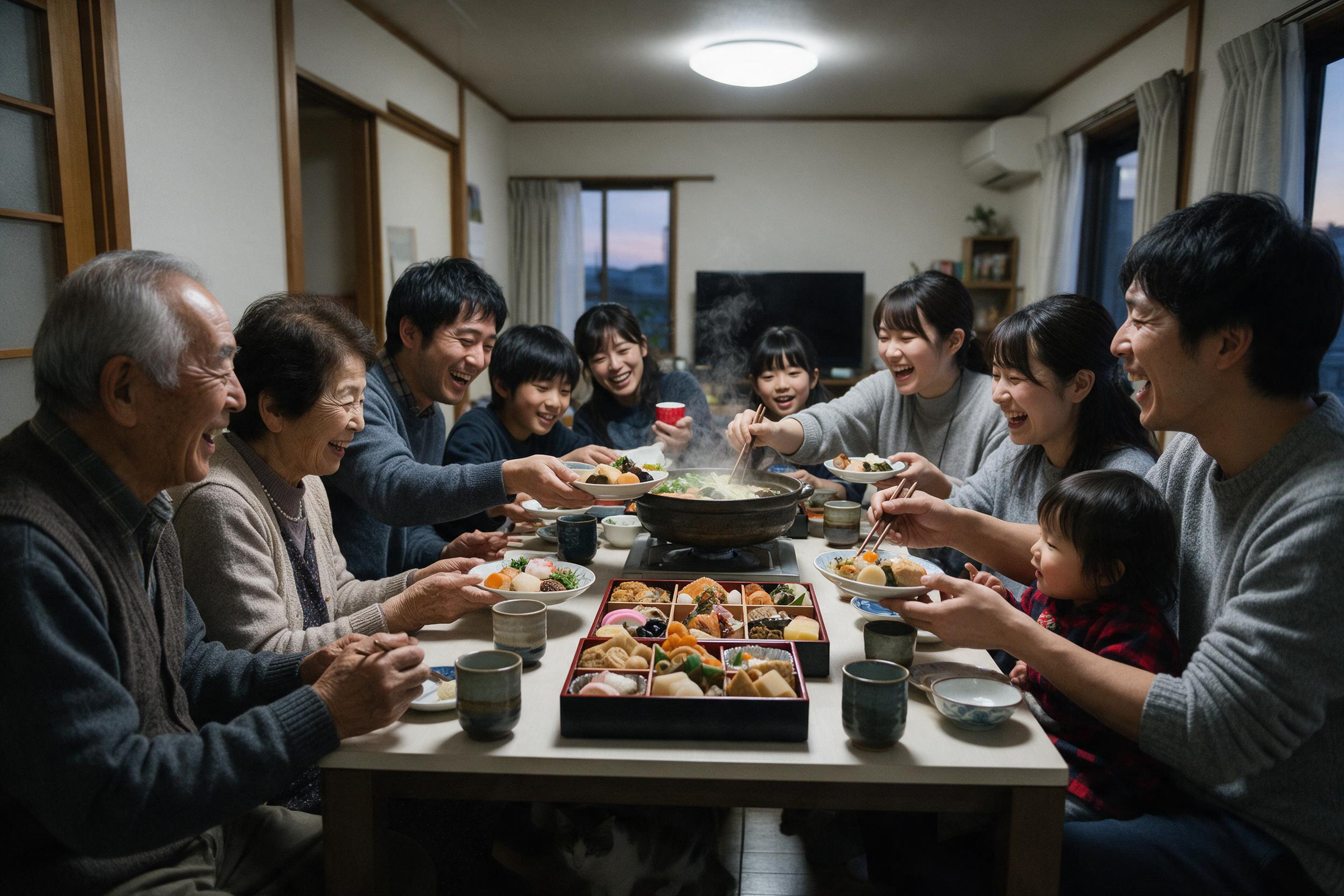
この漫画のつまらなさは如何ともし難いですが、Infographicsはかっこいいですよね。あんまり使ったことのなかったんですが、Infographics系ではセンスの良いものを出してくれそうです。3作目はちょっと怖い
Stable Diffusion 3.5 Large
1 作目は墨と水彩の物語風イラスト。Stability AI は「写真、絵画、線画、3D など、ほぼどんな画風でも」と、画風の幅を強みにしています。
2 作目はアニメ調のイラスト。比較記事で、アニメ調が得意という評価がありました。
3 作目は人物の寄りのポートレート。公式の発表の作例に、人物のポートレート写真があります。
使ったプロンプト(英語と日本語の意味)
1 作目:墨と水彩の物語風イラスト
A fantasy ink and watercolor illustration of a lantern-lit floating market on a misty canal at dusk. Wooden boats piled with fruit and flowers, delicate linework, soft watercolor washes, warm lantern glow against cool blue fog, highly detailed storybook art.日本語の意味
夕暮れの霧の運河に浮かぶ、提灯に照らされた水上マーケットの、墨と水彩のファンタジーイラスト。果物と花を山積みにした木の小舟、繊細な線、やわらかな水彩のにじみ、冷たい青い霧に映える暖かな提灯の光、細部まで描き込んだ絵本のような絵。2 作目:アニメ調のイラスト
Anime-style illustration of a girl with long silver hair reading a book in a cozy attic library at night, warm lamp light, stacks of old books, a sleeping cat on the windowsill, a moonlit window, soft cel shading, detailed background, vibrant colors.日本語の意味
夜、居心地のよい屋根裏の図書室で本を読む、長い銀髪の少女のアニメ調のイラスト。温かいランプの光、古い本の山、窓辺で眠る猫、月明かりの窓、やわらかなセル塗り、描き込まれた背景、鮮やかな色。3 作目:人物の寄りのポートレート
Close-up portrait photograph of an elderly woman with silver hair and deep laugh lines, wearing a hand-knitted mustard scarf, soft window light, shallow depth of field, natural skin texture, warm and gentle expression, 85mm lens.日本語の意味
銀髪で深い笑いじわのある年配の女性の、寄りのポートレート写真。手編みのからし色のマフラー、窓からのやわらかな光、浅い被写界深度、自然な肌の質感、温かく穏やかな表情、85mm レンズ。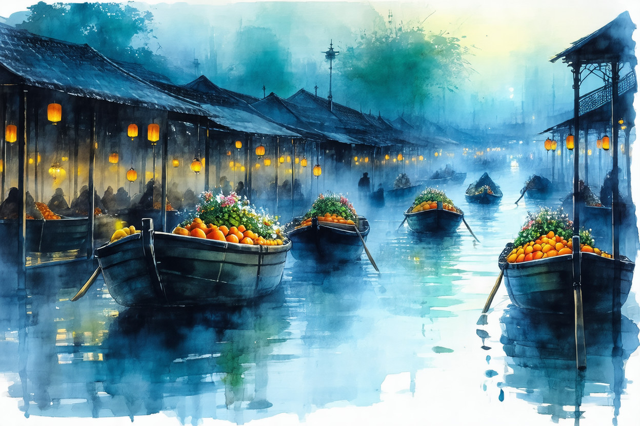
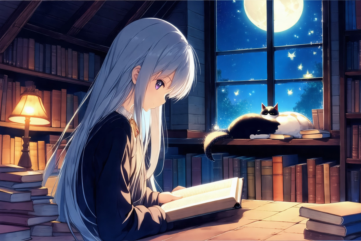
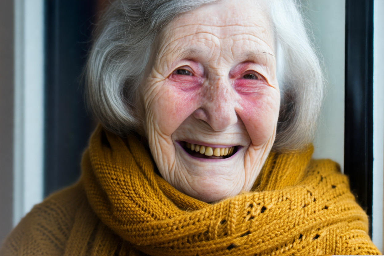
Stable Diffusion は名前は有名ですが、今回の出力はどれも微妙ですね。結構アニメイラストとかが得意なのかな? 3作目は結構ホラーに見えてしまう
FLUX 3
1 作目はファッション誌の写真。公式のモデルページの作例の大半が、ファッション写真です。
2 作目は2 色刷りのリソグラフ風ポスター。公式の作例に、リソグラフのポスターがあります。
3 作目は腕時計の商品写真。商品写真の用途で紹介されることが多いモデルです。
使ったプロンプト(英語と日本語の意味)
1 作目:ファッション誌の写真
A high-fashion editorial photograph for a magazine spread. A model in an oversized sculptural cobalt-blue wool coat stands on a vast, windswept white salt flat; the coat billows dramatically in the wind. Hard midday sun casts a crisp, long shadow. Minimal composition with generous negative space. Shot on medium format, with crisp fabric texture and natural skin detail.日本語の意味
雑誌の見開きのためのハイファッションな写真。大きく彫刻的なシルエットのコバルトブルーのウールのコートを着たモデルが、風の吹きすさぶ広大な白い塩原に立ち、コートが風で大きくはためいている。真昼の強い日差しが、くっきりとした長い影を落とす。余白をたっぷり取ったミニマルな構図。中判カメラで撮影し、生地の質感と自然な肌の細部までくっきりと。2 作目:2 色刷りのリソグラフ風ポスター
A two-color risograph print poster in fluorescent pink and teal for a fictional bicycle film festival titled "FREEWHEEL". Bold, oversized condensed lettering for the title across the top, a dynamic illustration of three cyclists racing down a hill below it, and the small text "FILM FESTIVAL · SPRING 2026" at the bottom. Visible grain, slight misregistration between the two ink layers, and the texture of real paper.日本語の意味
架空の自転車映画祭「FREEWHEEL」の、蛍光ピンクとティールの 2 色刷りのリソグラフのポスター。上部にタイトルを大きく太い縦長の文字で、その下に坂を駆け下りる 3 人のサイクリストの躍動的なイラスト、下部に小さく「FILM FESTIVAL · SPRING 2026」。目に見える粒子、2 色のインクのわずかな版ずれ、本物の紙の質感。3 作目:腕時計の商品写真
A premium product packshot of a fictional luxury mechanical wristwatch with a deep green sunburst dial and a brushed steel case, resting on a slab of dark wet slate with scattered water droplets. Controlled studio lighting with soft highlights along the case edges, crisp macro detail on the dial markers and the crown, shallow depth of field, and a clean dark background.日本語の意味
深い緑のサンバースト文字盤とヘアライン仕上げのステンレスのケースをもつ、架空の高級機械式腕時計の上質な商品写真。水滴の散った濡れた黒いスレートの上に置かれている。ケースの縁にやわらかなハイライトが入る計算された照明、文字盤のインデックスとリューズまでくっきりしたマクロの細部、浅い被写界深度、すっきりした暗い背景。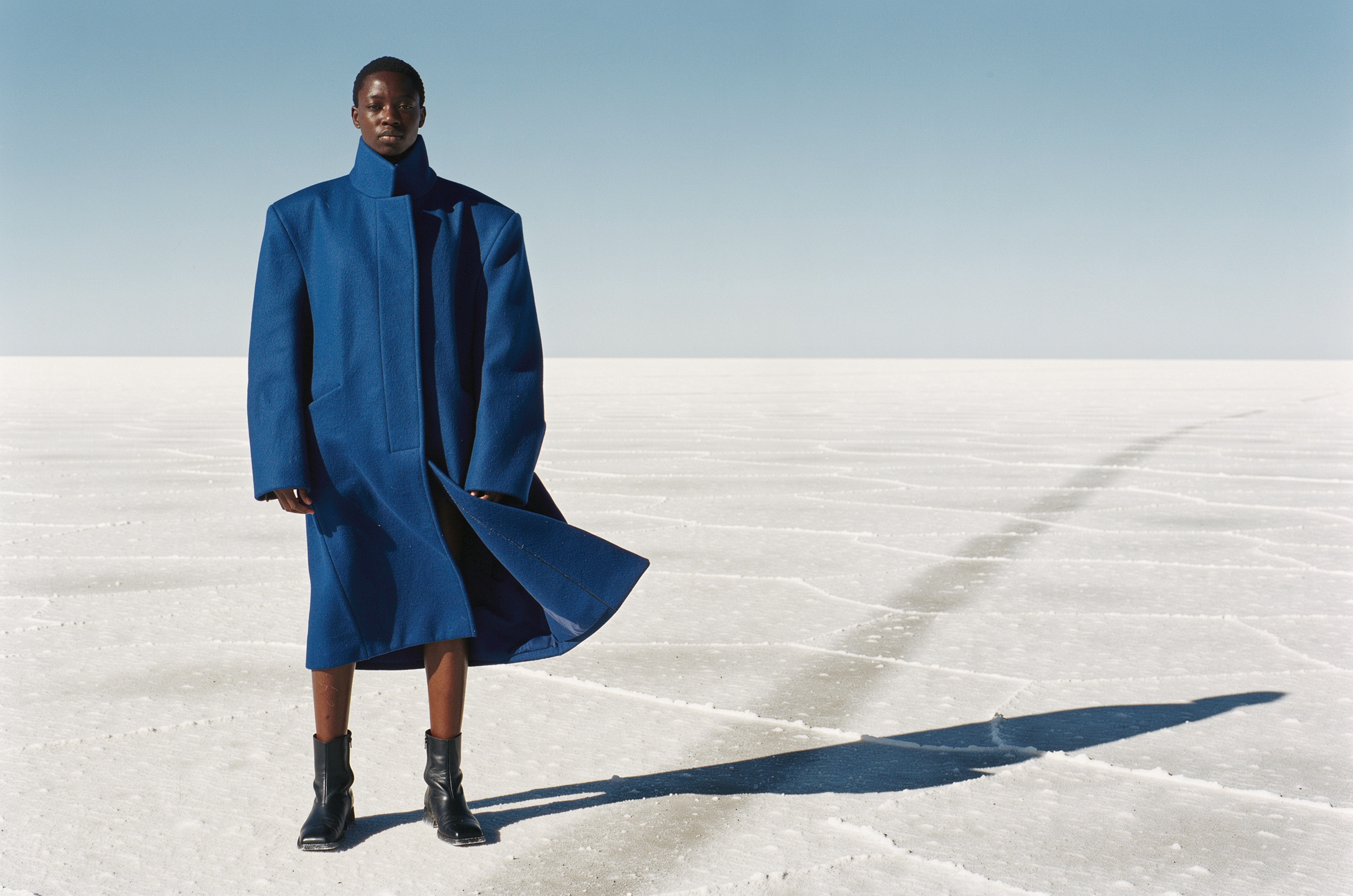
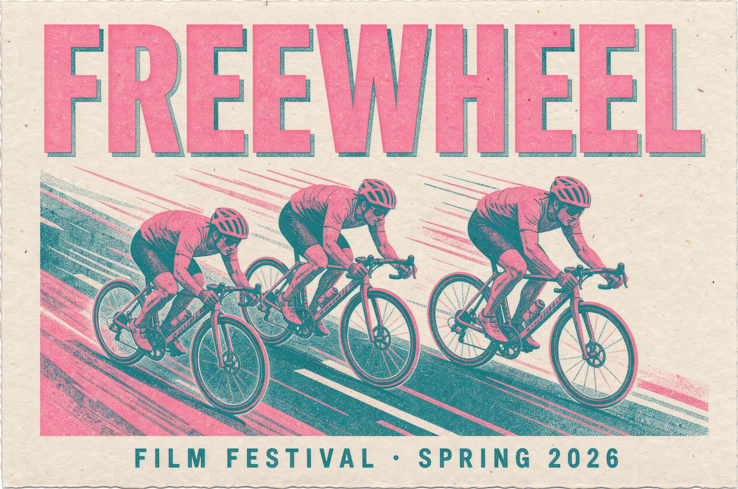
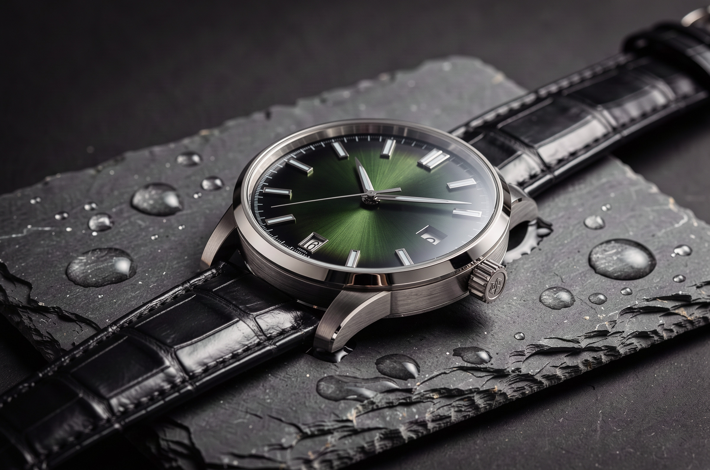
いやー、かっこいいですねぇ。さすがFLUX。おしゃれ番長。ファッショナブル
Kling Image 3.0 Omni
1 作目は映画のワンシーン。公式は「静止画で物語を語る、映画的な体験」と紹介していて、作例もほぼ映画のスチルです。
2 作目は絵コンテの連作。1 枚から続きのコマを作る機能(Image Series Mode)は、今回のモデルの中で Kling だけのものです。
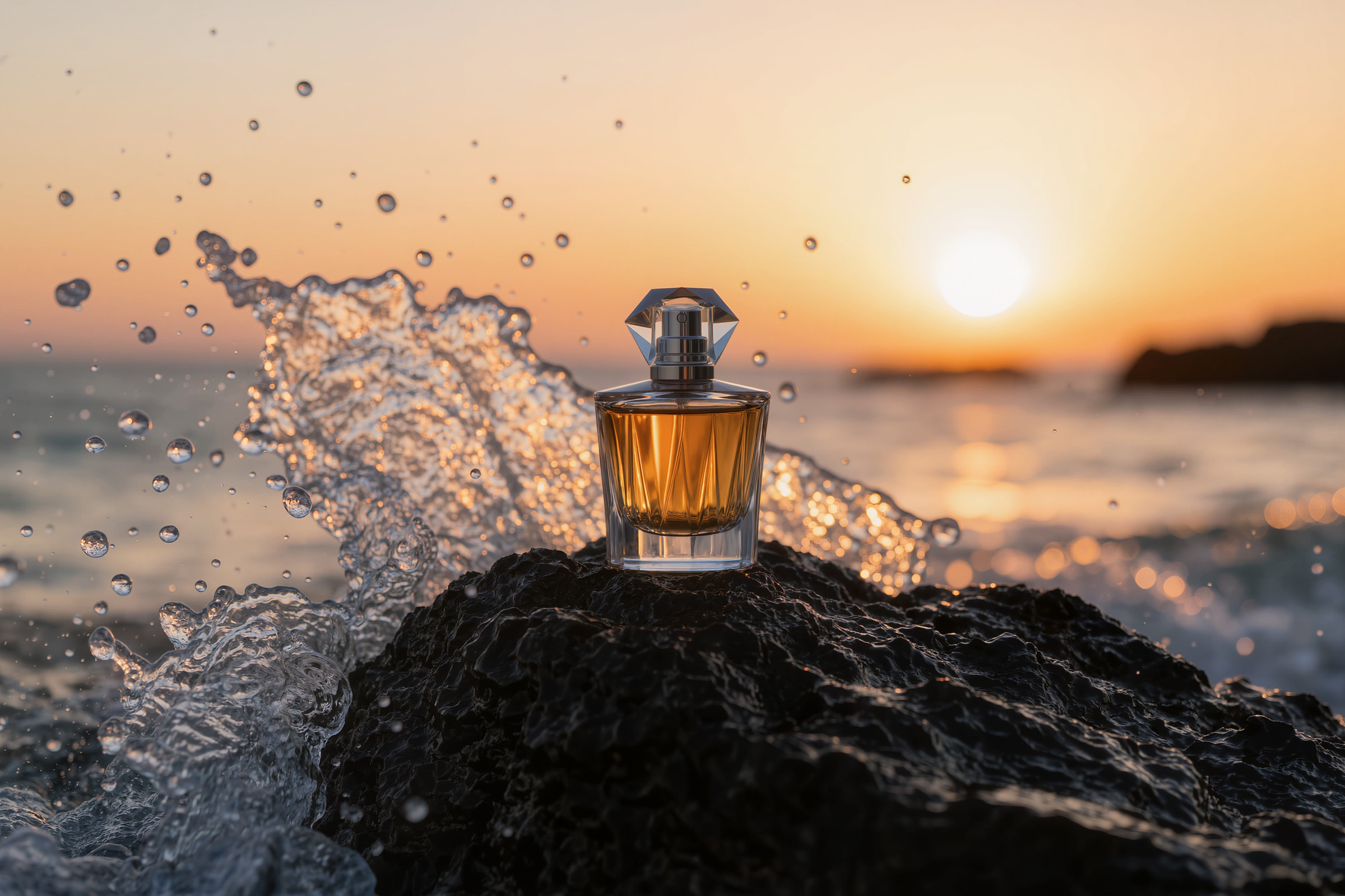
3 作目は香水のブランド画像。公式に、高解像度の用途として「brand promotional images, and product texture shots」とあります。
使ったプロンプト(英語と日本語の意味)
1 作目:映画のワンシーン
A cinematic film still from a pivotal scene in a thriller. A rain-soaked night in a narrow neon-lit alley in Tokyo. A woman in her thirties in a dark trench coat stands under a flickering sign, holding a closed umbrella, and looks back over her shoulder with a mix of fear and resolve. Shot on a 50mm anamorphic lens with shallow depth of field, teal-and-amber color grading, wet reflections on the pavement, dramatic rim light, and fine 35mm film grain.日本語の意味
スリラー映画の重要な場面の、映画のスチル写真。雨に濡れた夜の、ネオンに照らされた東京の細い路地。ダークなトレンチコートを着た 30 代の女性が、点滅する看板の下で閉じた傘を持って立ち、恐れと決意の入り混じった表情で肩越しに振り返る。50mm のアナモフィックレンズで撮影、浅い被写界深度、ティールとアンバーの色調、濡れた路面の反射、劇的な輪郭光、細かな 35mm フィルムの粒子。2 作目:絵コンテの連作
1 コマ目
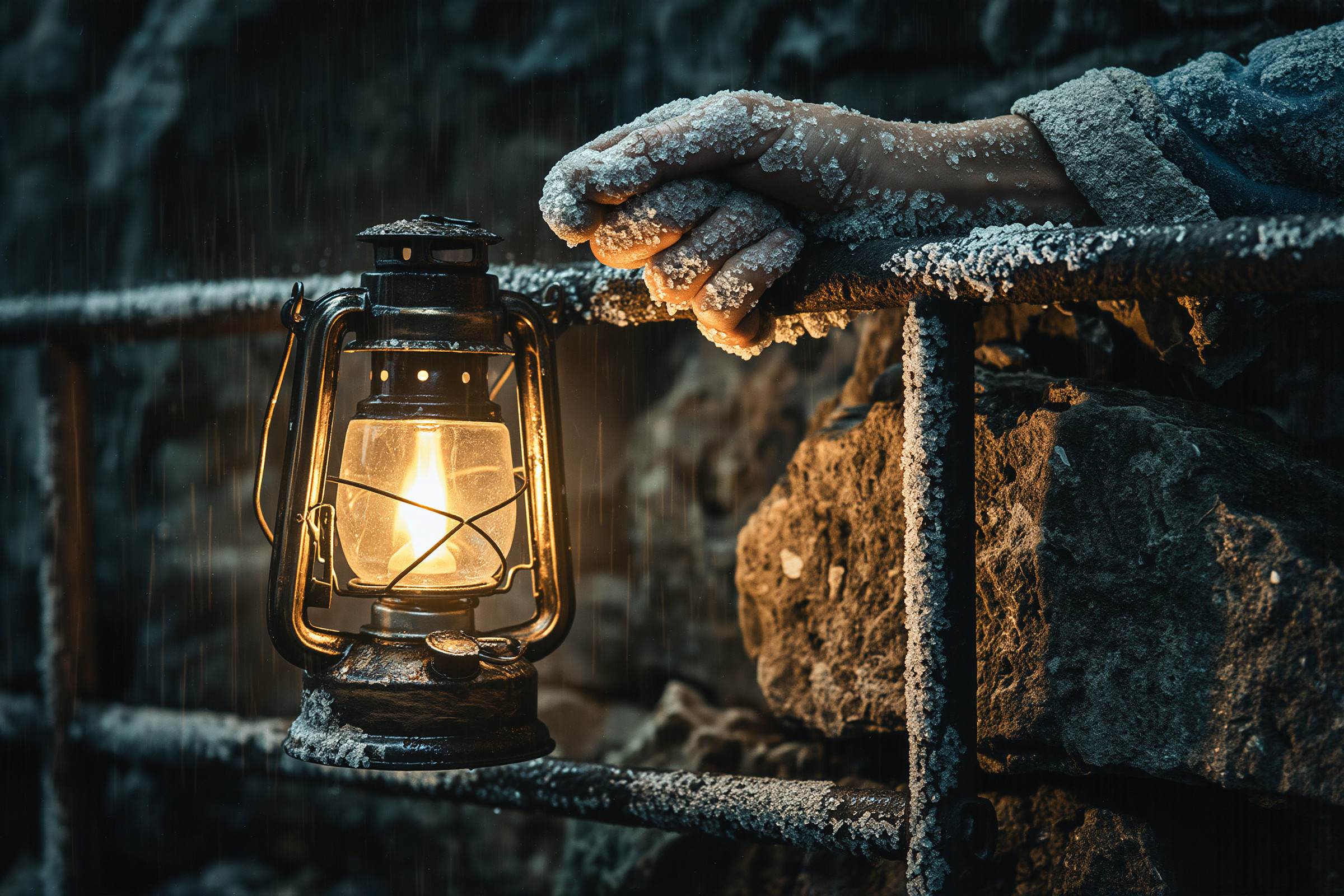
A cinematic film still, the opening wide shot of a storm scene: a lonely lighthouse on a rocky cliff at night, its beam cutting through heavy rain over a rough, churning sea, a small window glowing warm at the top. Shot on a 35mm anamorphic lens, cold blue-green color grading with a warm amber beam, fine 35mm film grain.日本語の意味
映画のスチル写真。嵐の場面の最初の引きのショット: 夜、岩の崖に立つ孤独な灯台。その光が、荒れ狂う海に降る激しい雨を切り裂き、てっぺんの小さな窓が暖かく光っている。35mm のアナモフィックレンズで撮影、冷たい青緑の色調に琥珀色の光、細かな 35mm フィルムの粒子。連作(Image Series Mode・4 枚・1 コマ目を参照画像に)
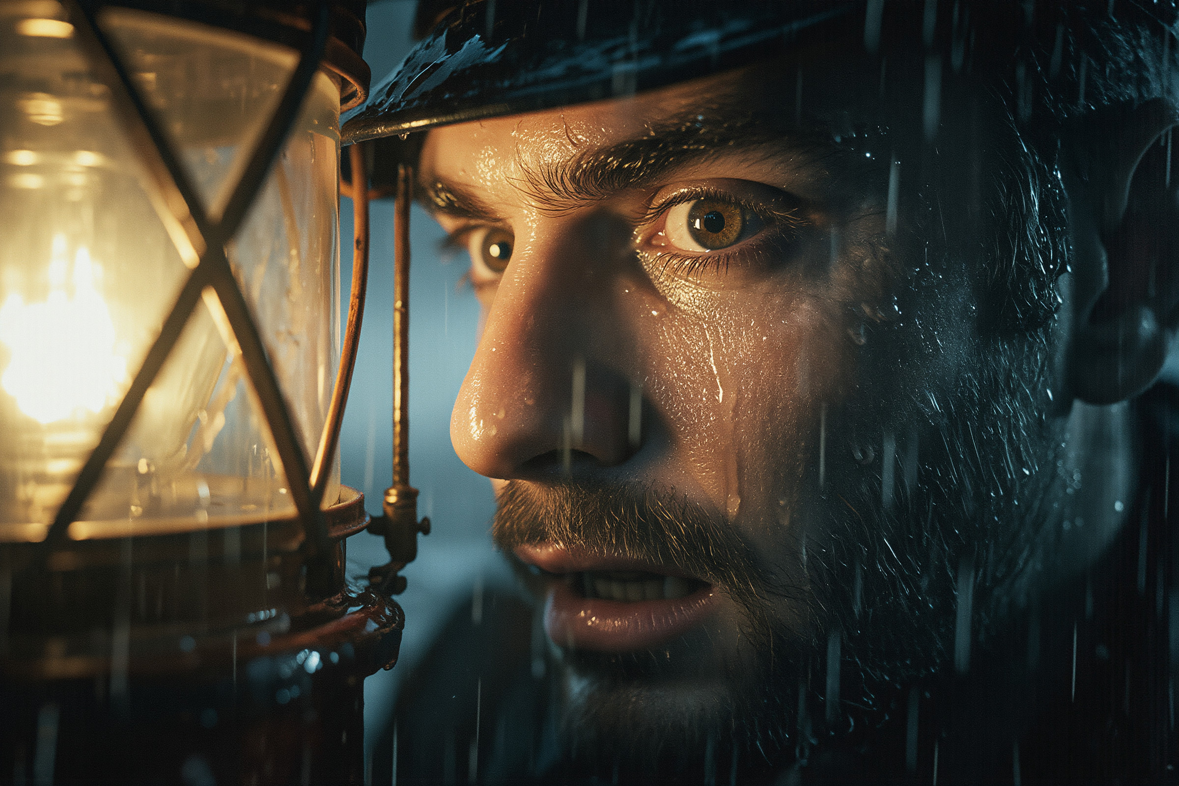
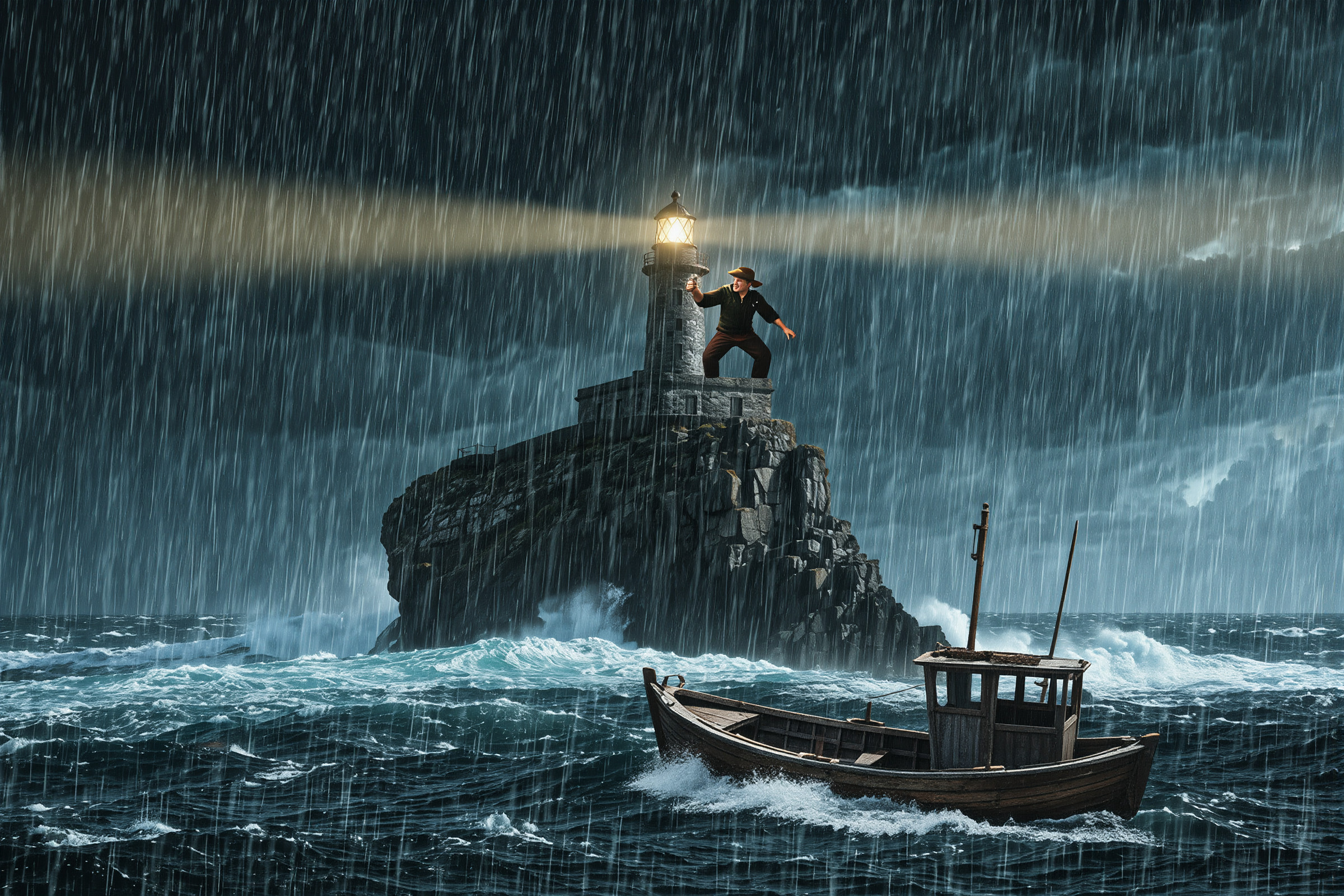
Continue this scene as a cinematic storyboard sequence with the same lighthouse, weather, lighting, and color grading. A lighthouse keeper in his sixties climbs the spiral staircase with an oil lantern; a close-up of his weathered face as he spots a small boat struggling in the waves; an over-the-shoulder shot as he swings the lantern to signal the boat. Consistent character and cinematic composition across all frames, 35mm film look.日本語の意味
この場面の続きを、同じ灯台・天気・光・色調のまま、映画の絵コンテの連作にしてください。60 代の灯台守がオイルランタンを持ってらせん階段を上る。波にもまれる小舟に気づいた彼の、風雨にさらされた顔の寄り。肩越しのショットで、彼がランタンを振って小舟に合図する。すべてのコマで人物と映画的な構図を一貫させ、35mm フィルムの見た目に。3 作目:香水のブランド画像
A cinematic, high-definition brand image for a fictional perfume. A faceted crystal perfume bottle with amber liquid stands on black volcanic rock at the edge of the sea at sunset, with spray from a breaking wave frozen in the air behind it. Rich product texture on the glass and the liquid, dramatic backlight through the bottle, warm cinematic color grading, shot on a 100mm macro lens with shallow depth of field.日本語の意味
架空の香水の、映画のような高精細なブランド画像。琥珀色の液体が入った多面カットのクリスタルの香水瓶が、夕暮れの海辺の黒い溶岩の上に立ち、その背後では砕ける波のしぶきが宙に止まっている。ガラスと液体の豊かな質感、瓶を透かす劇的な逆光、温かみのある映画の色調、100mm マクロレンズで撮影、浅い被写界深度。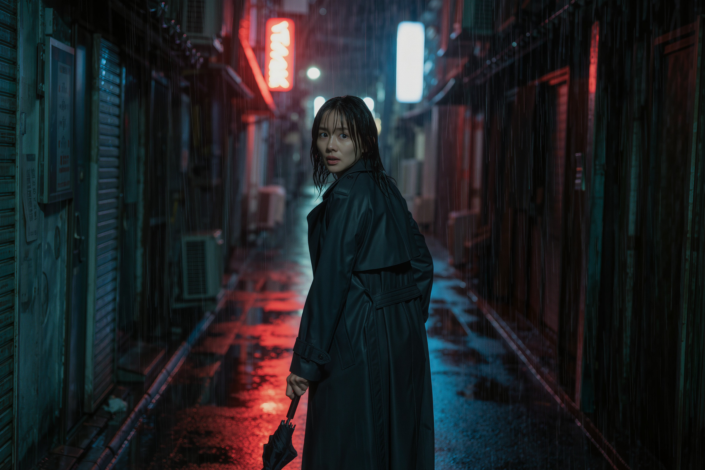
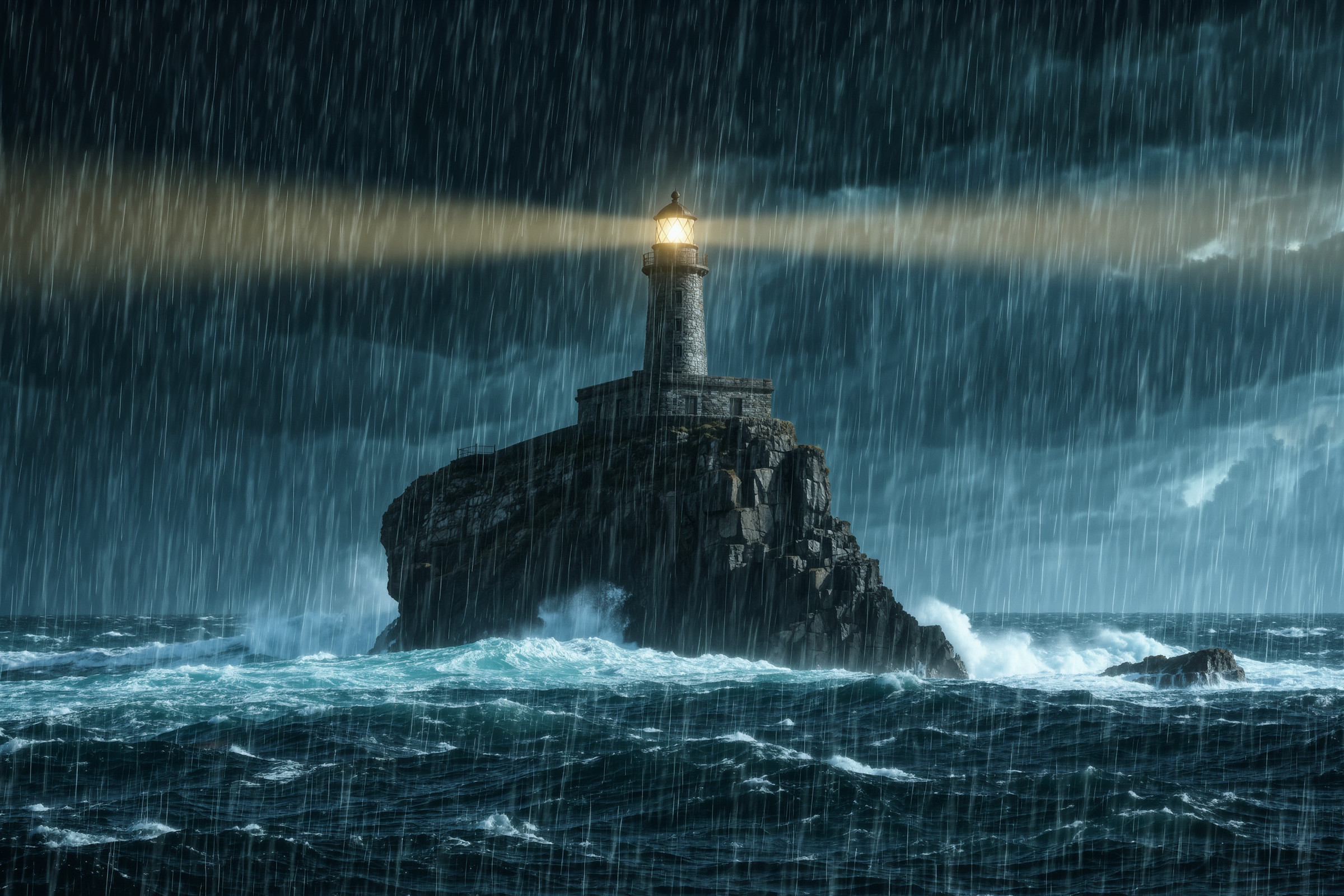
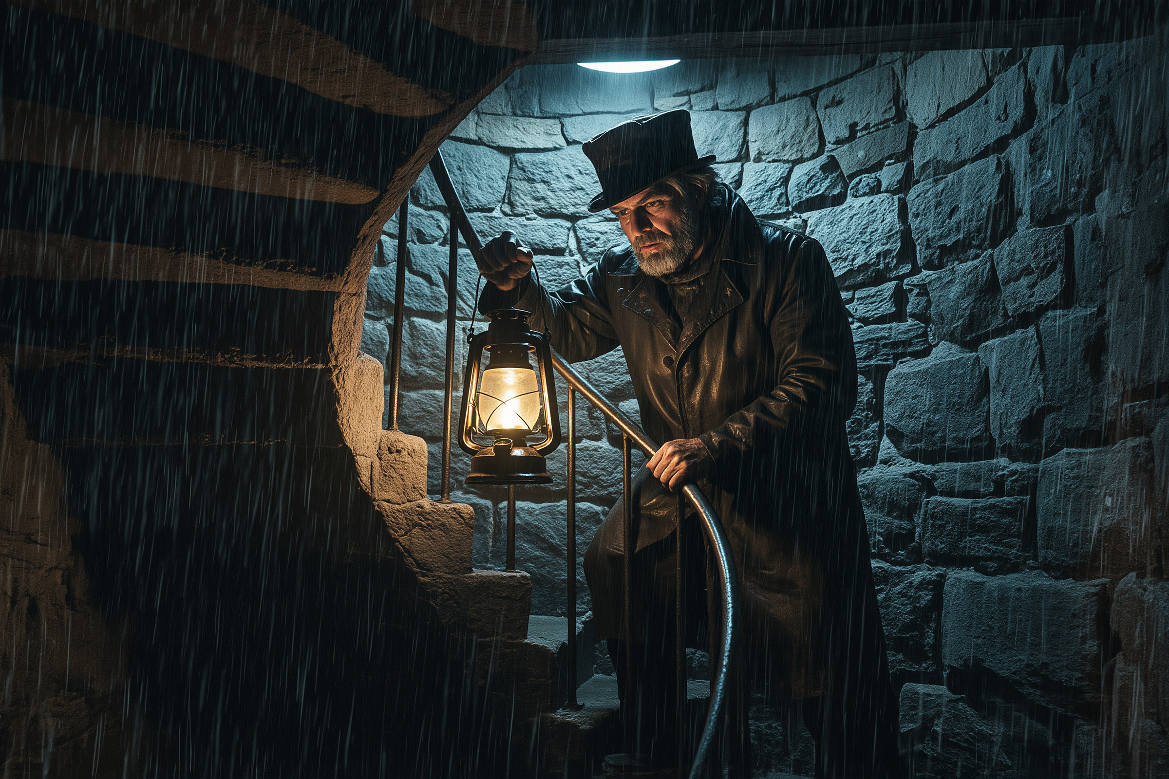
ストーリー的な続き物を作れるというKling。今回の続きものはよくわかんねぇですが、それはプロンプトのせいかも。映画的な絵作りが得意なようです。確かに1作目はかっこいいですね
Ideogram 4.5
1 作目は文字が主役のタイポグラフィポスター。文字の描画は前のバージョン(4.0)から評価が高い分野です。
2 作目は画像の編集(色だけを変える)。4.5 は公式に「The most precise edit model.」と、編集のモデルとして紹介されています。
3 作目はWeb サイトのヒーローバナー。公式ドキュメントで、4.0 の用途に「banners, website headers」が挙がっています。
使ったプロンプト(英語と日本語の意味)
1 作目:文字が主役のタイポグラフィポスター
A bold typographic poster for a fictional design conference, with the headline "MAKE IT MATTER" filling most of the poster in huge, tightly kerned, expressive letters in black and tomato red that overlap and interlock with each other.
Below the headline, in small clean sans-serif: "DESIGN WEEK 2026" and "NOV 12–14 · OSAKA".
Off-white paper background with a subtle print texture. Award-winning typographic design where the lettering itself is the artwork.
日本語の意味
架空のデザインカンファレンスの、大胆なタイポグラフィのポスター。見出し「MAKE IT MATTER」が、黒とトマトレッドの巨大で字間を詰めた表情豊かな文字で、互いに重なり組み合いながらポスターの大部分を占める。
見出しの下に、小さく整ったサンセリフ体で「DESIGN WEEK 2026」と「NOV 12–14 · OSAKA」。
うっすら印刷の質感があるオフホワイトの紙の背景。文字そのものが作品になっている、受賞作のようなタイポグラフィのデザイン。
2 作目:画像の編集(色だけを変える)
生成
A clean studio product photograph of a white leather sneaker on a pale gray seamless background, soft diffused lighting, with crisp detail on the stitching, the laces, and the textured rubber sole.日本語の意味
淡いグレーの継ぎ目のない背景に置いた白い革のスニーカーの、すっきりしたスタジオの商品写真。やわらかく拡散した光で、縫い目・靴ひも・凹凸のあるゴム底をくっきりと。編集(Ideogram 4.5 Precise Edit)
Change only the sneaker's leather to deep forest green and its sole to cream, and keep everything else in @Image1 exactly the same.日本語の意味
スニーカーの革を深いフォレストグリーンに、ソールをクリーム色に変えるだけにして、@Image1(元の画像)のそれ以外はまったく同じにしてください。3 作目:Web サイトのヒーローバナー
A website hero banner for a fictional online coding school called "BYTE CAMP".
On the left, the headline "Learn to Code in 12 Weeks" in large, clean bold sans-serif, with the subheading "Live classes · Real projects · Career support" below it, and a rounded button with the text "Start Free Trial".
On the right, a friendly flat illustration of a laptop with floating code brackets, a rocket, and colorful geometric shapes.
A calm navy-to-indigo background with soft glows, balanced spacing, and a polished, modern web design.
日本語の意味
架空のオンラインのプログラミングスクール「BYTE CAMP」の、Web サイトのヒーローバナー。
左側に、見出し「Learn to Code in 12 Weeks」を大きく整った太いサンセリフ体で。その下に小見出し「Live classes · Real projects · Career support」と、「Start Free Trial」と書かれた角の丸いボタン。
右側に、浮かぶコードの括弧・ロケット・カラフルな幾何学の形と一緒に描いたノートパソコンの、親しみやすいフラットなイラスト。
紺からインディゴへの落ち着いた背景にやわらかな光、バランスのよい余白、洗練された今風の Web デザイン。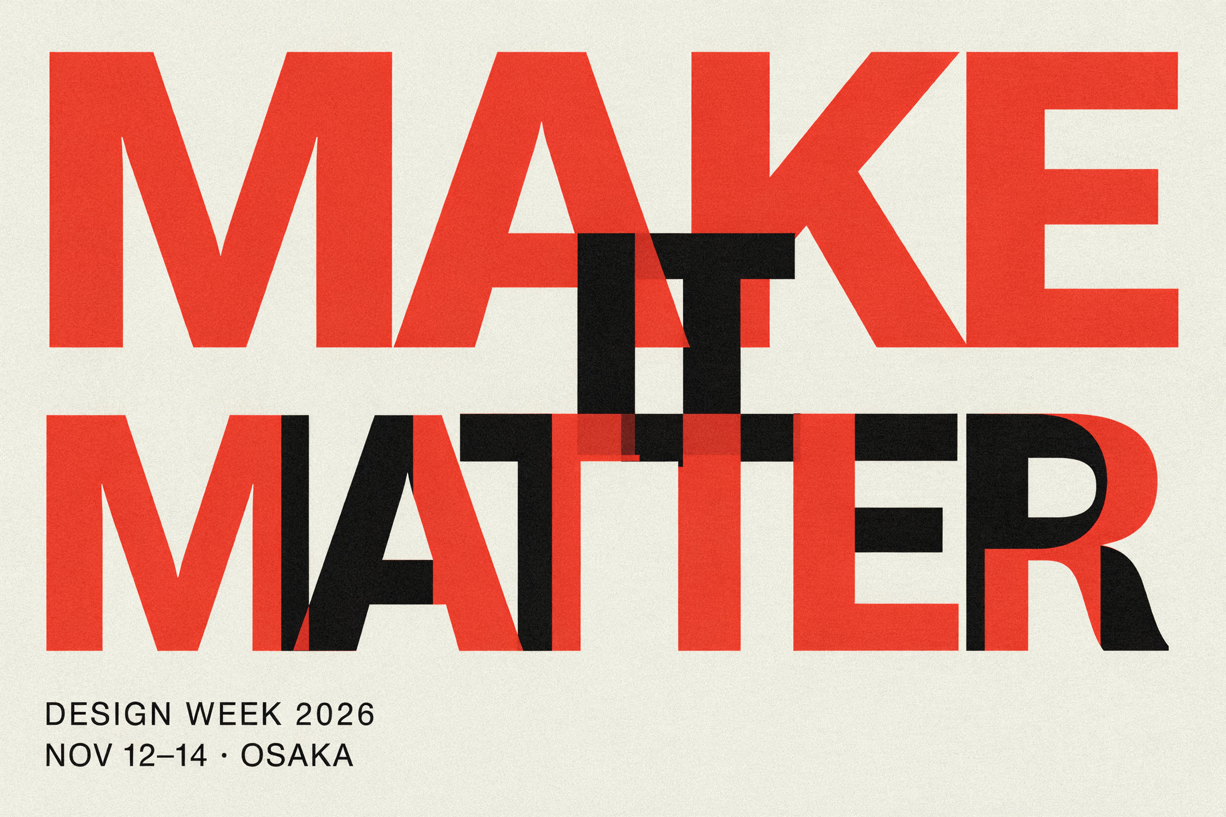

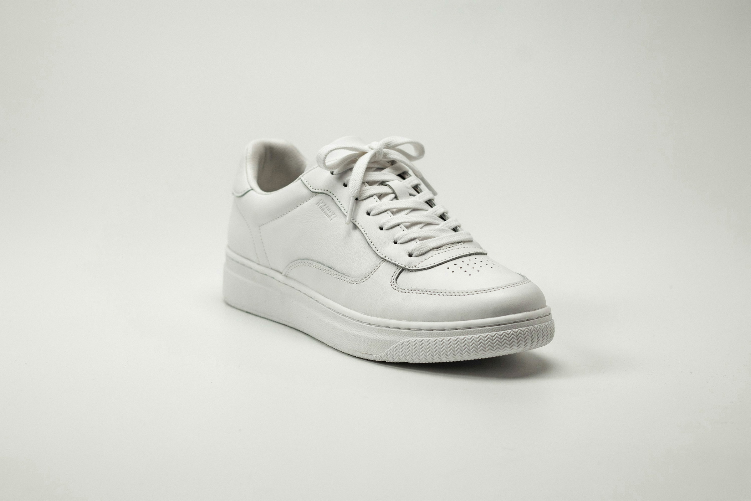
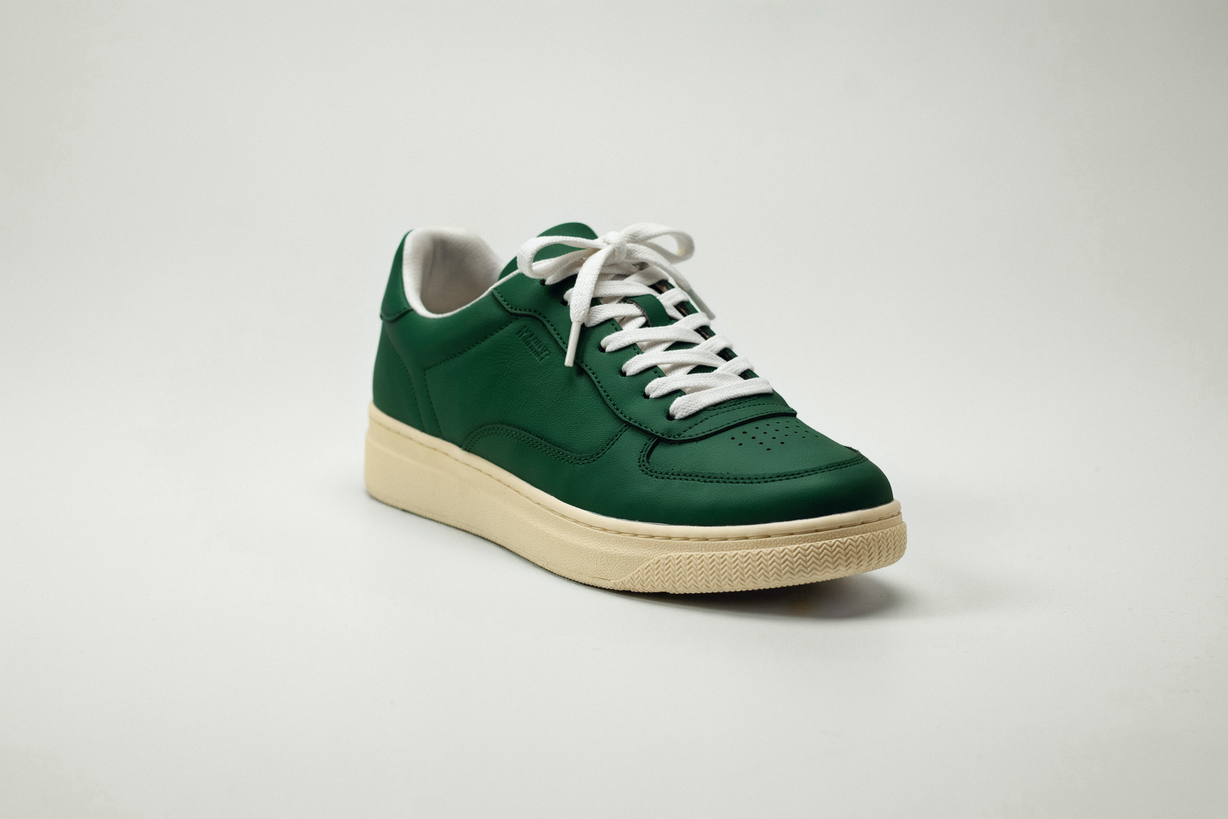
Ideogramもまたおしゃれですね。一作目もカッコしいし、3作目の色変更も見事です。ここまで完璧に色だけ変えられるのはIdeogramだけかもしれない
Recraft V4.1 Pro
1 作目はブランドのパッケージデザイン。公式に「ロゴ・タイポグラフィ・イラスト向け」とあり、デザインの分野に強いモデルです。
2 作目は自然な人物写真。V4.1 の発表で「人間らしさを感じる写真」を強みに挙げています。
3 作目はSVG のベクターイラスト。今回のモデルの中で、拡大しても粗くならない SVG を直接出せるのは Recraft だけです。
使ったプロンプト(英語と日本語の意味)
1 作目:ブランドのパッケージデザイン
Packaging and brand identity for a fictional artisan tea brand called "KIRI". Three matte cylindrical tea tins in sage green, warm cream, and deep indigo stand on a light stone surface with soft natural shadows. Each tin carries a refined minimalist logo: the word "KIRI" with a small mist-like line mark, and one flavor name: "SENCHA", "HOJICHA", or "GENMAICHA". Elegant, cohesive brand design and premium product photography.日本語の意味
架空の職人系のお茶のブランド「KIRI」のパッケージとブランドデザイン。セージグリーン・温かみのあるクリーム・深いインディゴの、マットな円筒形の茶缶 3 つが、明るい石の上にやわらかな自然な影を落として並ぶ。どの缶にも洗練されたミニマルなロゴ(「KIRI」の文字と、霧のような小さな線のマーク)と、味の名前を 1 つずつ:「SENCHA」「HOJICHA」「GENMAICHA」。上品で統一感のあるブランドデザインと、高級感のある商品写真。2 作目:自然な人物写真
Two friends laughing together on a city rooftop at golden hour, a candid moment, natural skin, soft warm light.日本語の意味
夕暮れどき、街のビルの屋上で一緒に笑う 2 人の友人。自然な一瞬、自然な肌、やわらかく暖かい光。3 作目:SVG のベクターイラスト
A flat vector illustration of a cozy corner coffee shop called "MORI COFFEE" on a quiet morning street, with a striped awning, potted plants, a bicycle parked out front, and a hanging sign with a simple leaf-and-cup logo and the name "MORI COFFEE". Clean geometric shapes, a warm, limited color palette, and a modern editorial illustration style.日本語の意味
静かな朝の通りにある、居心地のよい角地のコーヒーショップ「MORI COFFEE」のフラットなベクターイラスト。しま模様の日よけ、鉢植えの植物、店の前に止めた自転車、シンプルな葉とカップのロゴと「MORI COFFEE」の名前が入った吊り看板。すっきりした幾何学の形、温かみのある限られた配色、今風の雑誌のイラストのスタイル。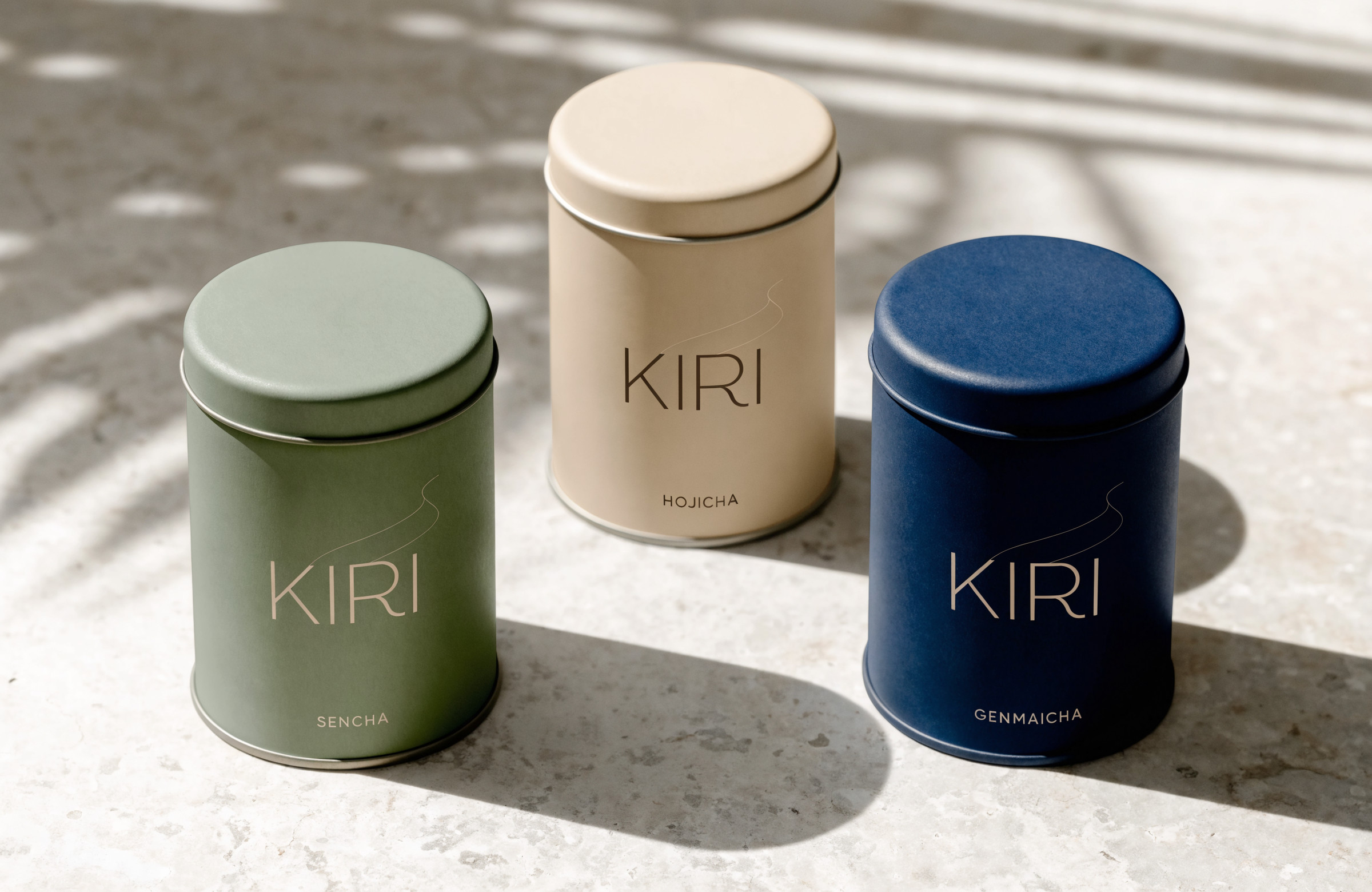
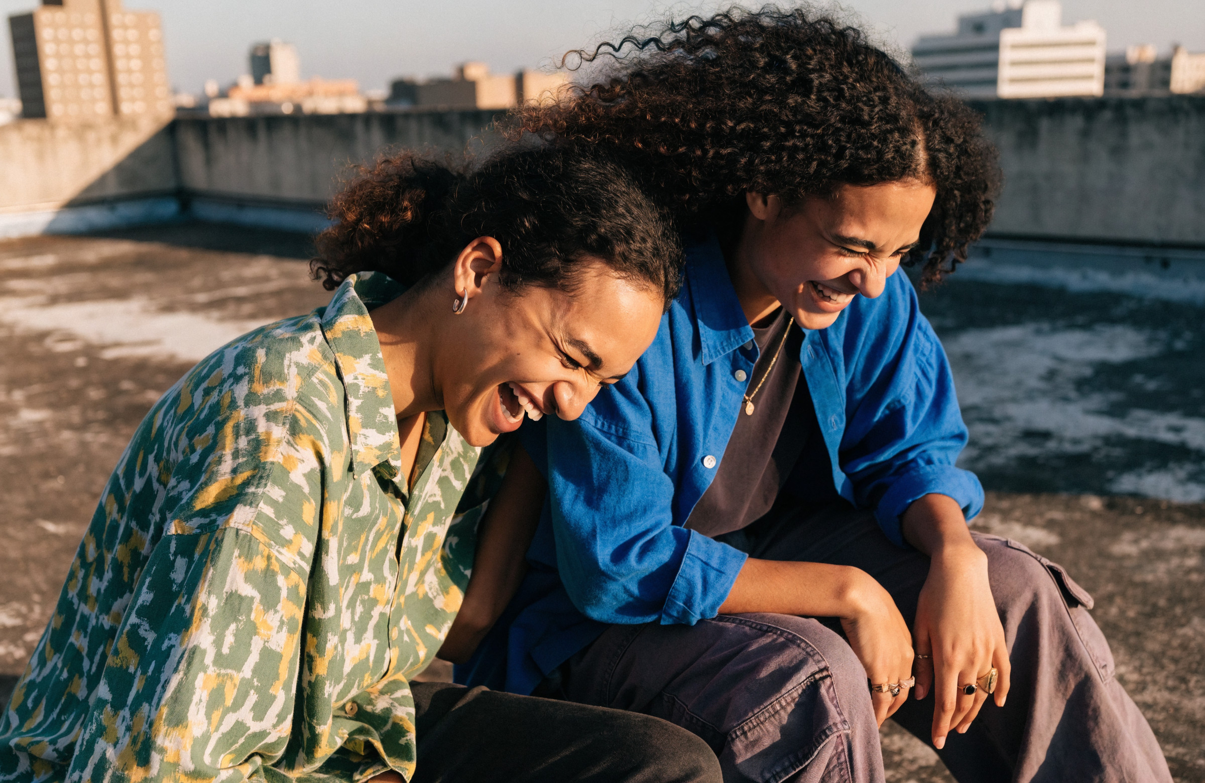
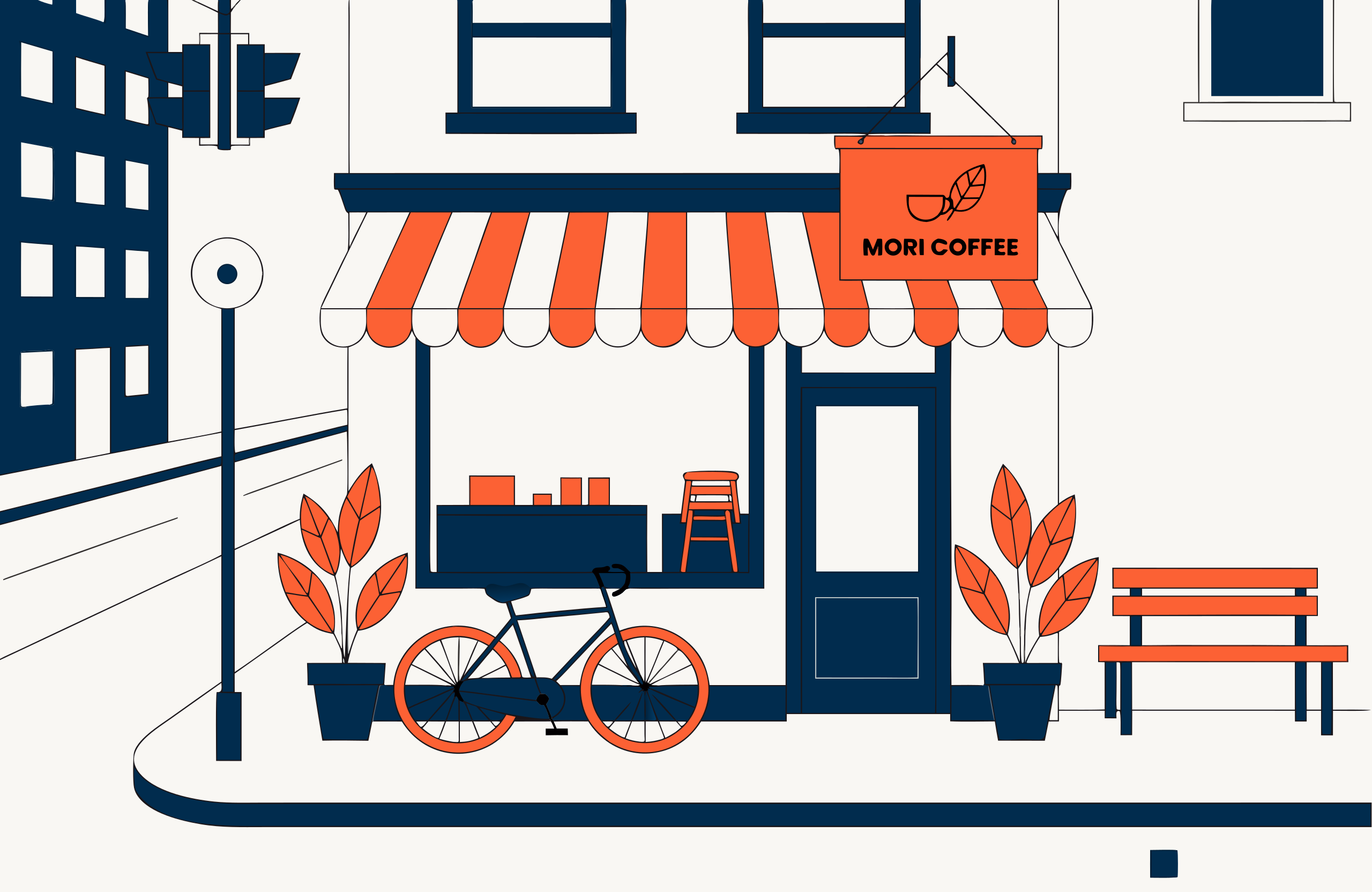
Recraft もいいですね。2作目の画像もとても良い。SVGが出せるというのも面白い。
修正をきちんとできるか試してみた
生成というのも大事ですが、同等に重要なのが修正だと思います。できあがった画像に「ここだけ直して」とお願いしたときに、どこまで言うことを聞いてくれるかを比べました。
どのモデルにも同じ 1 枚の写真を渡して、1 回に 1 か所だけ直してもらいます。直す内容は、実際に利用者から多く寄せられる修正の種類(研究用に集められた 600 件あまりの依頼の分類)を参考に、8 種類にしました。
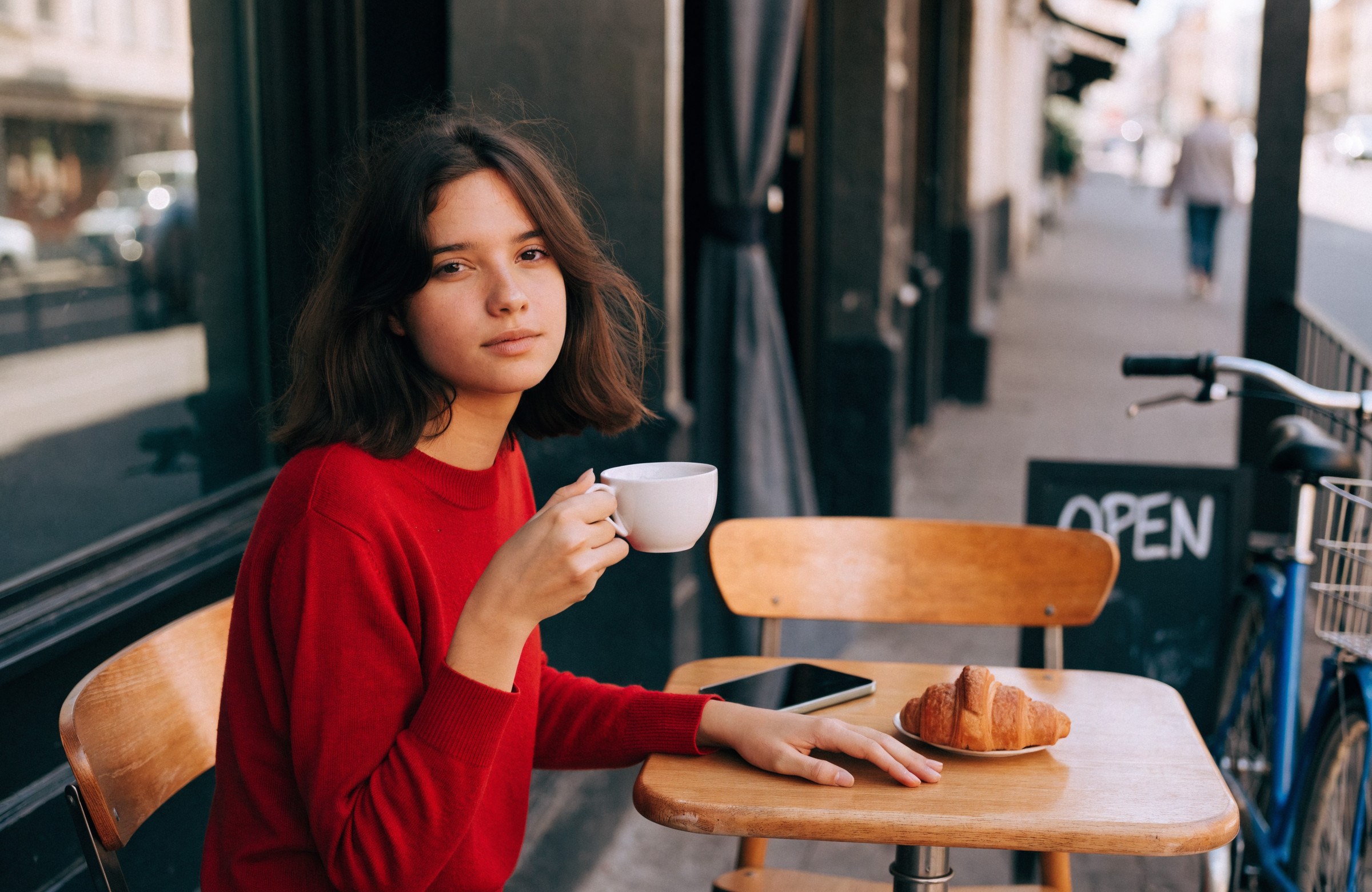
使ったプロンプト(英語)
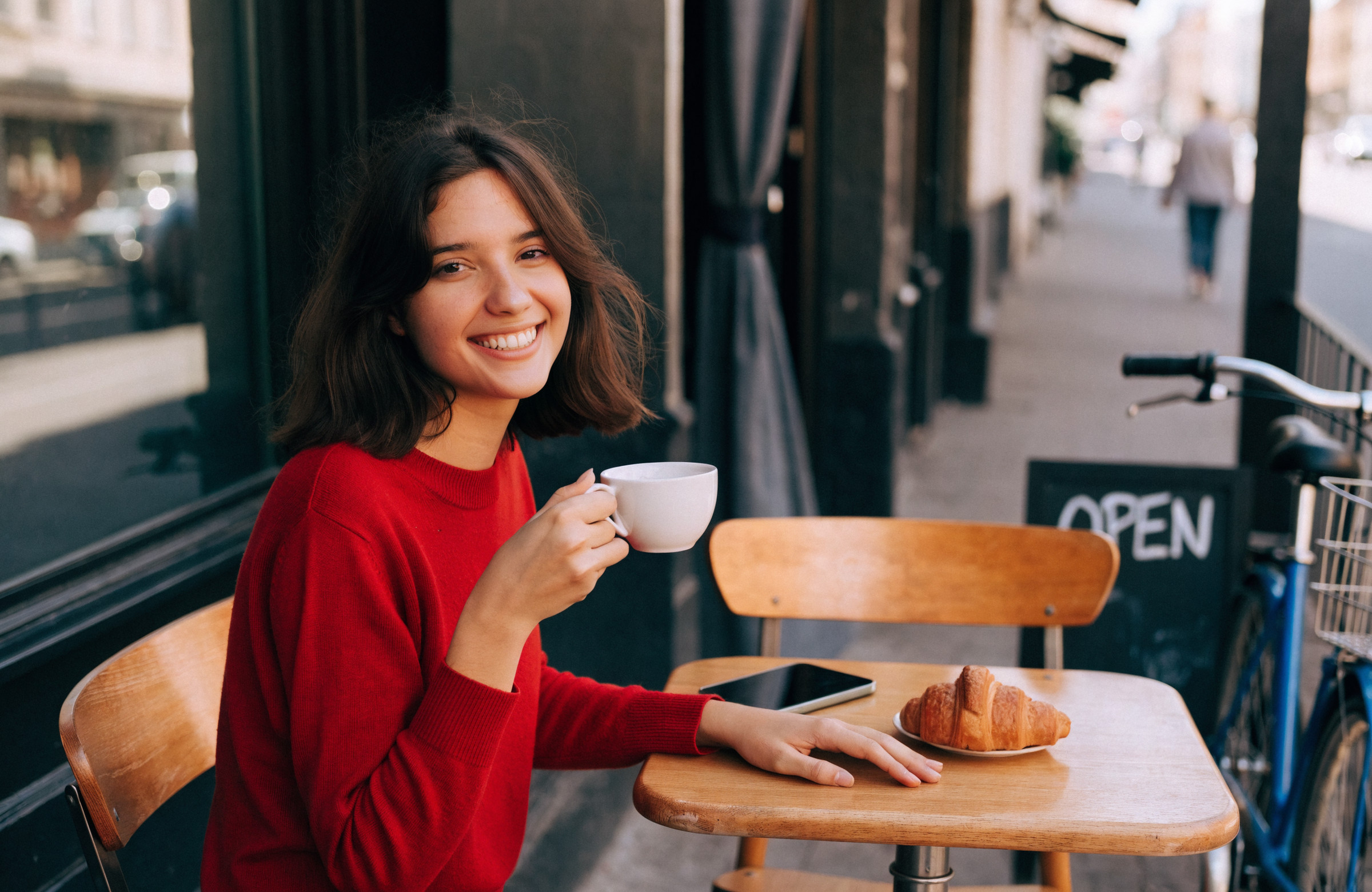
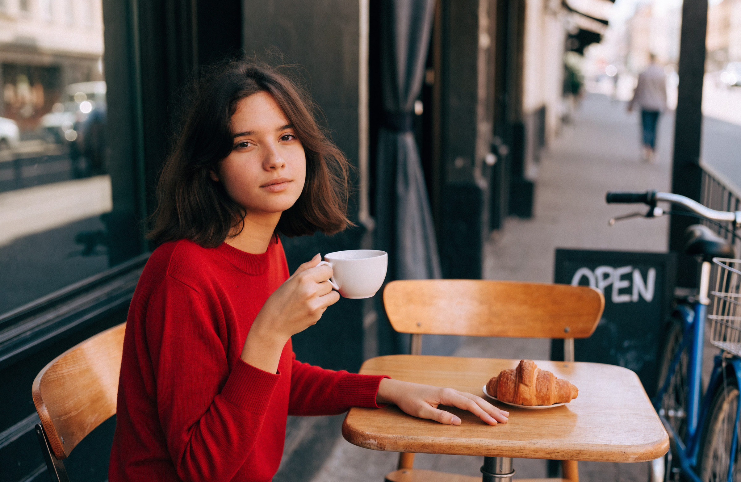
A natural, candid photograph of a young woman in her twenties sitting at a small wooden table on the terrace of a street café on a sunny afternoon, framed from the waist up, slightly left of center. She has shoulder-length dark hair, wears a red knit sweater, and looks at the camera with a calm, neutral expression. Her right hand holds a white coffee cup naturally by its handle, with her index finger through the handle and her thumb resting on top, and her left hand rests flat on the table. On the table are a smartphone and a croissant on a small plate. An empty wooden chair stands on the other side of the table. Behind her on the right, a black chalkboard sign clearly reads "OPEN" in white letters, and a blue bicycle leans against the café wall. Soft natural daylight, realistic detail.日本語の意味
晴れた午後、街のカフェのテラスで小さな木のテーブルに座る 20 代の女性の自然な写真。腰から上を、中央より少し左に。肩までの黒髪で赤いニットのセーターを着て、落ち着いた無表情でこちらを見ている。右手で白いコーヒーカップを、取っ手に人差し指を通し親指を上に添えて自然に持ち、左手はテーブルの上に平らに置いている。テーブルの上にはスマートフォンと、小皿に載ったクロワッサン。テーブルの向こう側に空いた木の椅子。右後ろに、白い文字ではっきり「OPEN」と書かれた黒板の看板と、店の壁に立てかけた青い自転車。やわらかな自然光、細部までリアルに。- ※修正前の写真は、修正のテストに参加しない Recraft V4.1 Pro で作りました。自分が描いた絵を直すモデルが有利にならないようにするためです。
- ※Stable Diffusion 3.5 Large と Recraft V4.1 Pro は、文章の指示で画像を直す機能が無いため、このテストには参加していません(Recraft は公式ドキュメントで「プロンプトでの編集は V4 では未対応」と明記)。
- ※どの指示にも、最後に「Keep everything else in the image exactly the same.(ほかは何も変えないでください)」を付けています。Ideogram だけは決まりに合わせて「the image」を「@Image1」と書いています。
お願いした修正は次の 8 種類です。
| # | 種類 | 修正の中身 |
|---|---|---|
| 1 | 表情 | 無表情を満面の笑顔に |
| 2 | 手の形 | テーブルの左手でピースサイン |
| 3 | 色 | セーターを赤から深緑に |
| 4 | 置き換え | 右手のカップを文庫本に |
| 5 | 削除 | テーブルのスマートフォンを消す |
| 6 | 追加 | 空いた椅子に犬を座らせる |
| 7 | 文字 | 看板を OPEN から CLOSED に |
| 8 | 天気・時間 | 晴れた昼を雨の夕方に |
使った指示(英語と日本語の意味)
1. 表情:無表情を満面の笑顔に
Change only her facial expression to a big, happy smile. Keep everything else in the image exactly the same.日本語の意味
表情だけを満面の笑顔にしてください。ほかは何も変えないでください。2. 手の形:テーブルの左手でピースサイン
Change only her left hand, which rests on the table: she raises it next to her face and makes a peace sign. Keep everything else in the image exactly the same.日本語の意味
テーブルに置いた左手だけを変えてください。その手を顔の横に上げて、ピースサインをします。ほかは何も変えないでください。3. 色:セーターを赤から深緑に
Change only the color of her sweater from red to forest green. Keep everything else in the image exactly the same.日本語の意味
セーターの色だけを、赤から深い緑に変えてください。ほかは何も変えないでください。4. 置き換え:右手のカップを文庫本に
Replace only the white coffee cup in her right hand with a small paperback book. Keep everything else in the image exactly the same.日本語の意味
右手の白いコーヒーカップだけを、小さな文庫本に置き換えてください。ほかは何も変えないでください。5. 削除:テーブルのスマートフォンを消す
Remove only the smartphone from the table. Keep everything else in the image exactly the same.日本語の意味
テーブルの上のスマートフォンだけを消してください。ほかは何も変えないでください。6. 追加:空いた椅子に犬を座らせる
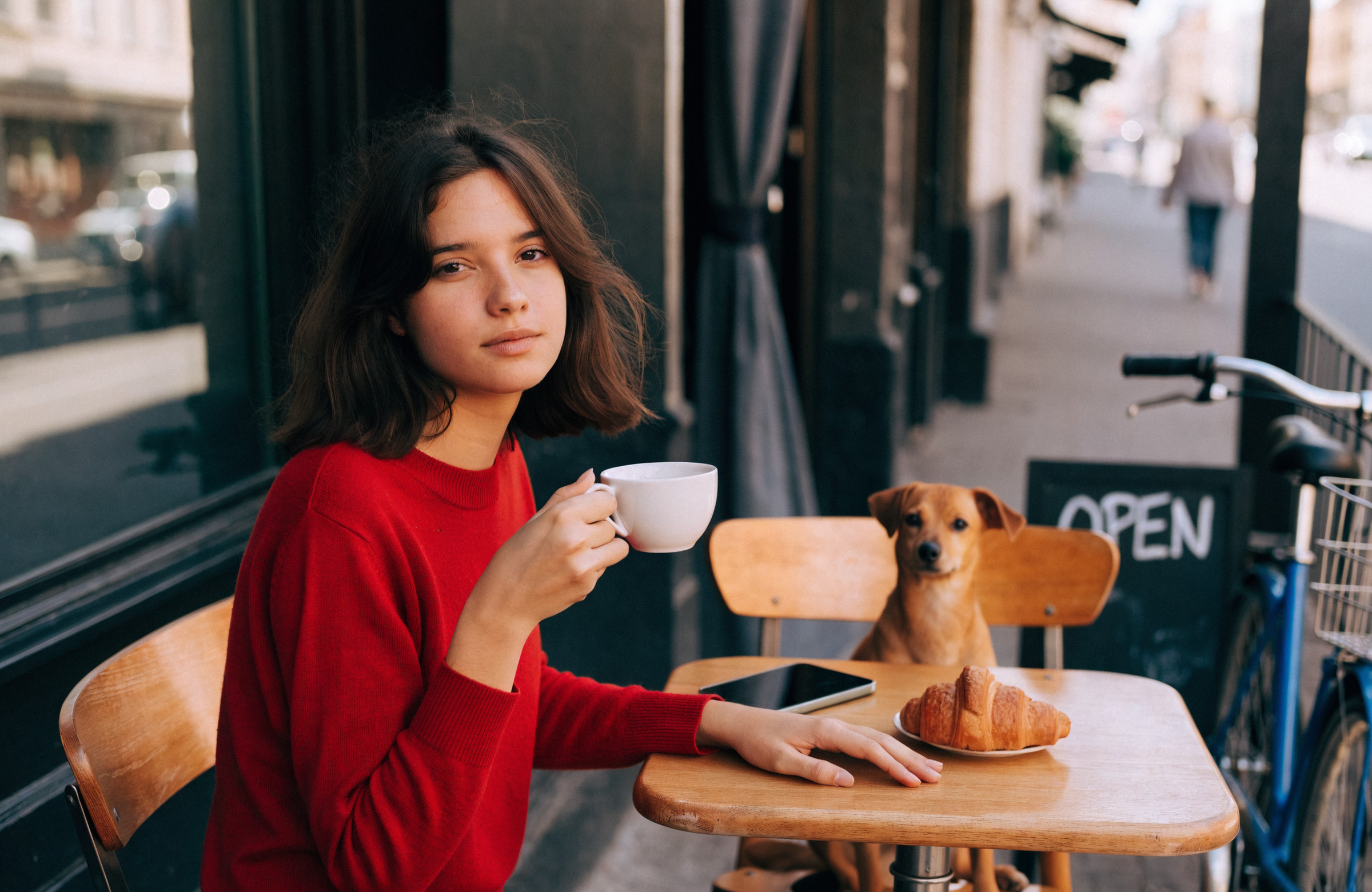
Add a small brown dog sitting on the empty wooden chair at the far side of the table. Keep everything else in the image exactly the same.日本語の意味
テーブルの奥の空いた木の椅子に、茶色の小型犬を座らせてください。ほかは何も変えないでください。7. 文字:看板を OPEN から CLOSED に
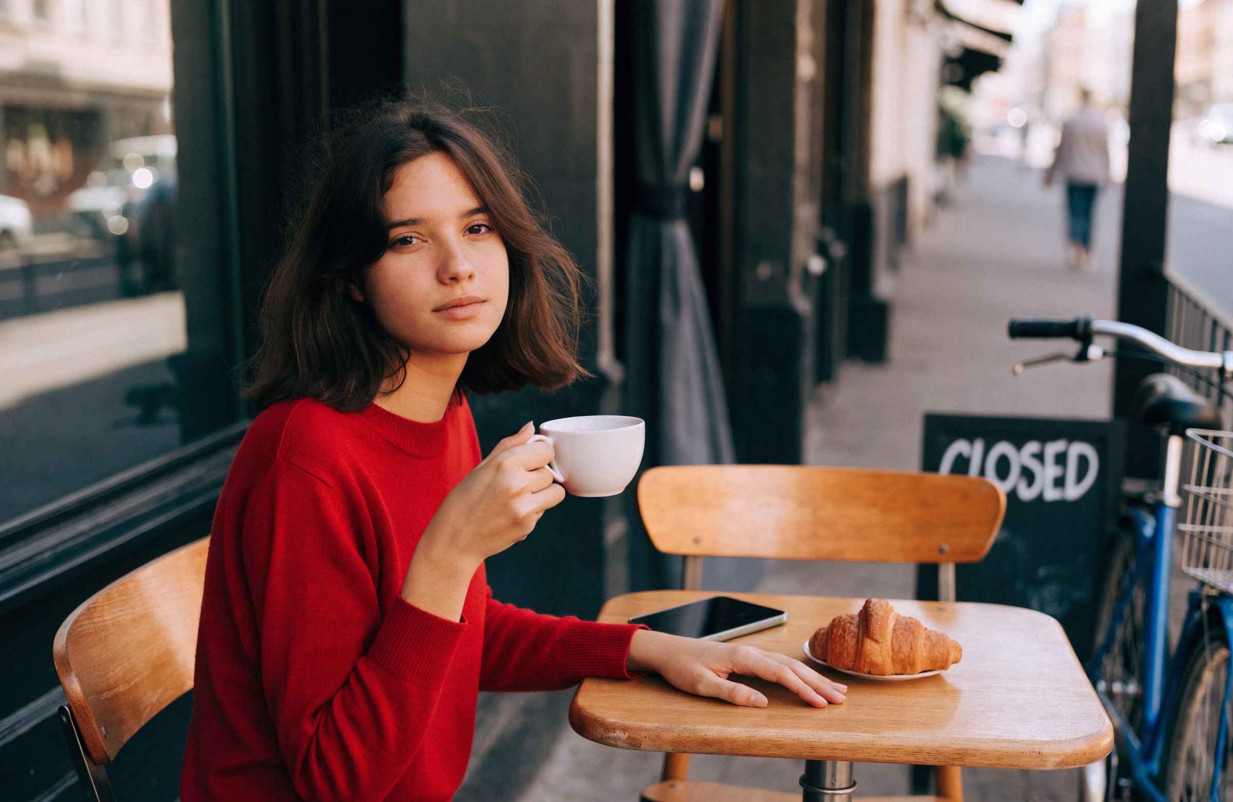
Change only the text on the chalkboard sign from "OPEN" to "CLOSED". Keep everything else in the image exactly the same.日本語の意味
黒板の看板の文字だけを、「OPEN」から「CLOSED」に変えてください。ほかは何も変えないでください。8. 天気・時間:晴れた昼を雨の夕方に
Change only the time and weather to a rainy evening, with wet reflections on the street and warm lights from the café. Keep everything else in the image exactly the same.日本語の意味
時間と天気だけを雨の夕方に変えてください。道は濡れて光を映し、カフェからは暖かい明かりがこぼれています。ほかは何も変えないでください。GPT Image 2.5 Sunburst
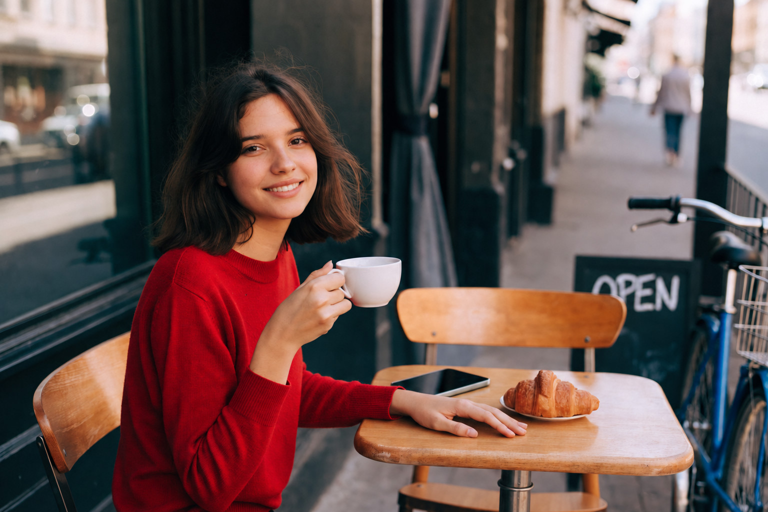
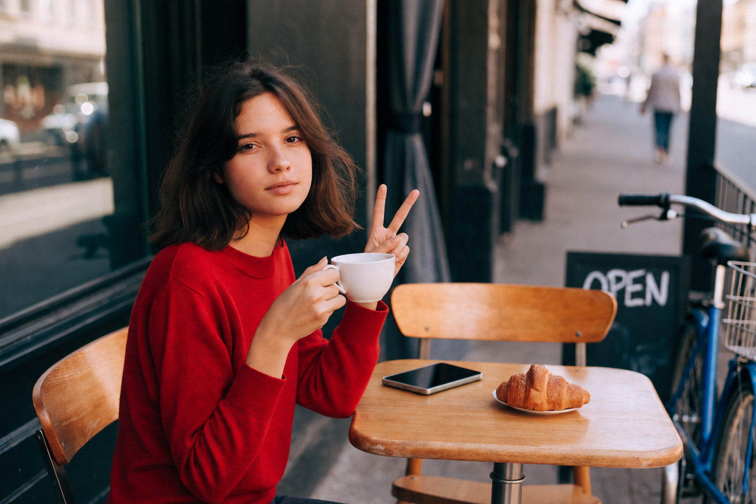
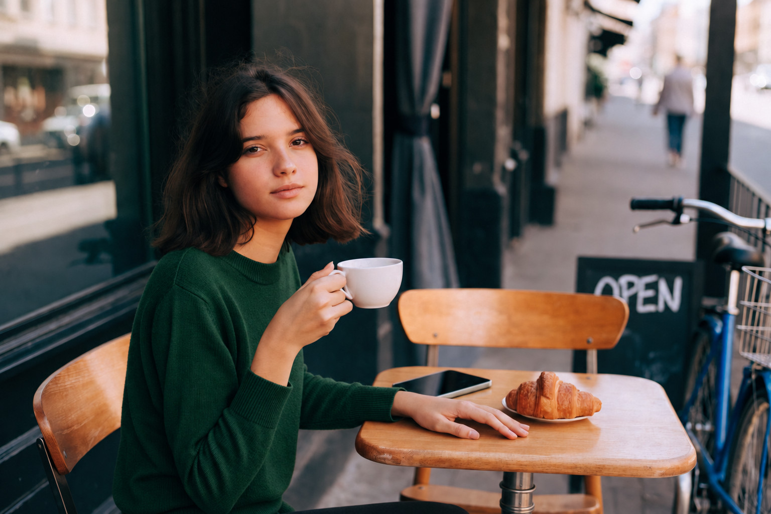
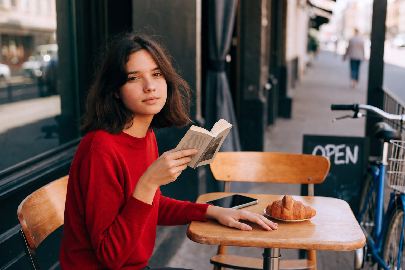
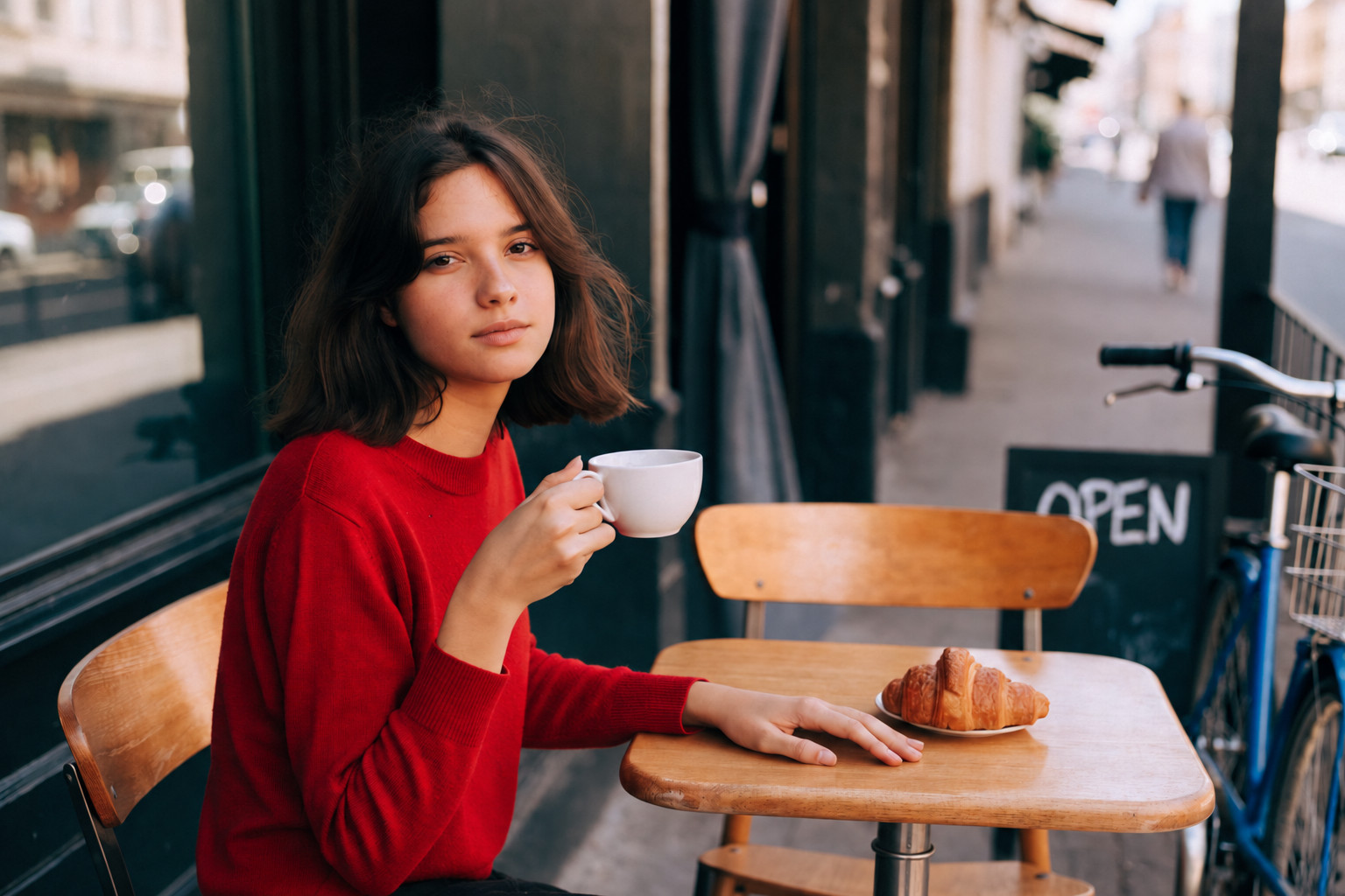
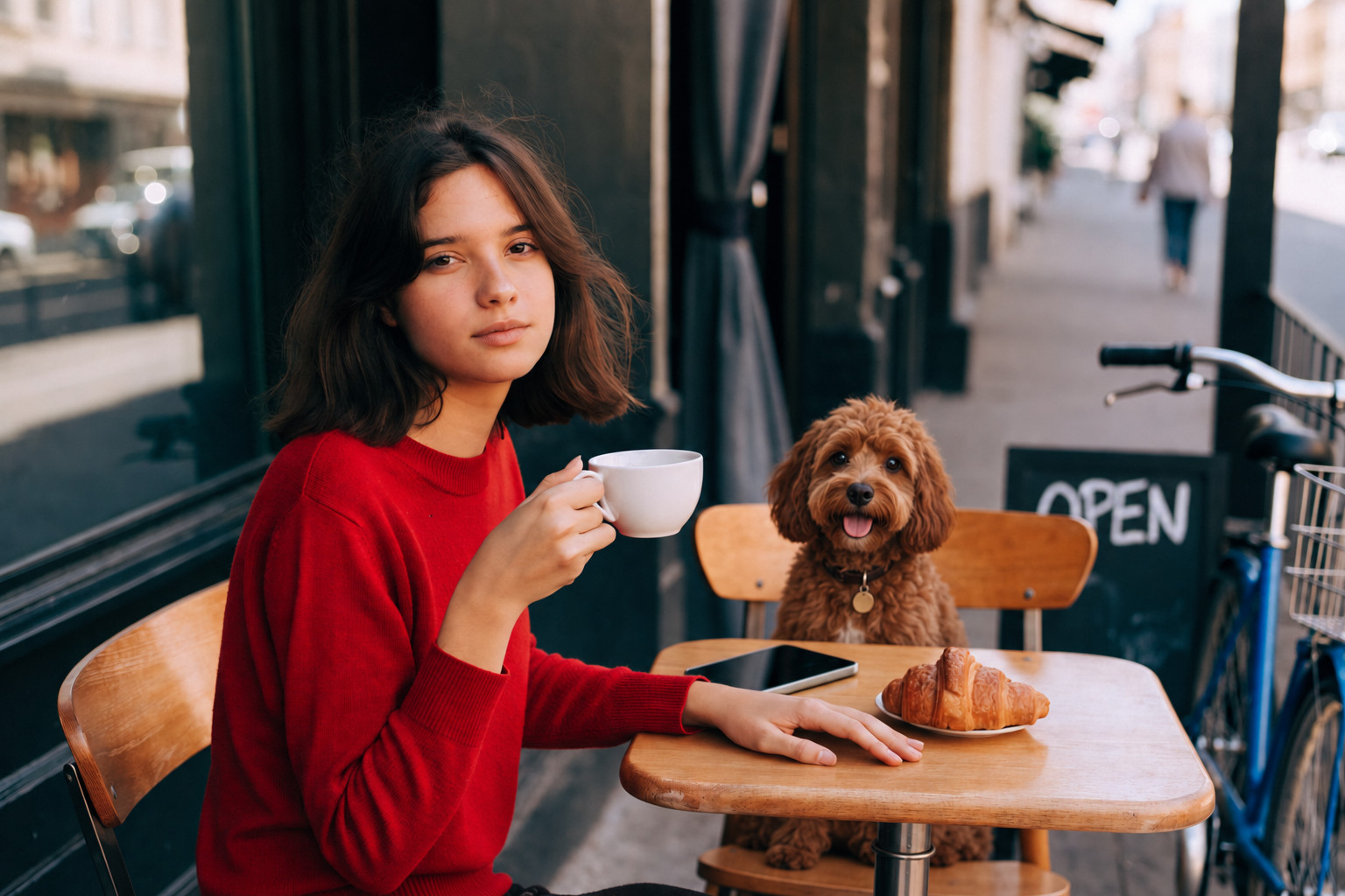
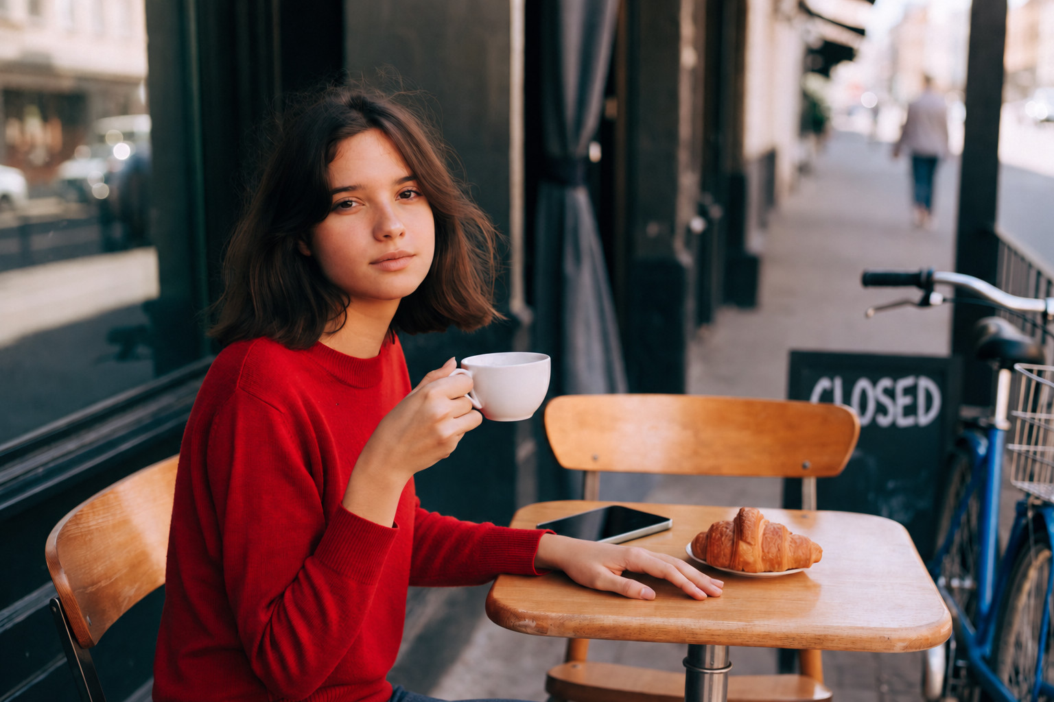
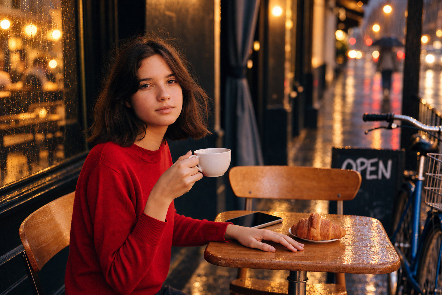
やはり優等生。GPT Image 2.5。そうそう。そうして欲しかったんだよ。っていう修正をやってくれます。服を緑にした時にカップに映り込んでいた反射の赤も変えてくれている気遣いができているモデルは多くはありません。本への持ち替えも自然にできているモデルは少ないです。
Nano Banana Pro

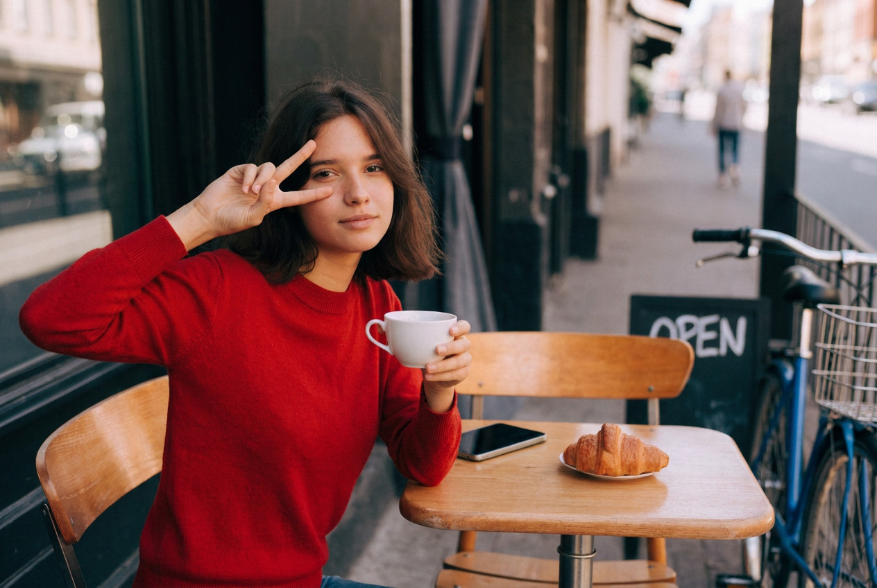
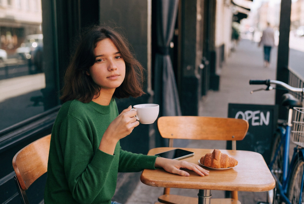
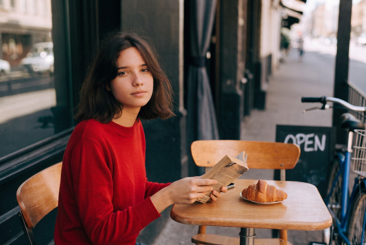
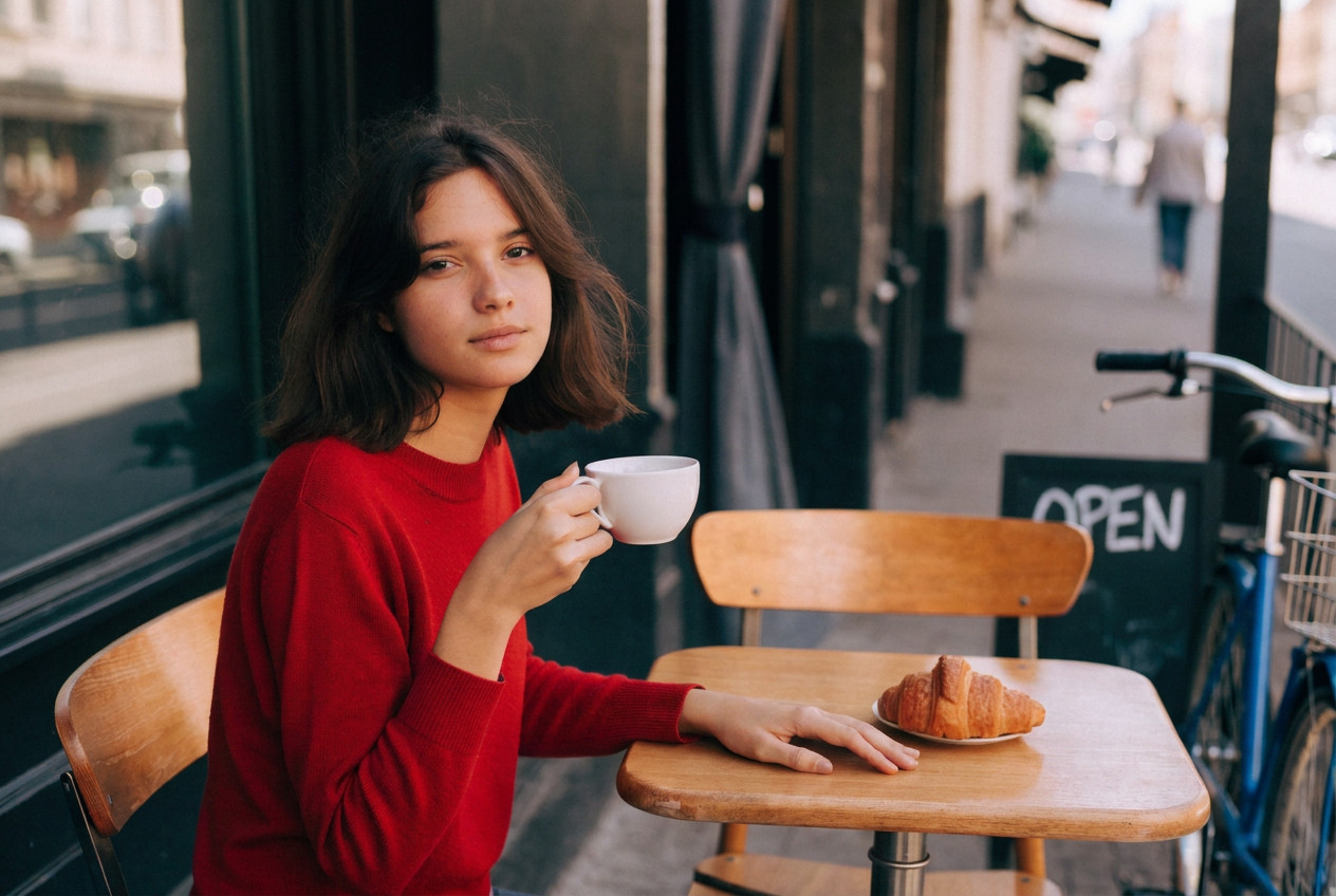
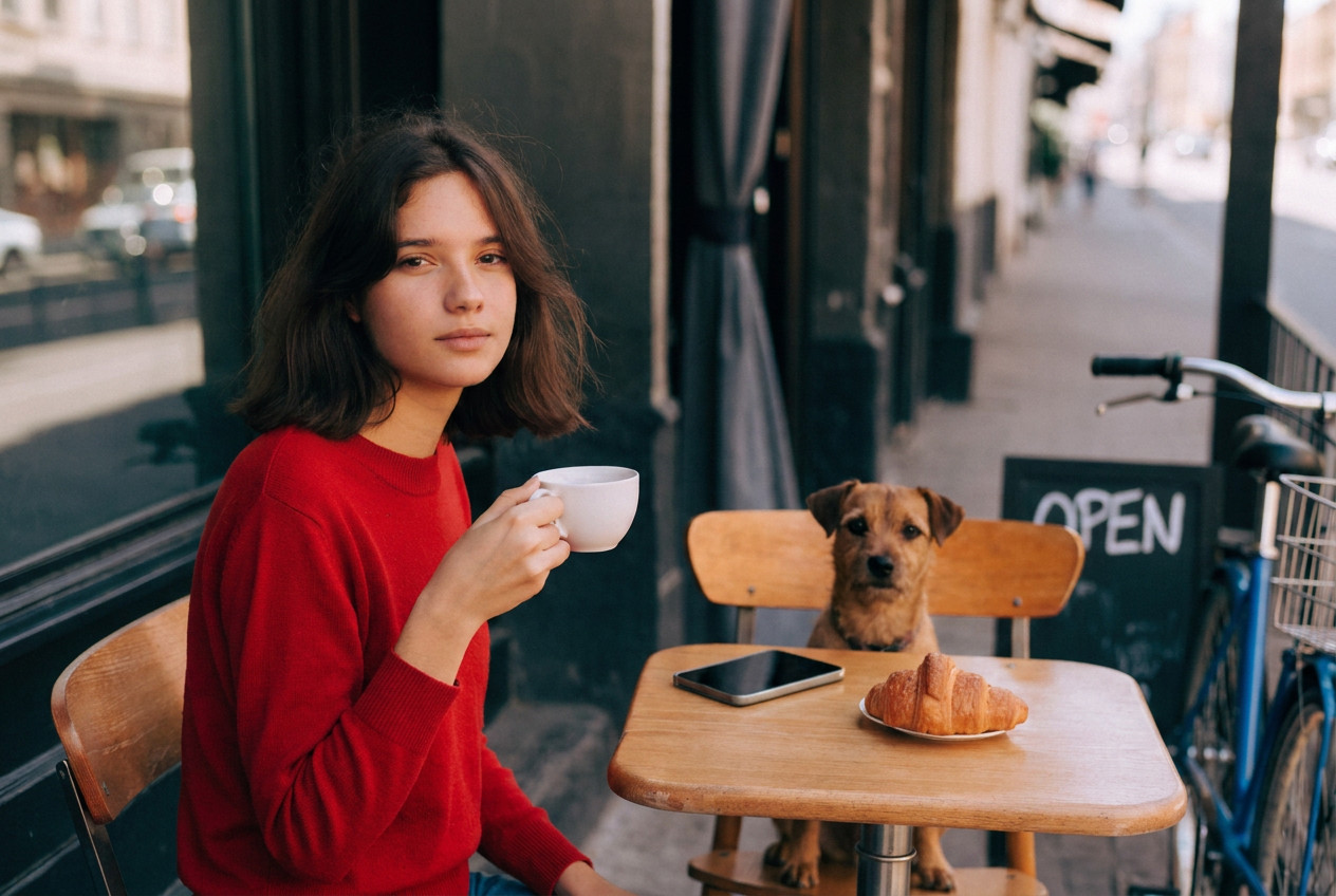
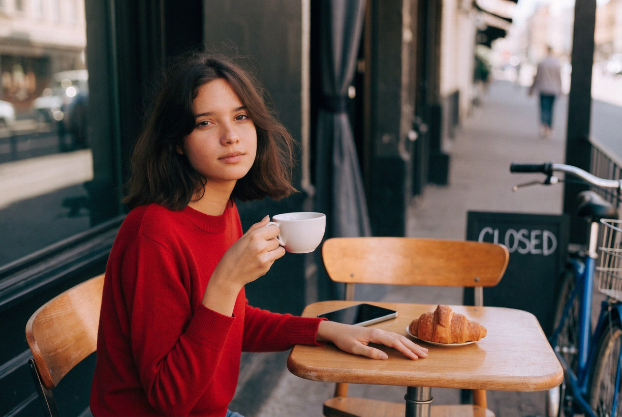
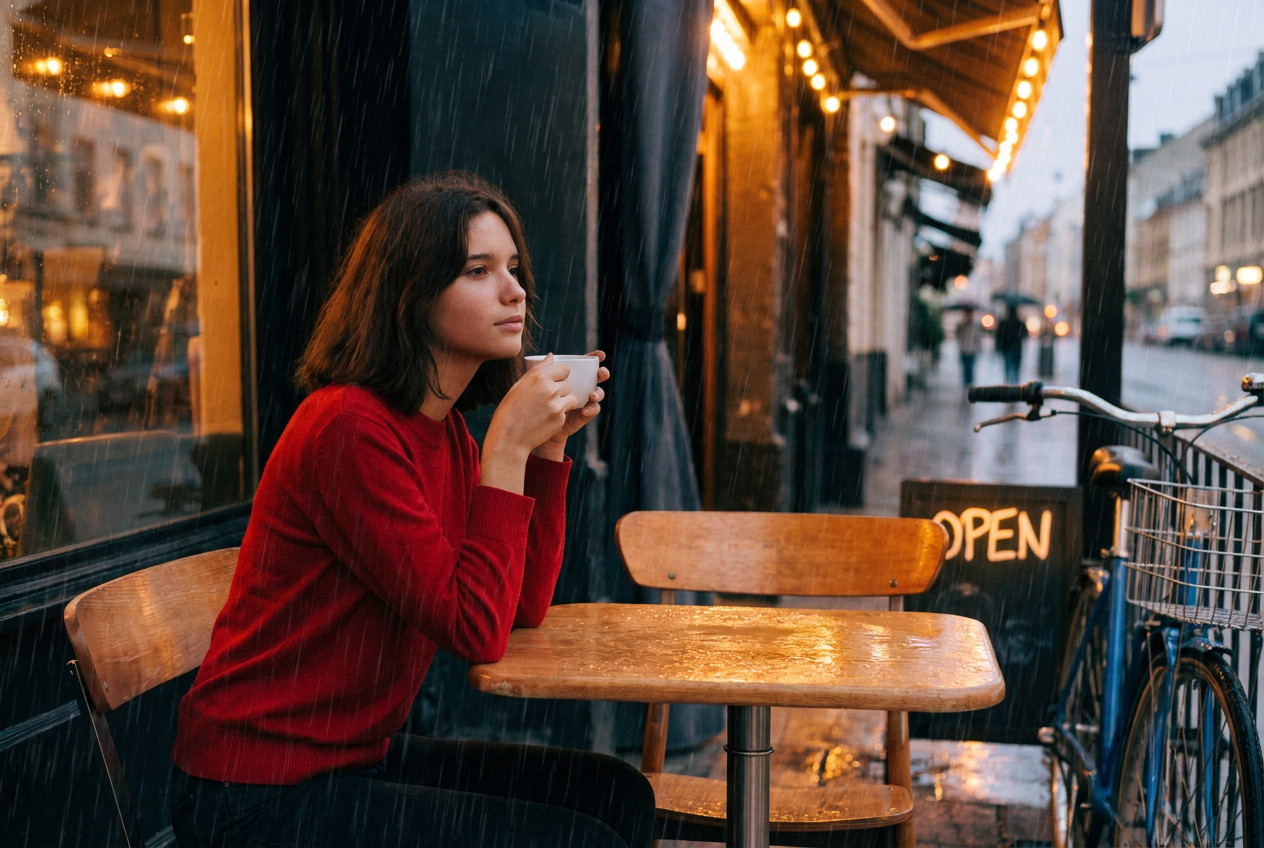
Nano Bananaも優等生のイメージはあるんですが、結構指示を飛び越えることがあります。2番は手の左右が違うし、8番は構図変えちゃってるしね。ただ、出来上がった画像としておかしなものは出してこない印象です。2番も8番も単体として見ておかしくはないですよね
Midjourney V8.2
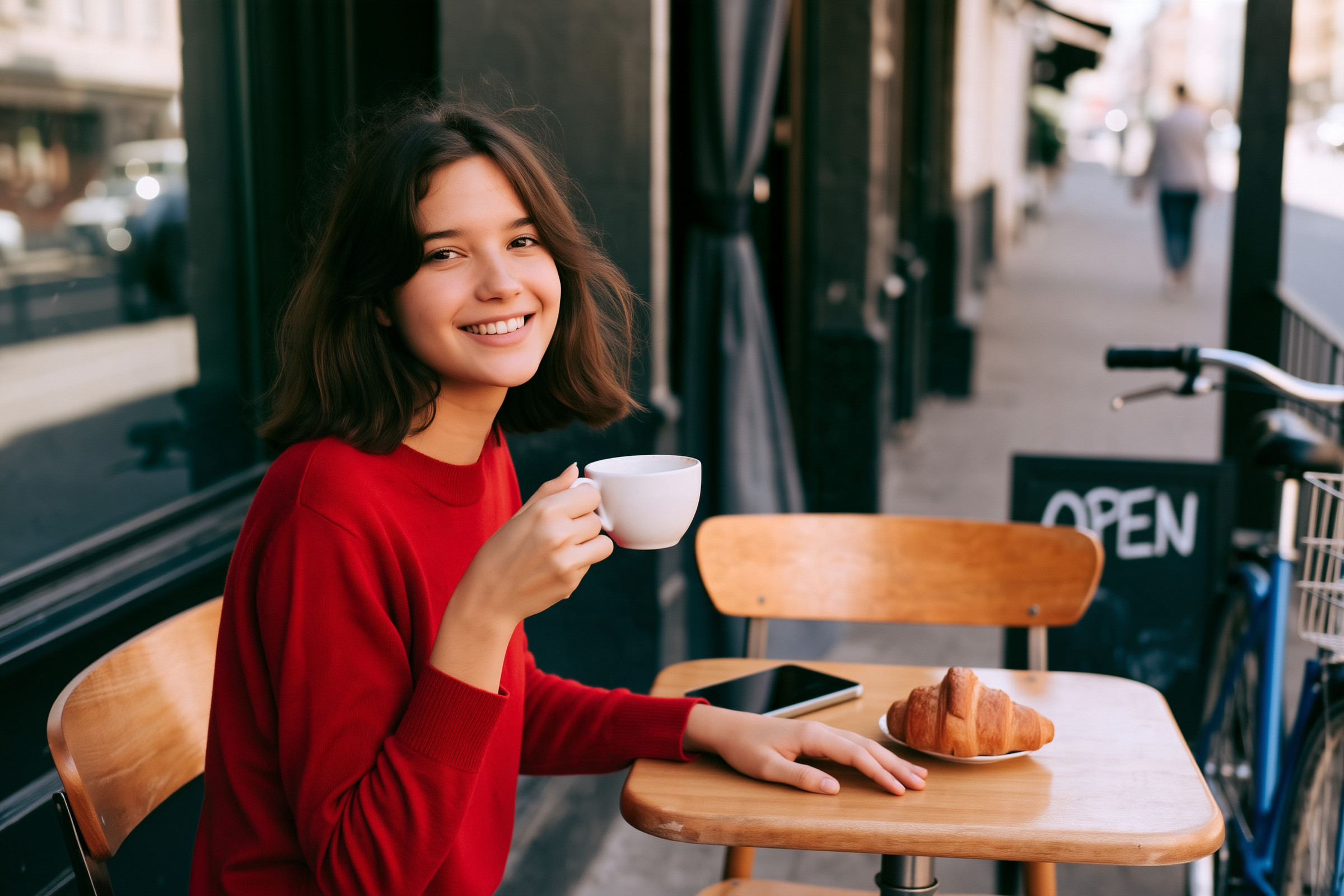
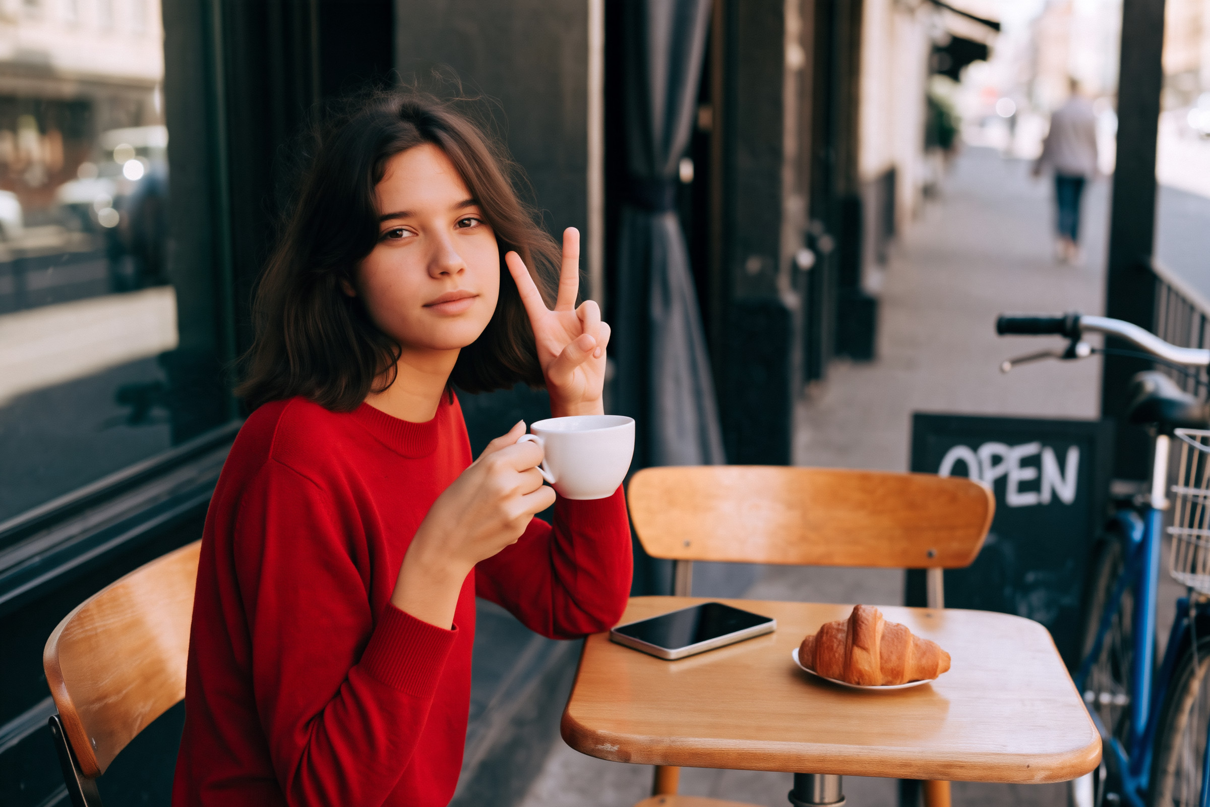
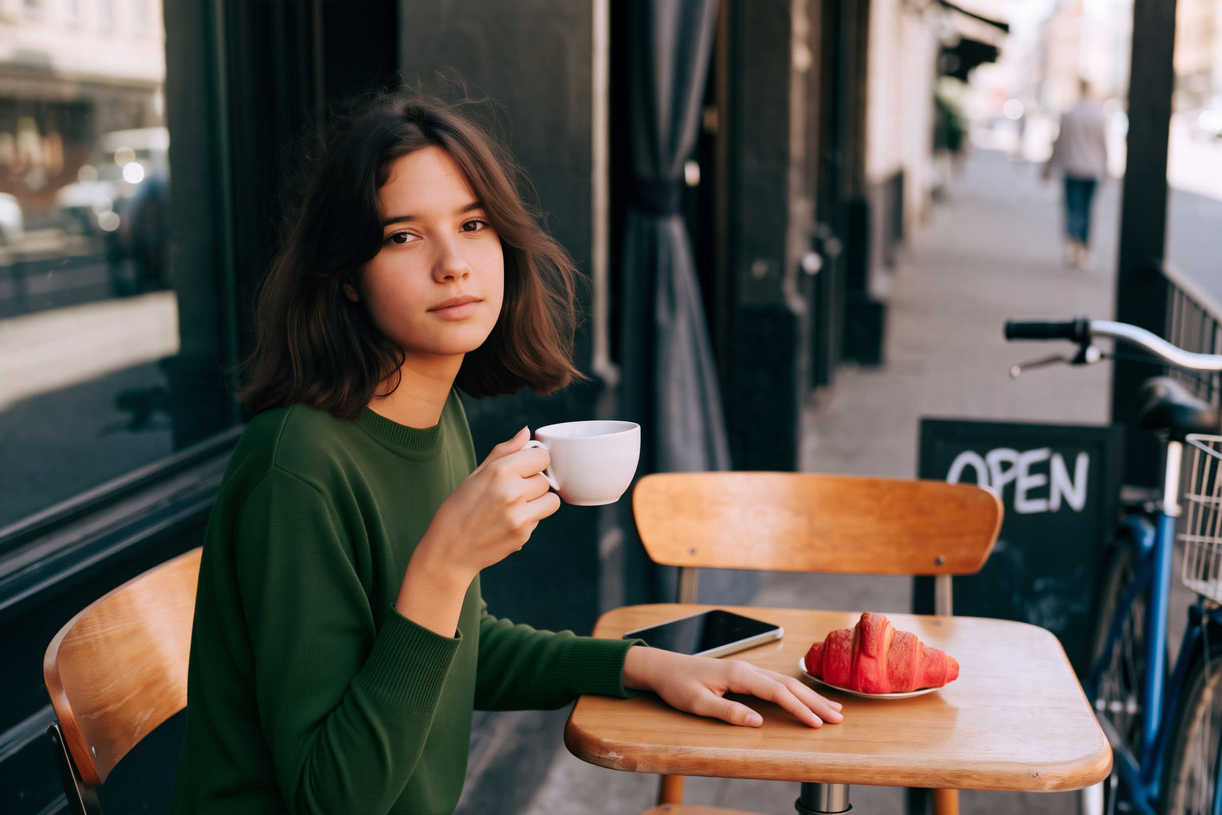
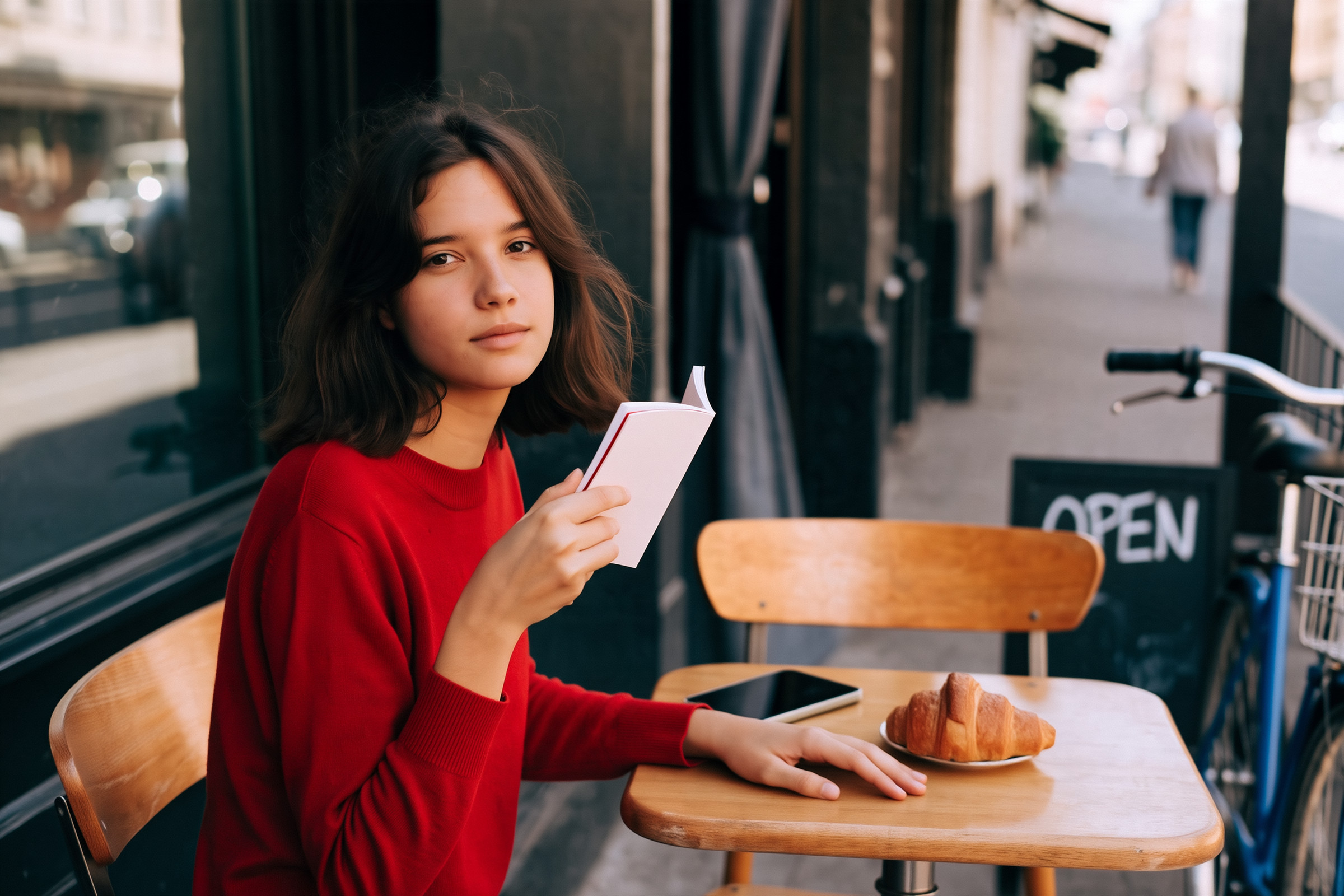
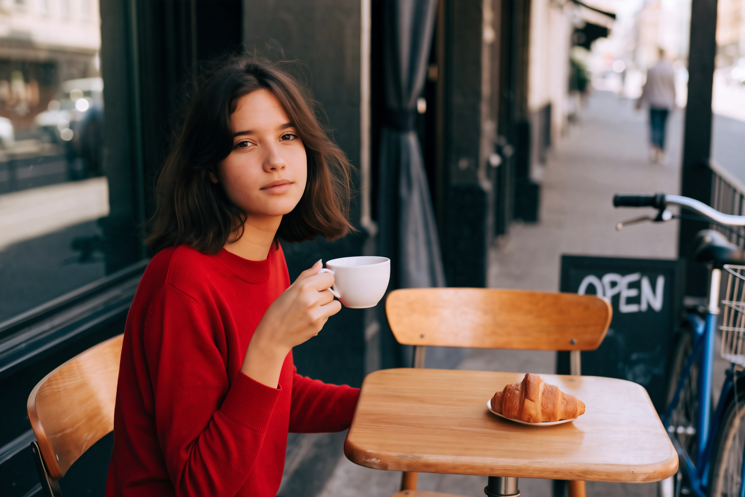
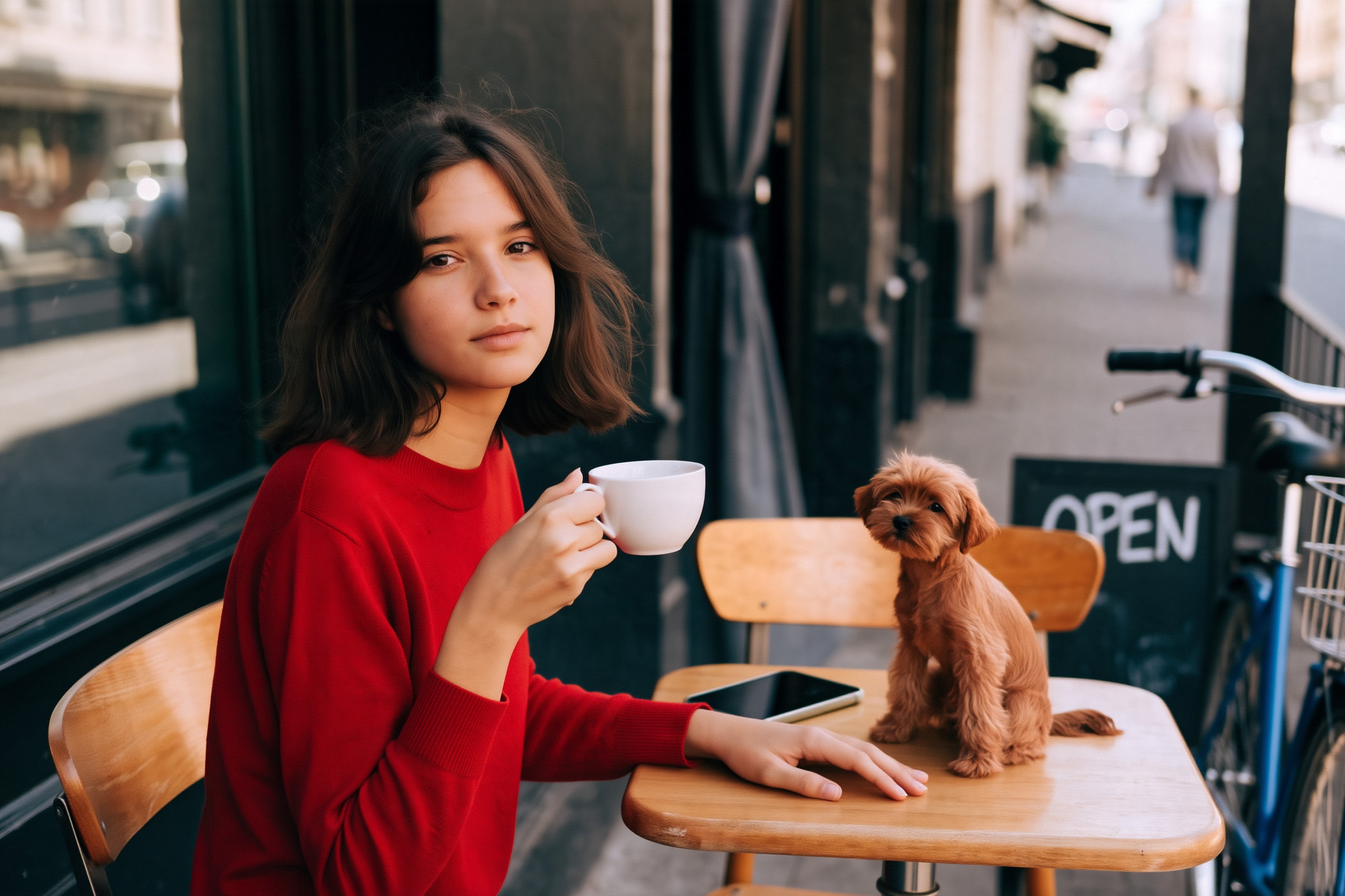
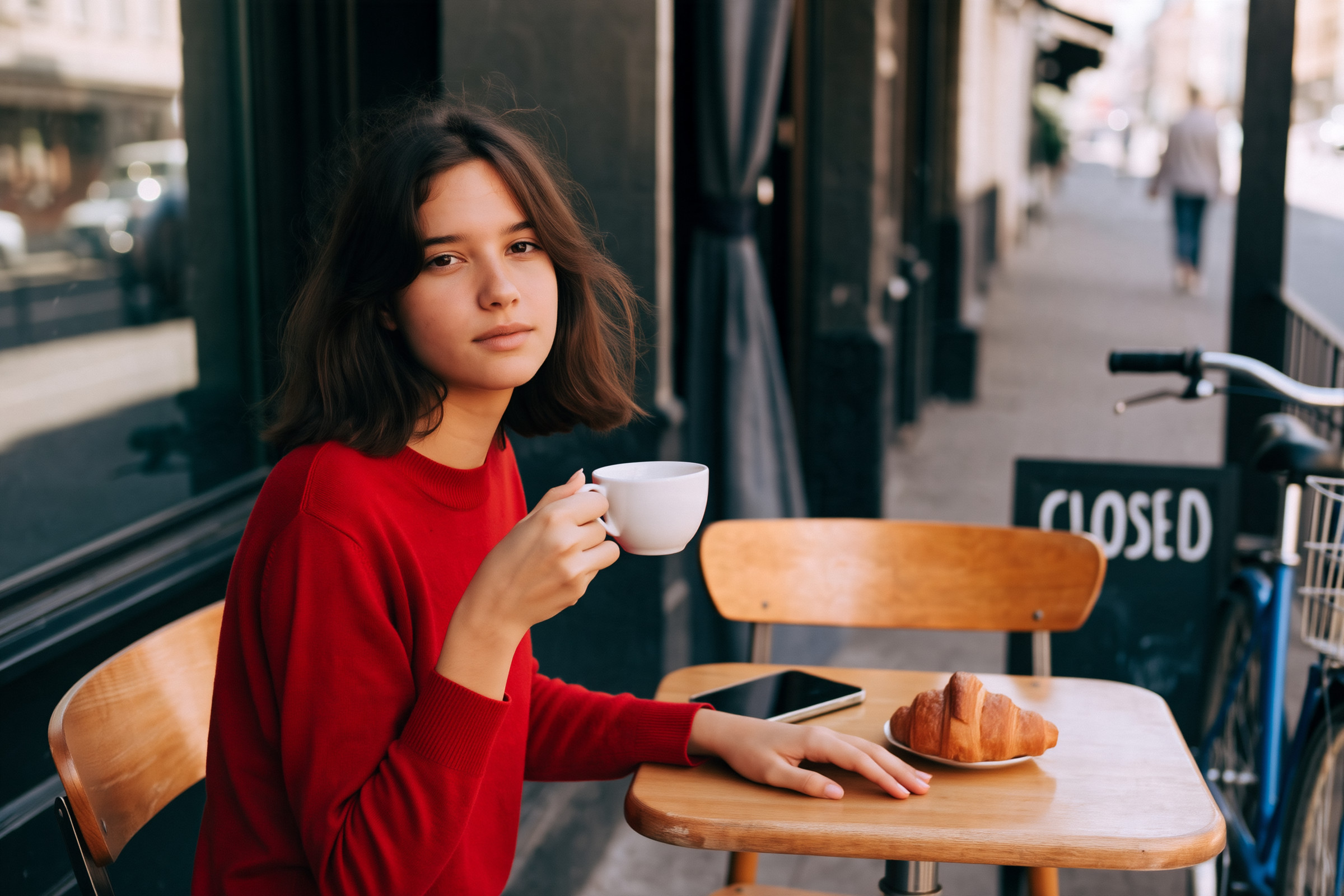
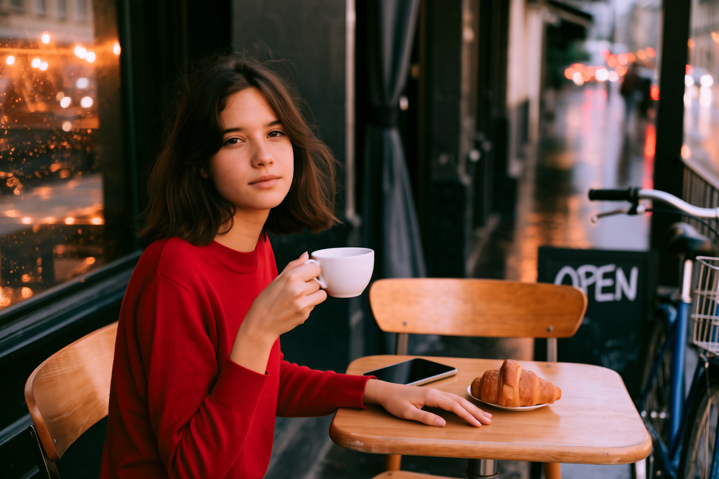
細かいところは見ないであげてください。本当はできる子なんです。バージョン8になって、ここまでできるようになっただけでもものすごく成長してるんです。自由にやらせてあげてください
Grok Imagine 2.0

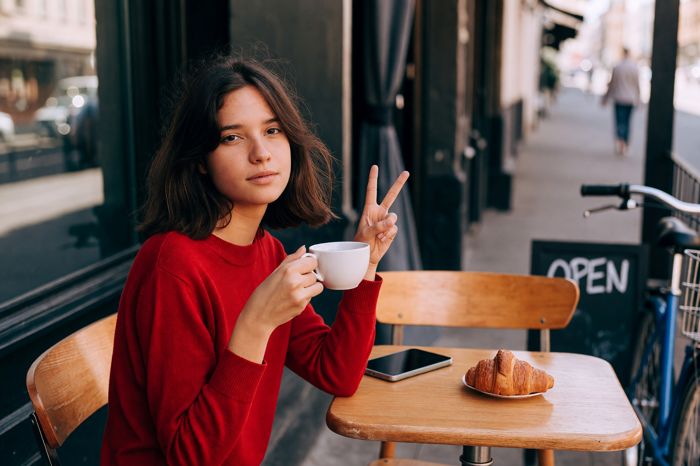
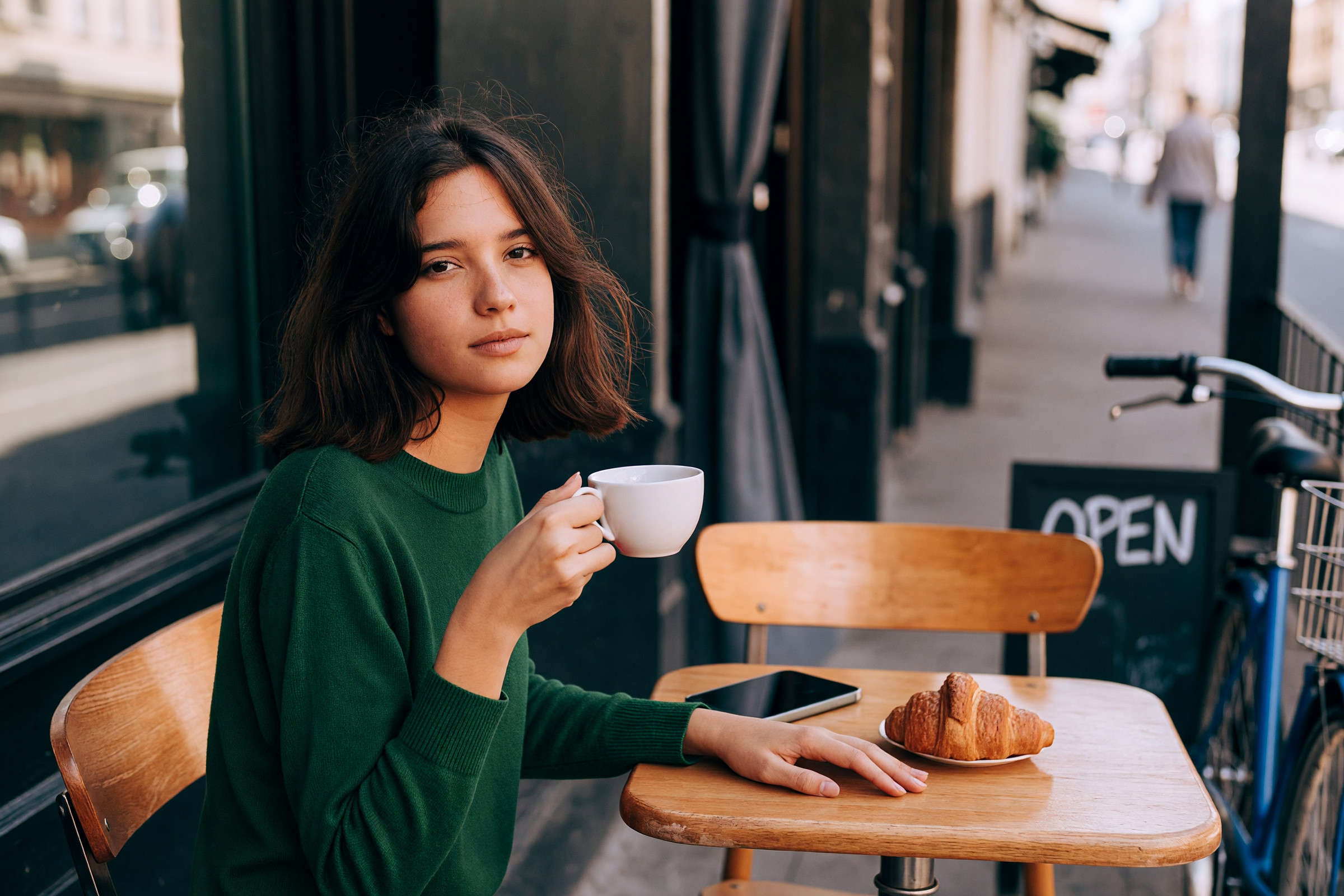
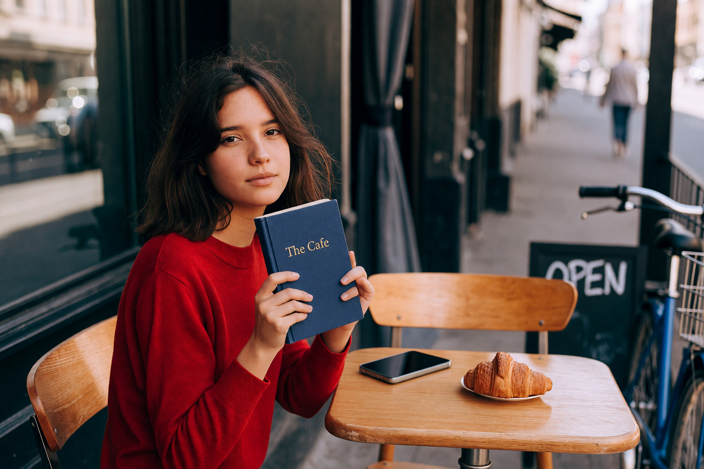
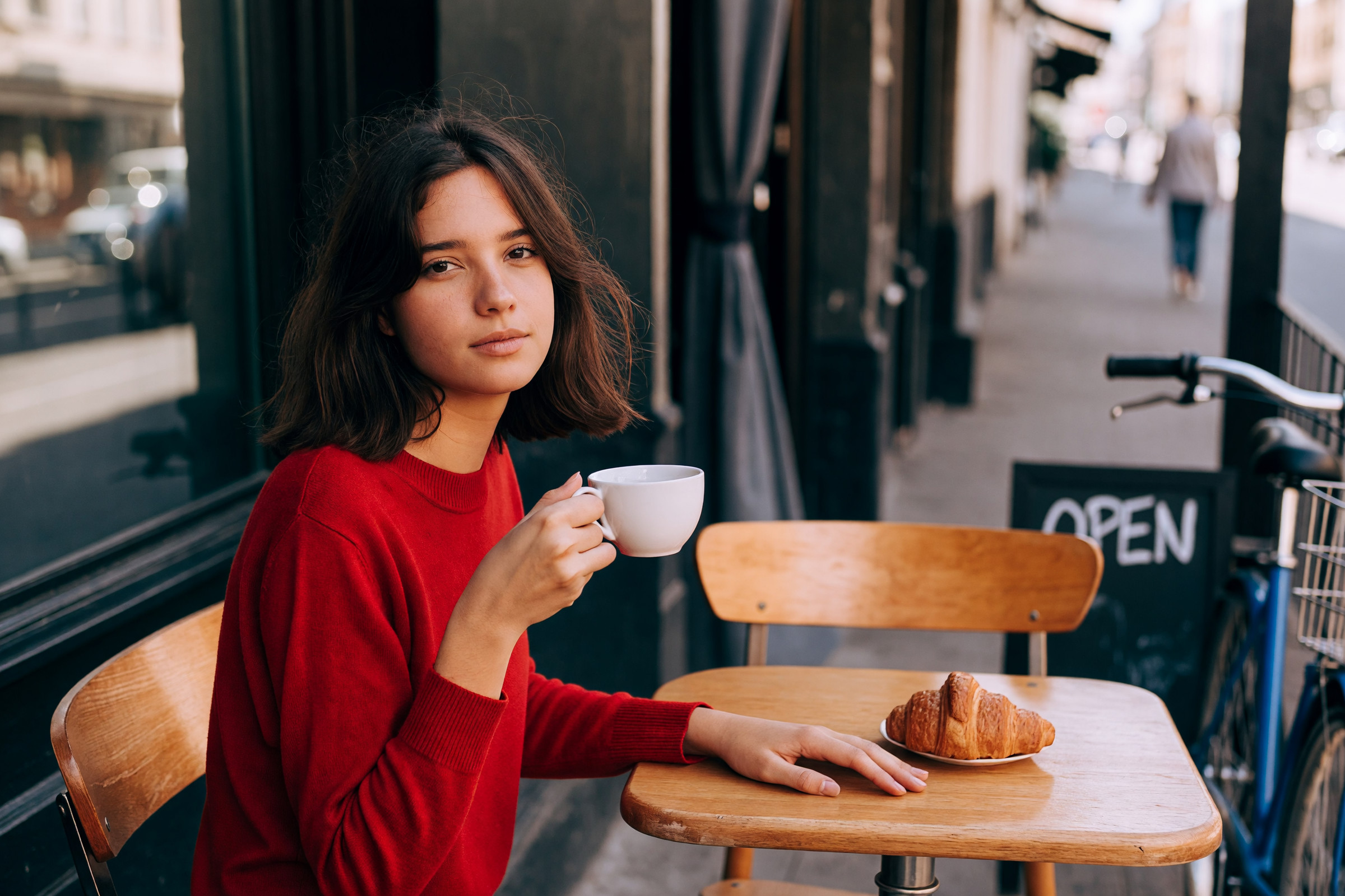
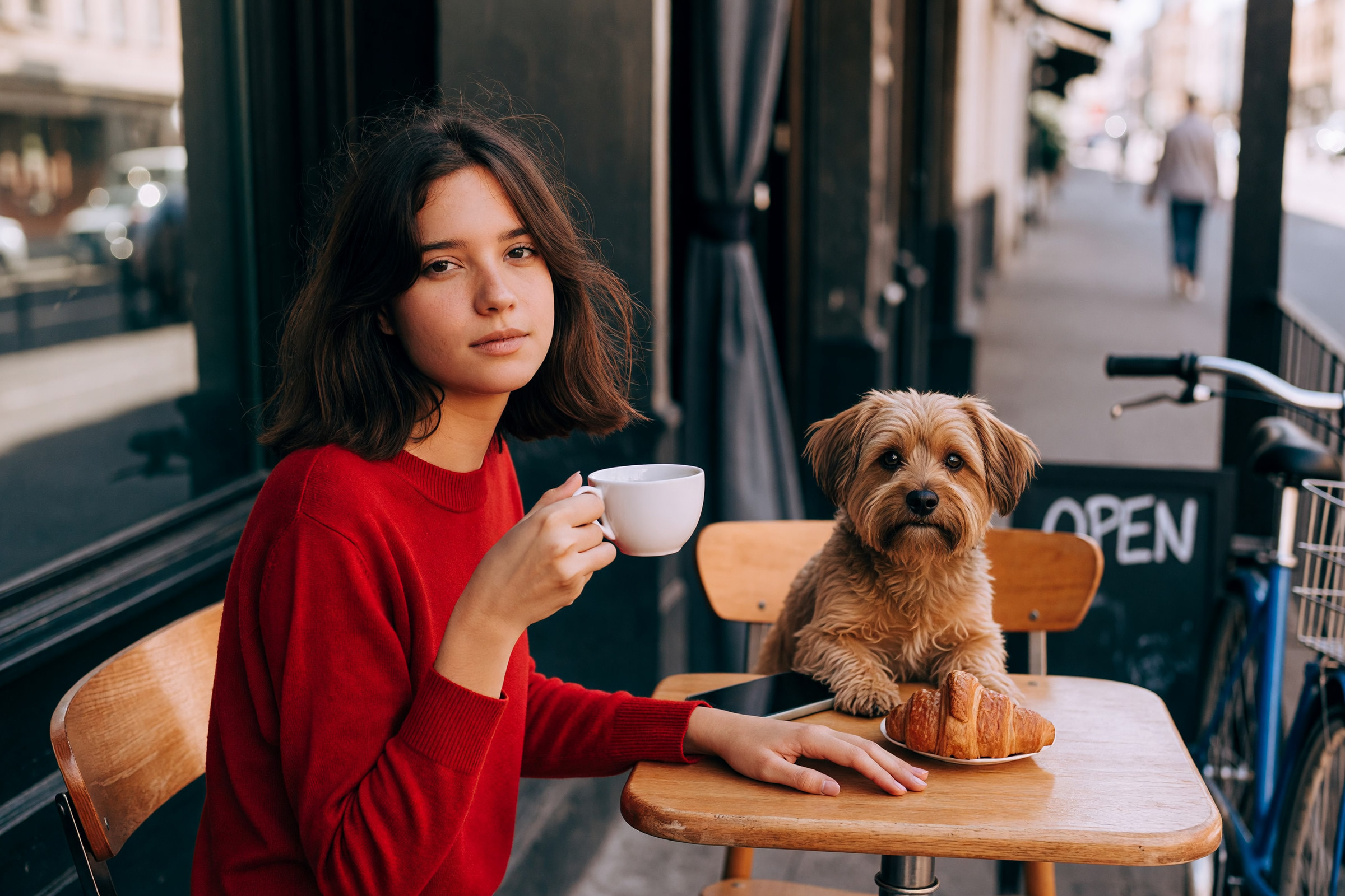
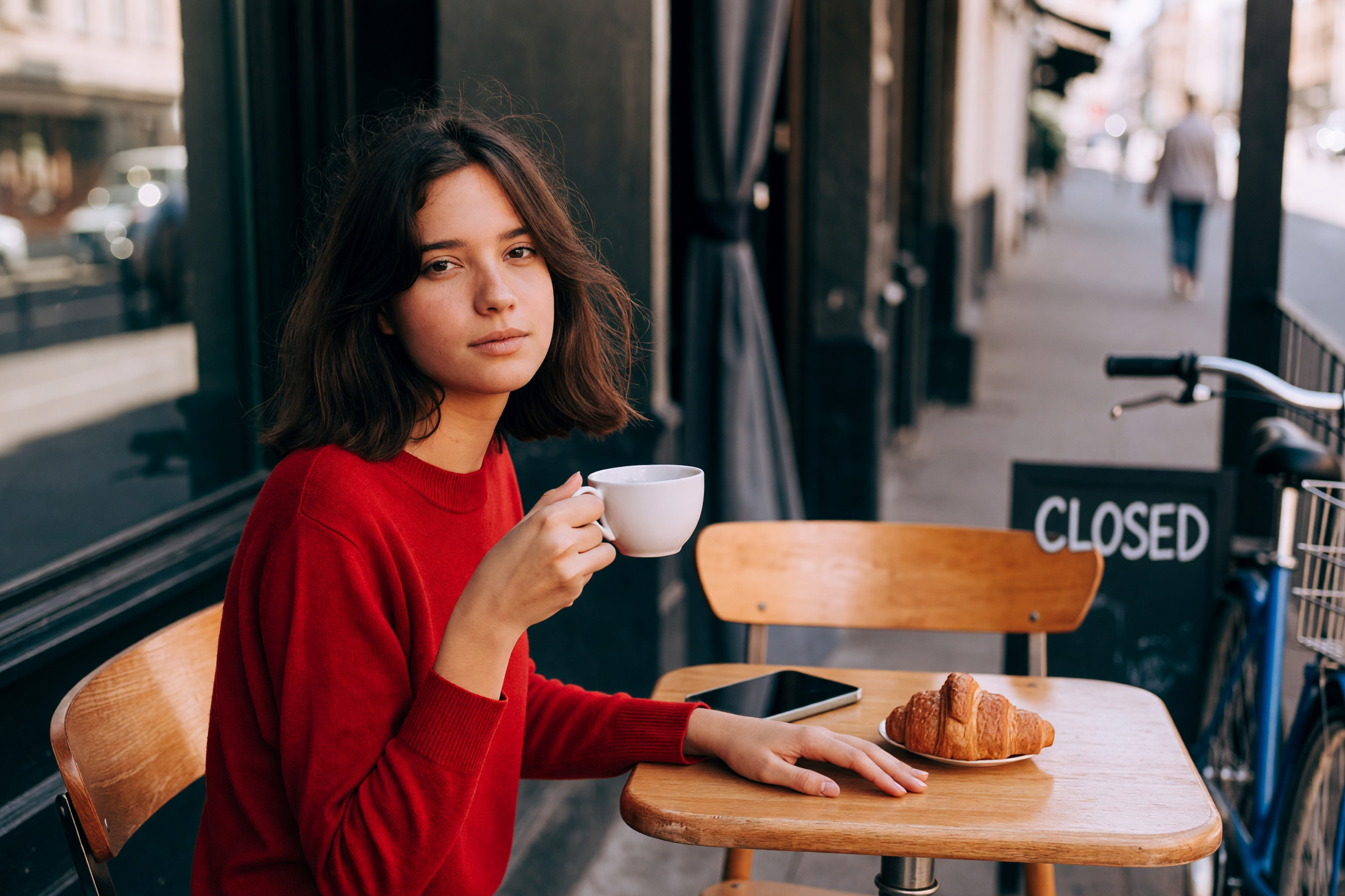
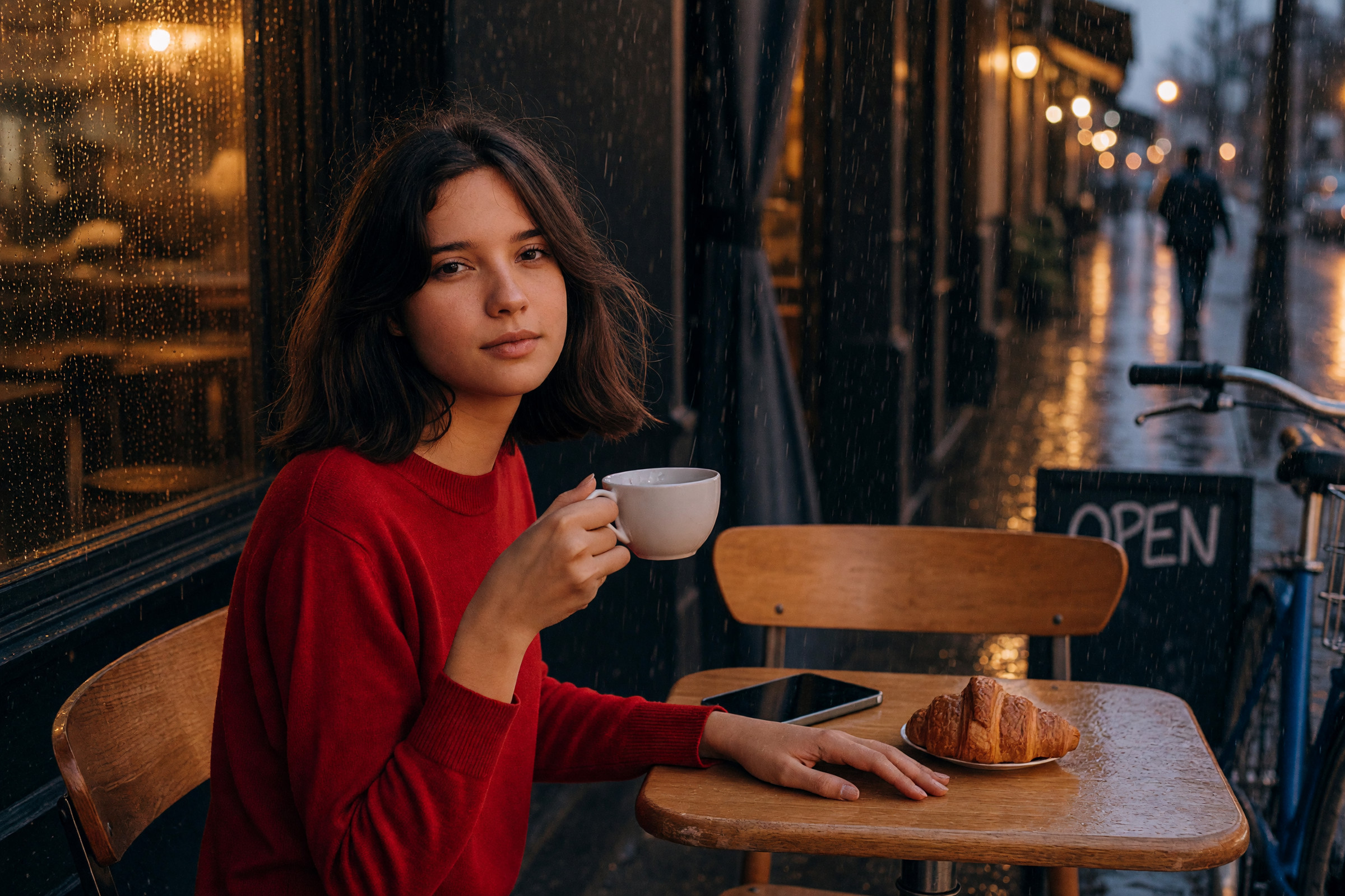
やっぱり、結構やる子ですよね。Grok。犬の感じは一番いい気がします。夜の感じも悪くない
Seedream 5.0 Pro
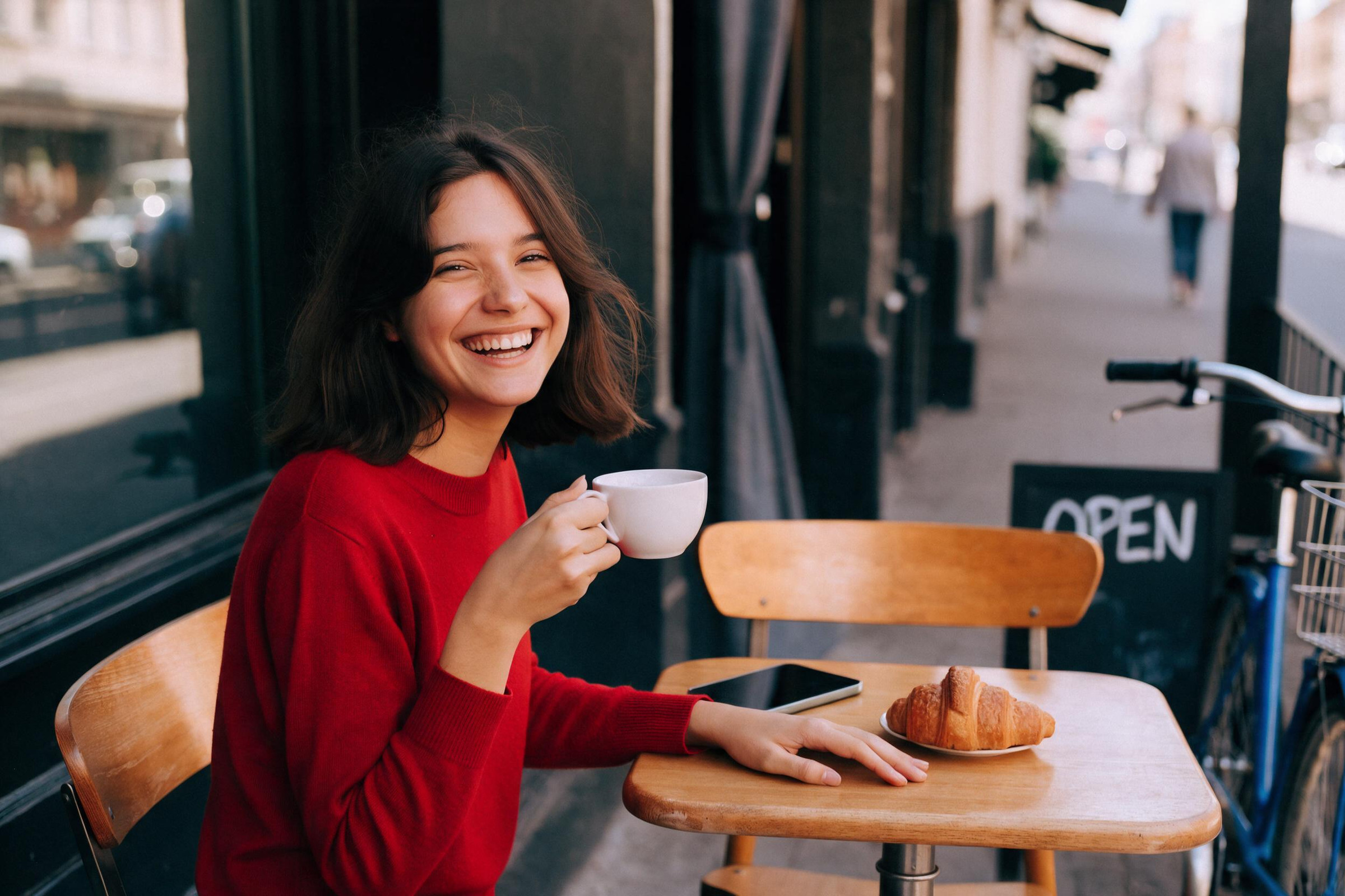
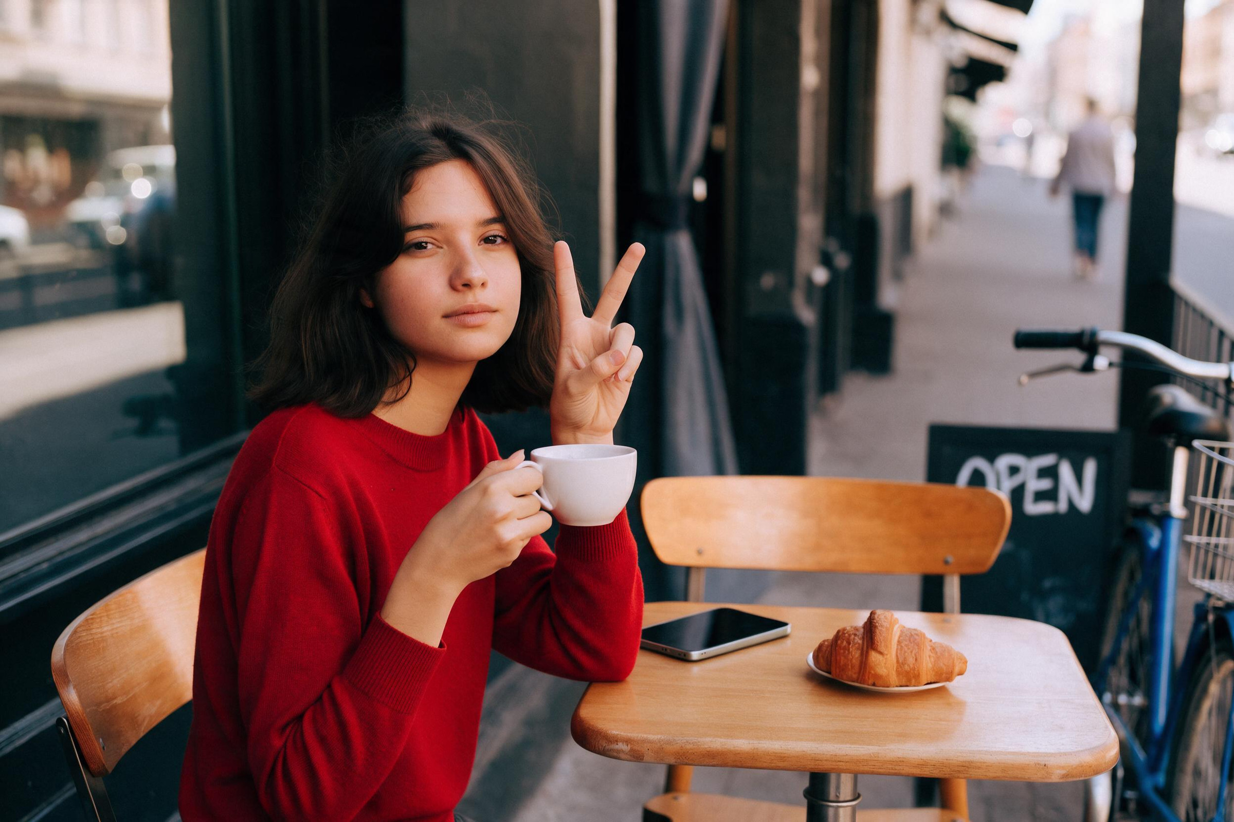
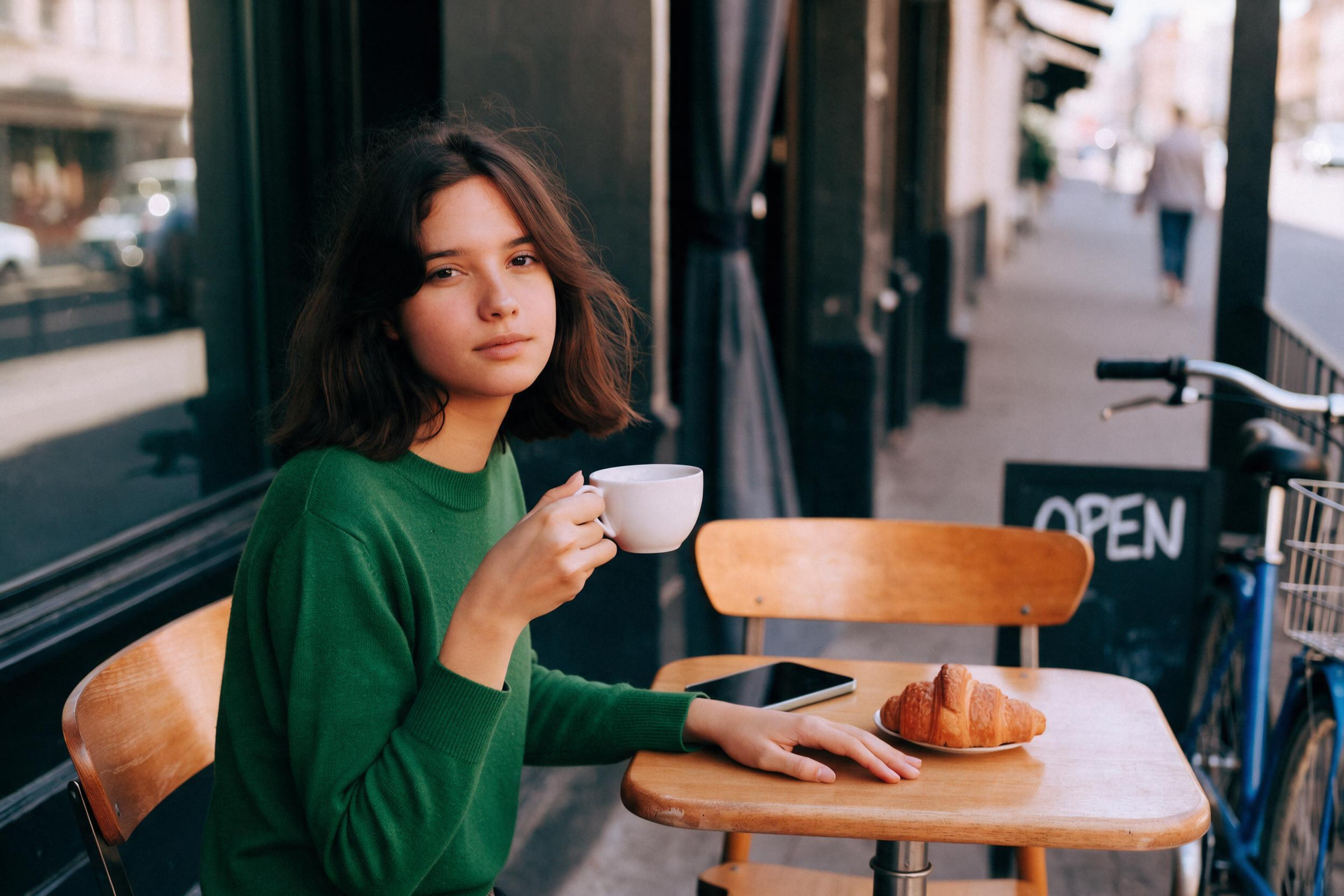
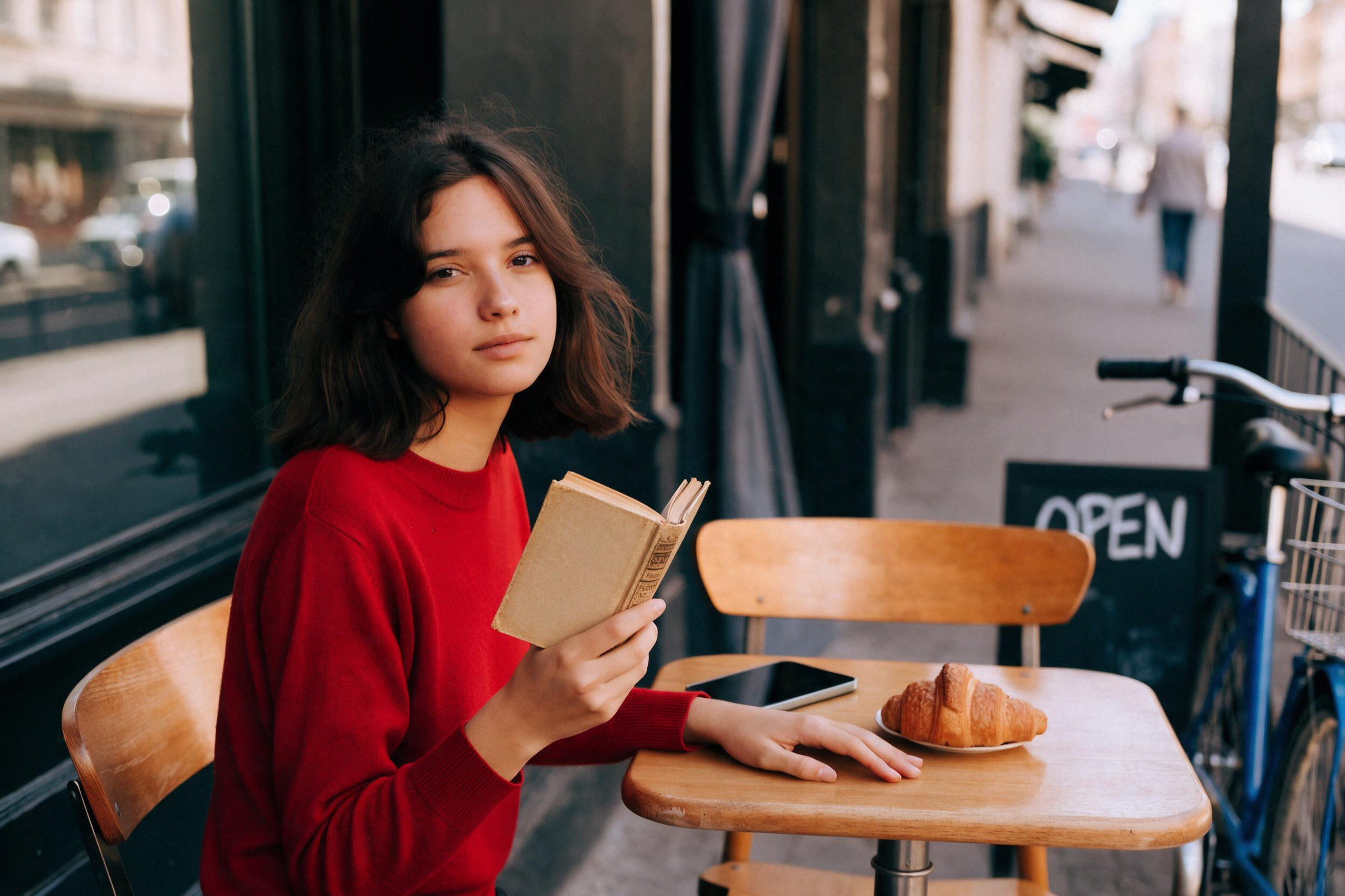
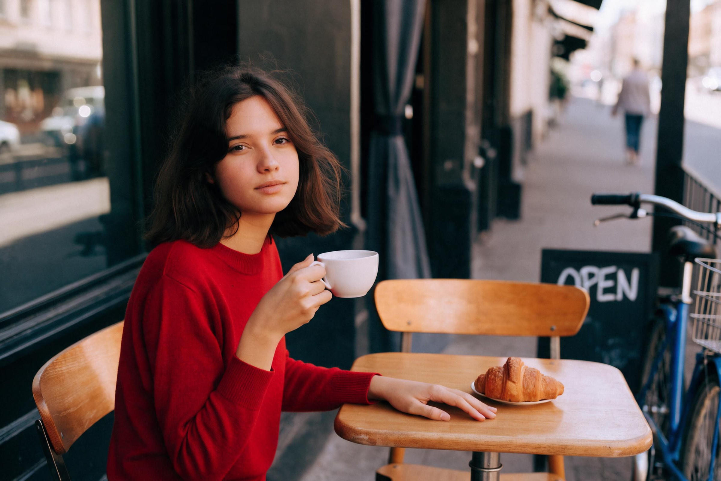
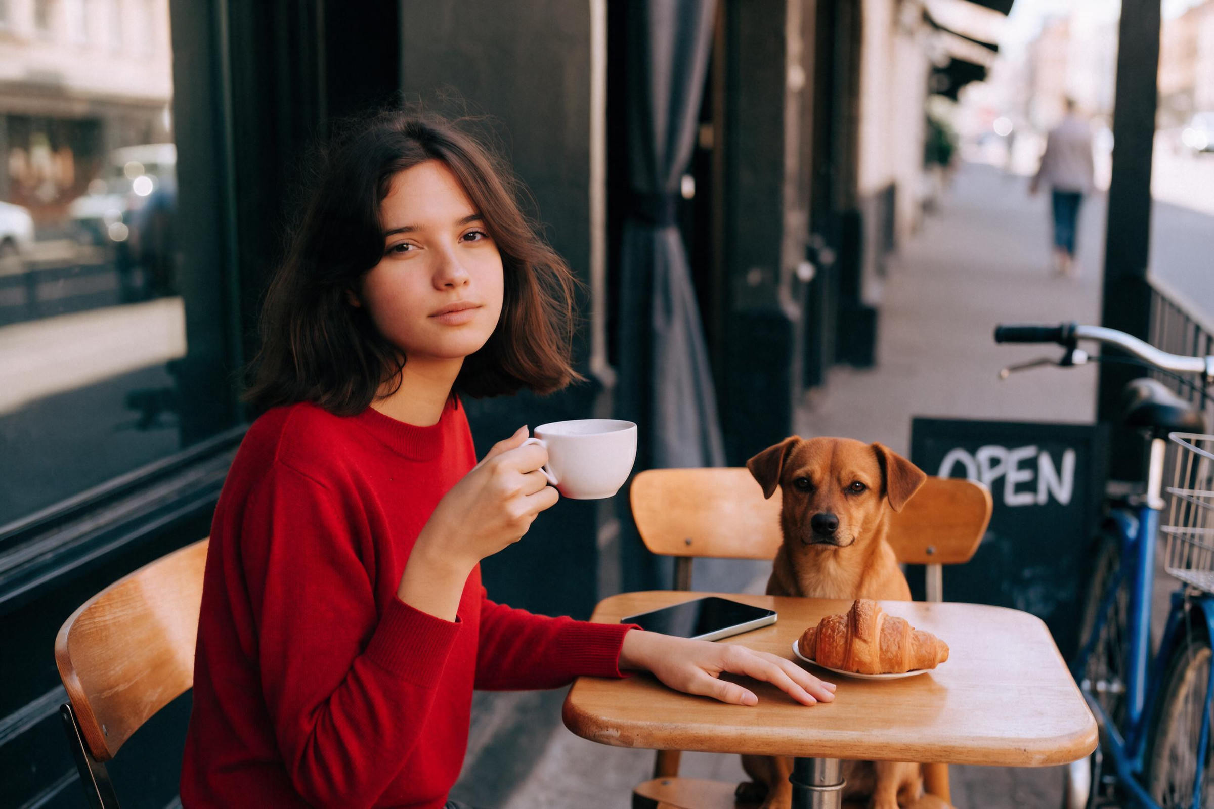
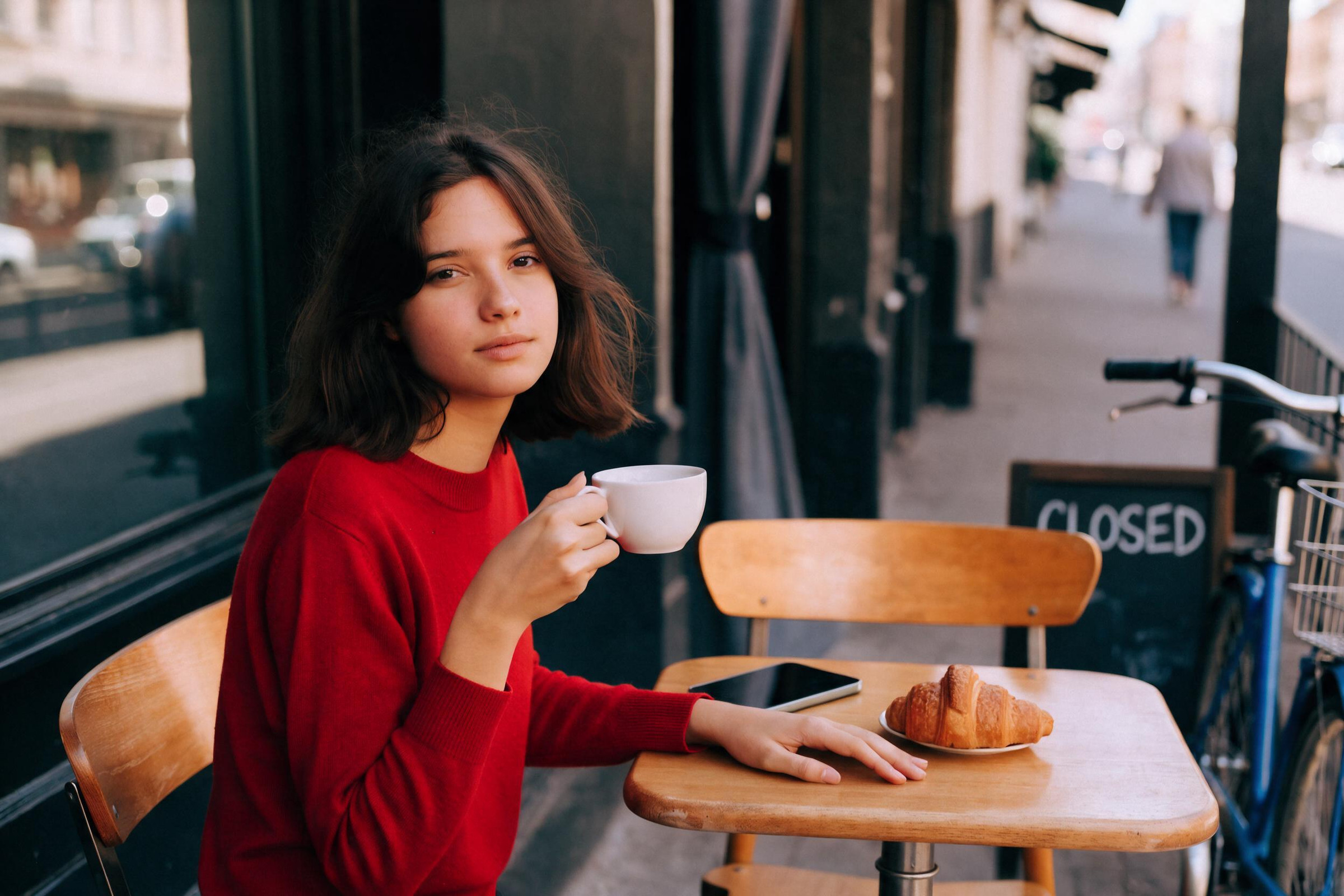
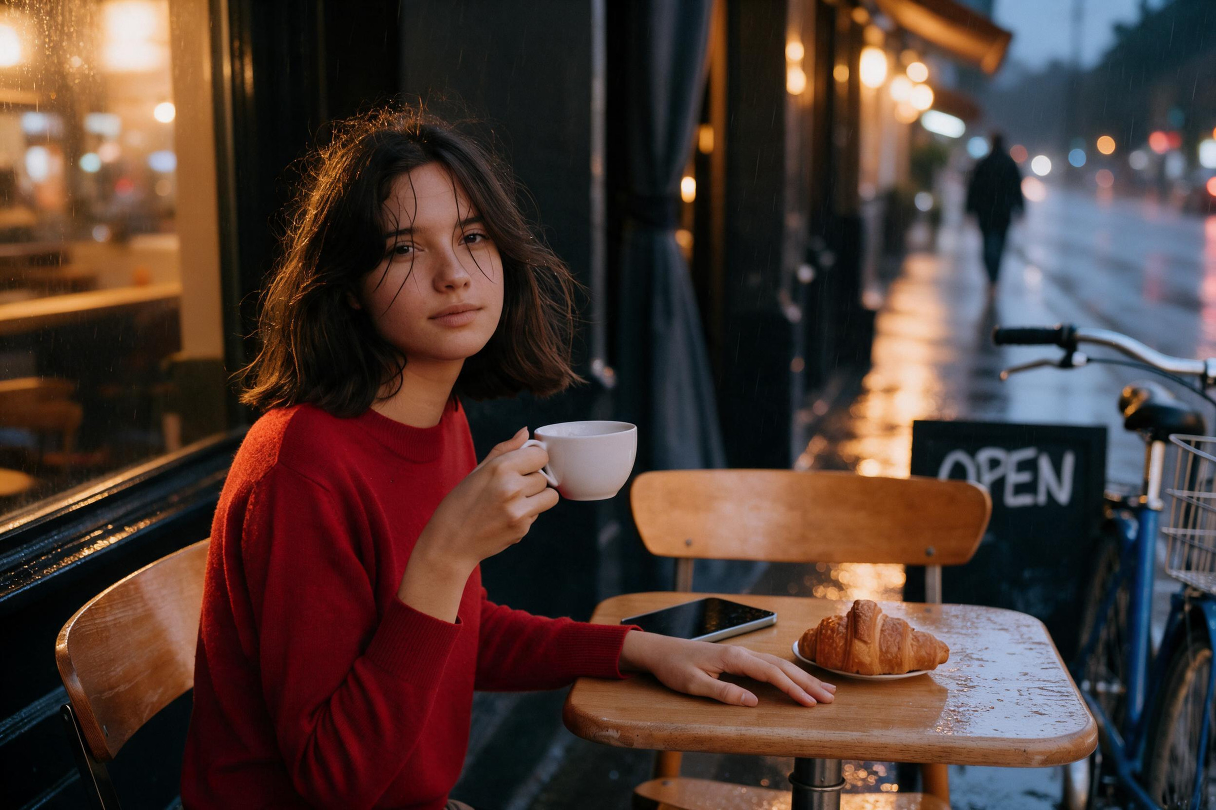
かなり優秀な結果になりました。Seedream。ダメなパターンないんじゃないですかね? 細かく言えば服を緑にした時にカップの映り込みまではきが回ってないことでしょうか。でもそれはこちらが再度指示すれば良いことのような気がします
FLUX 3
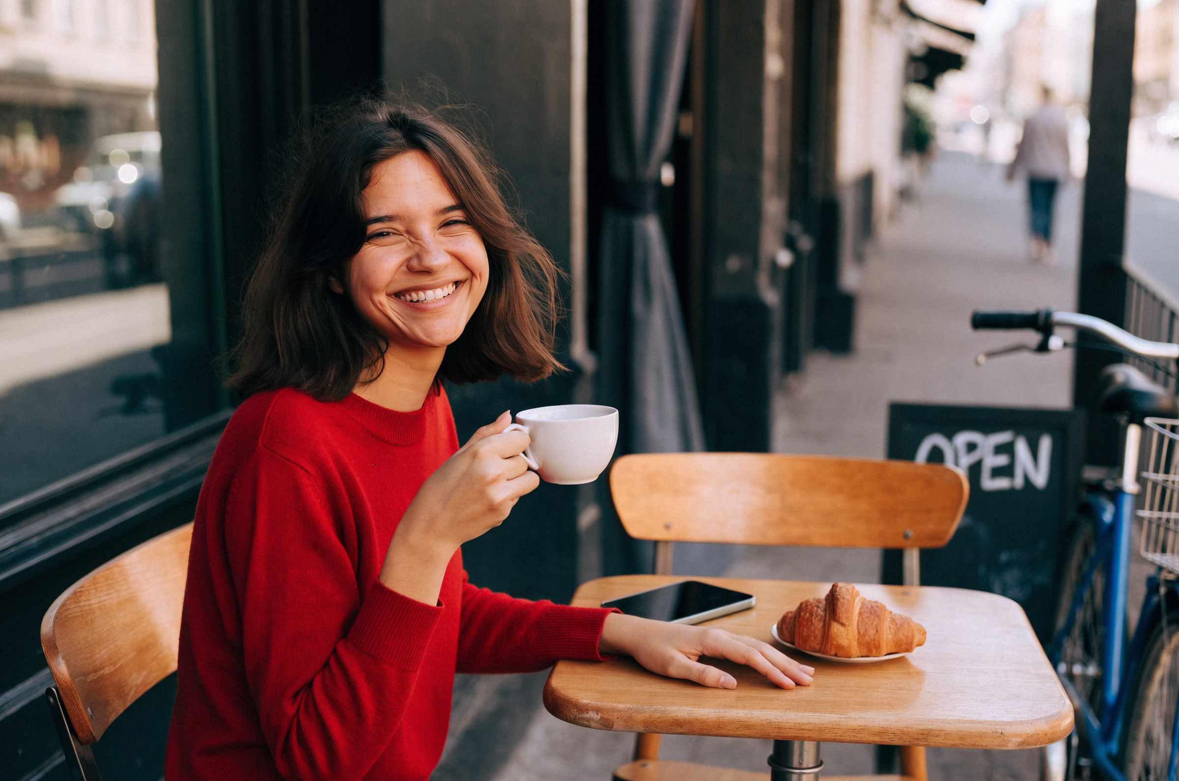
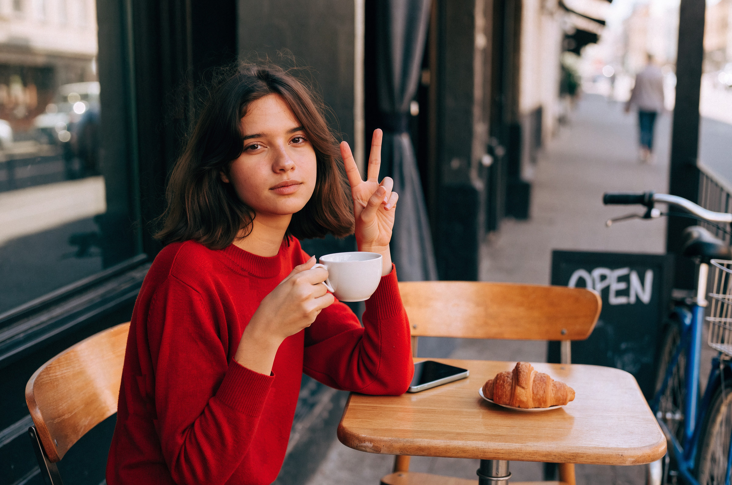
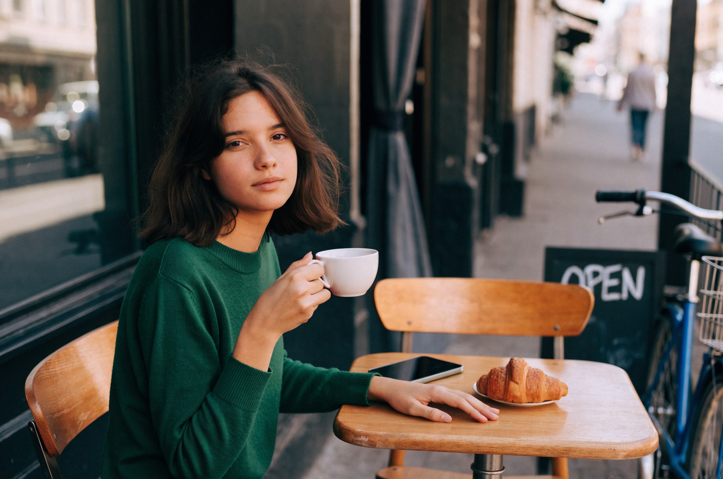
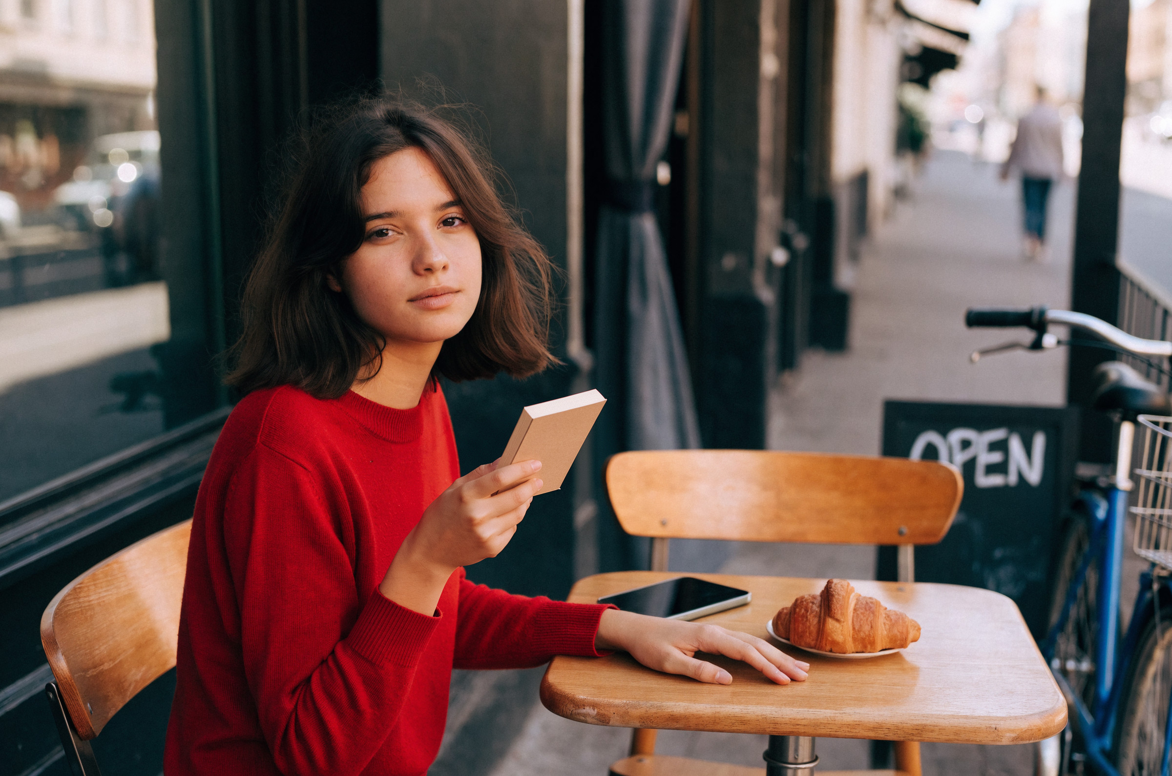
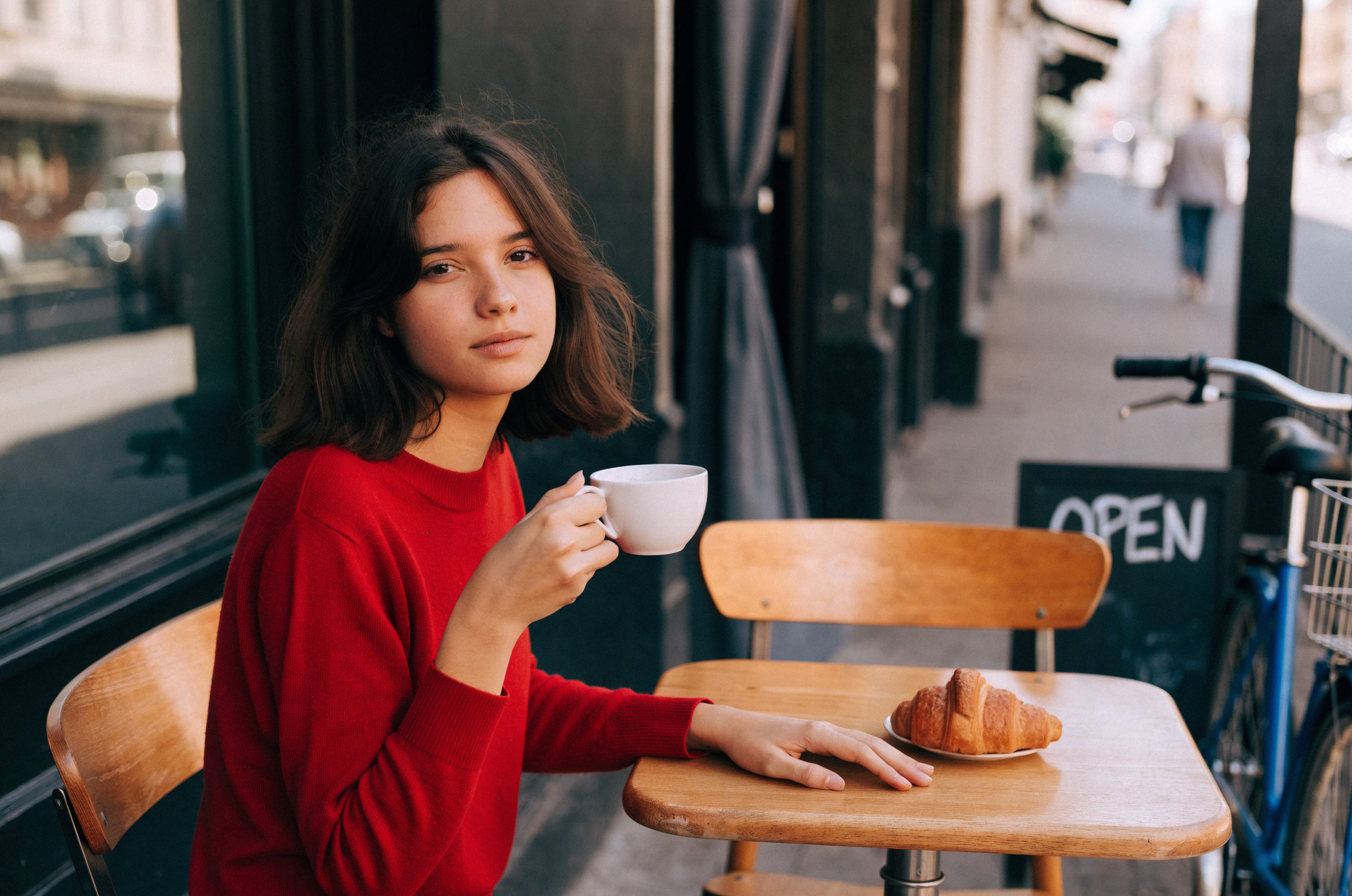
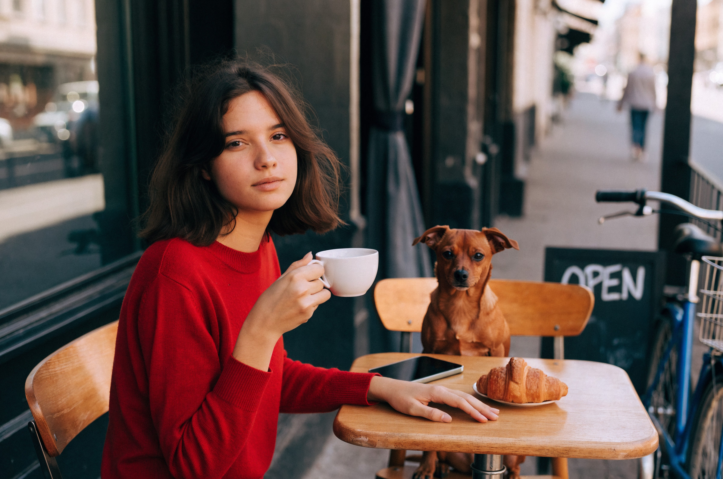
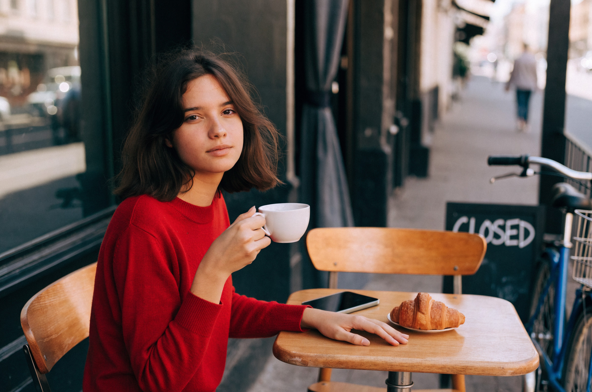
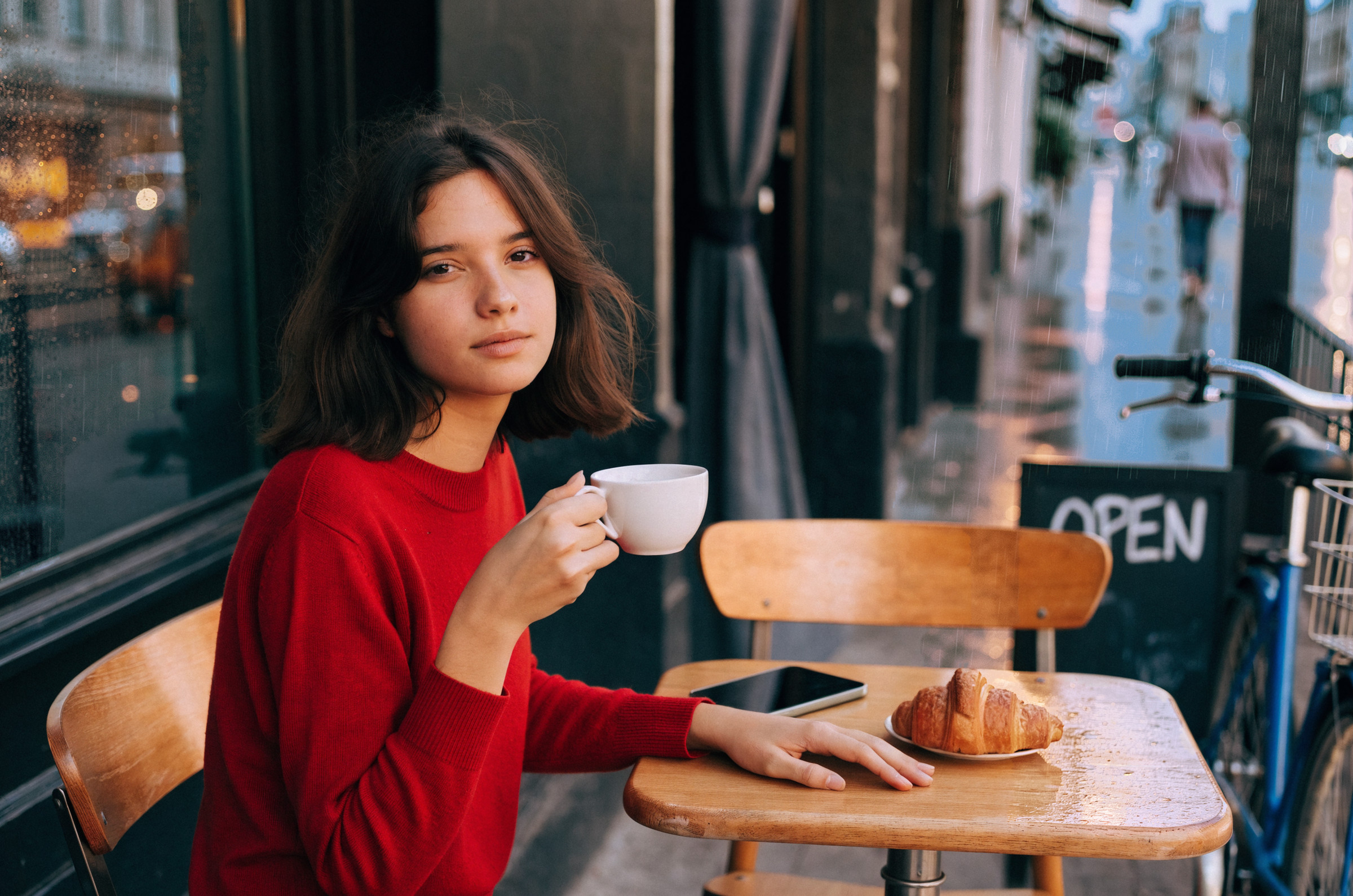
FLUXも優秀な結果となりました。ちょっと本の待ち変えが不自然かな? っていうくらいですかね
Kling Image 3.0 Omni
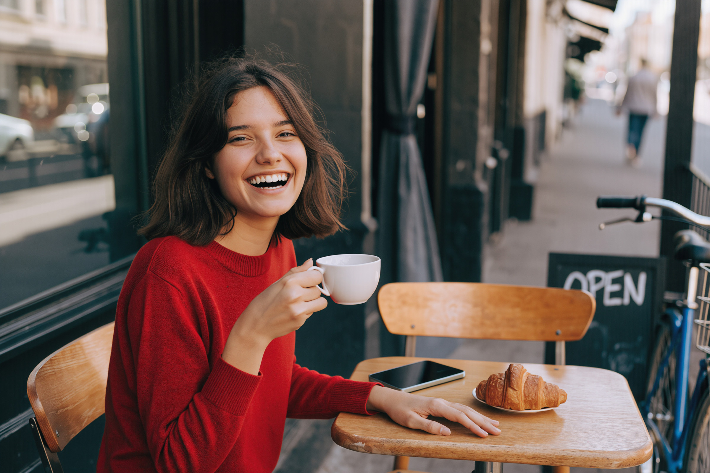
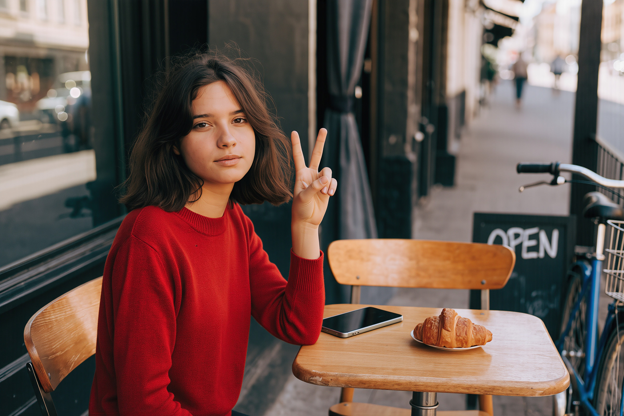
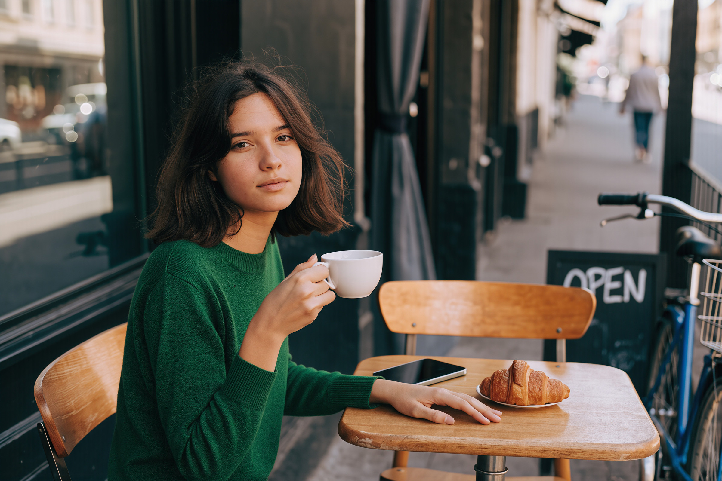
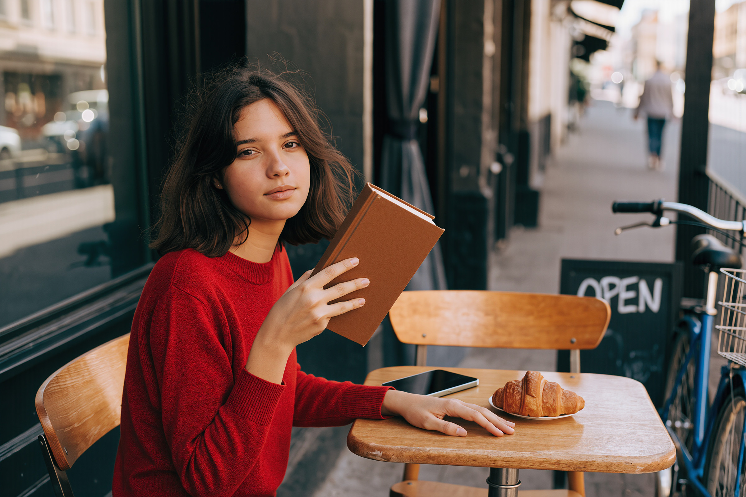
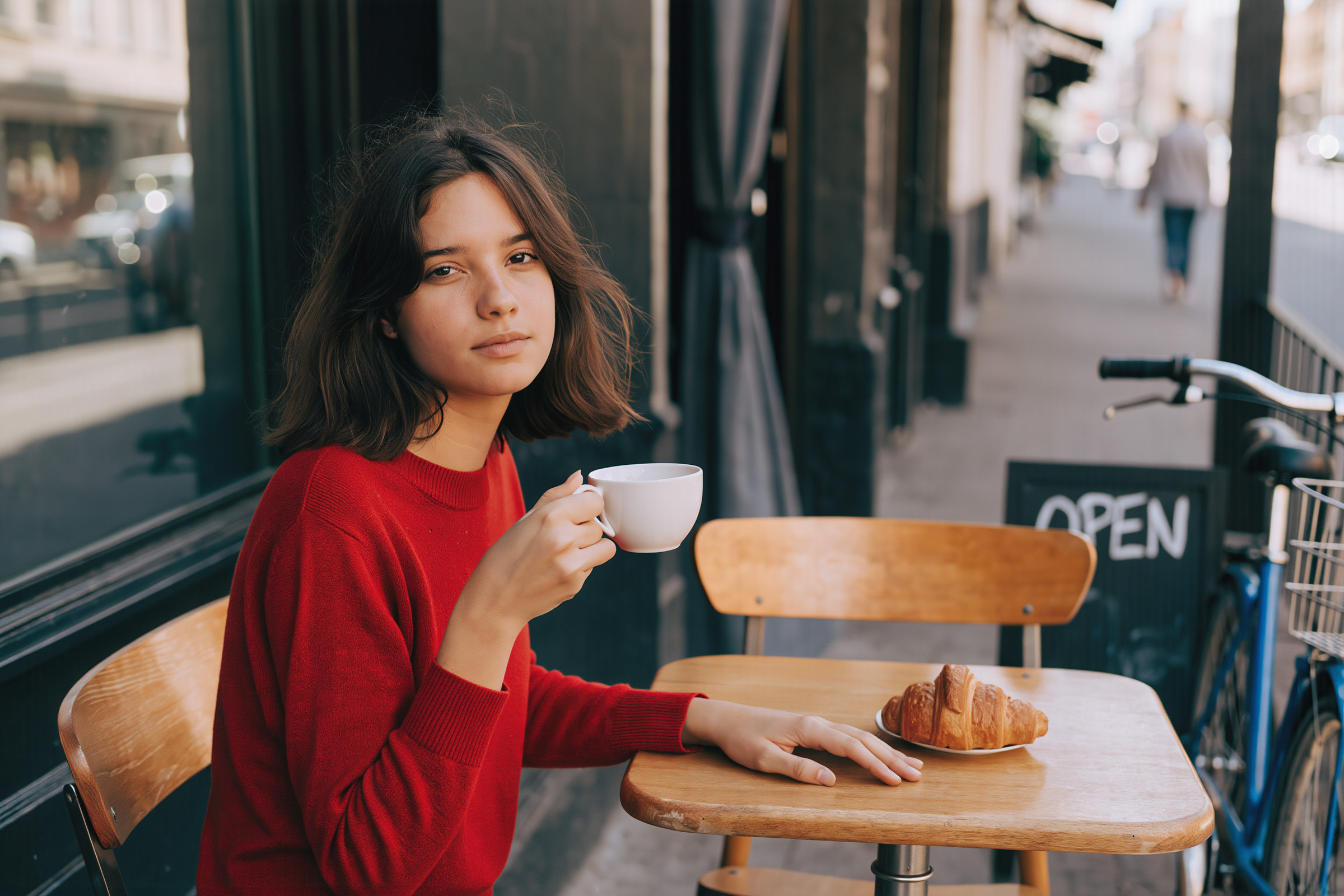
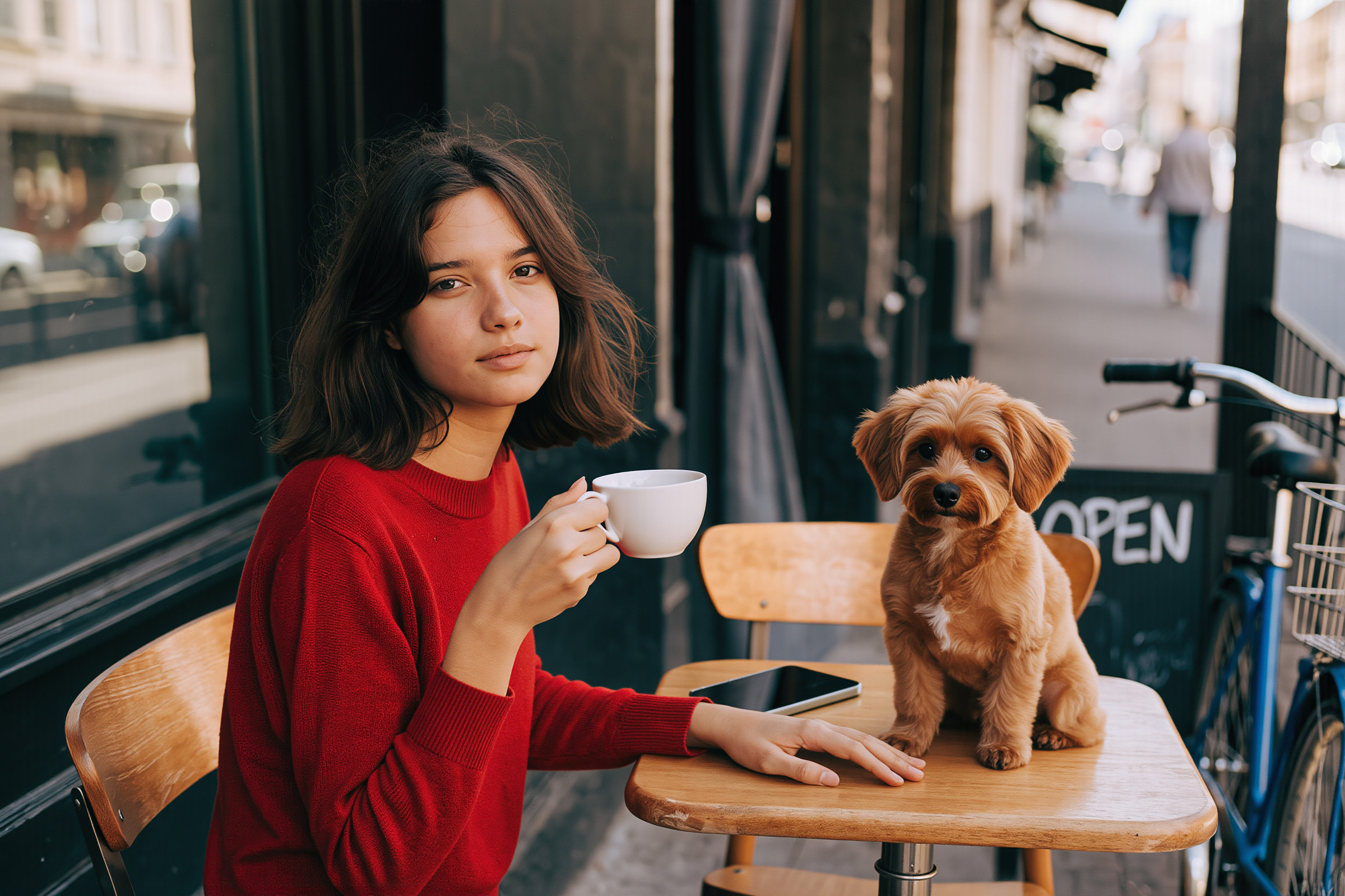
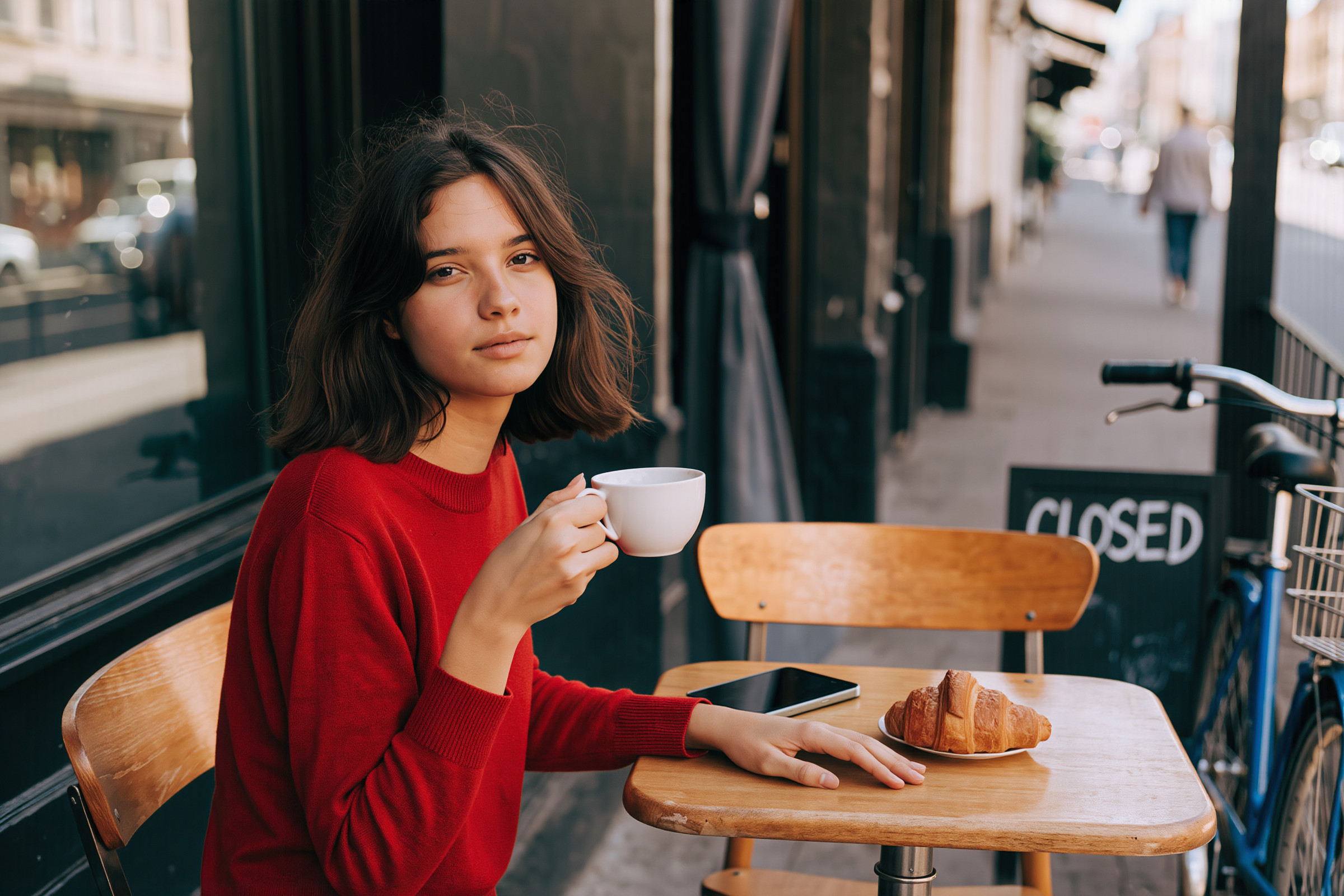
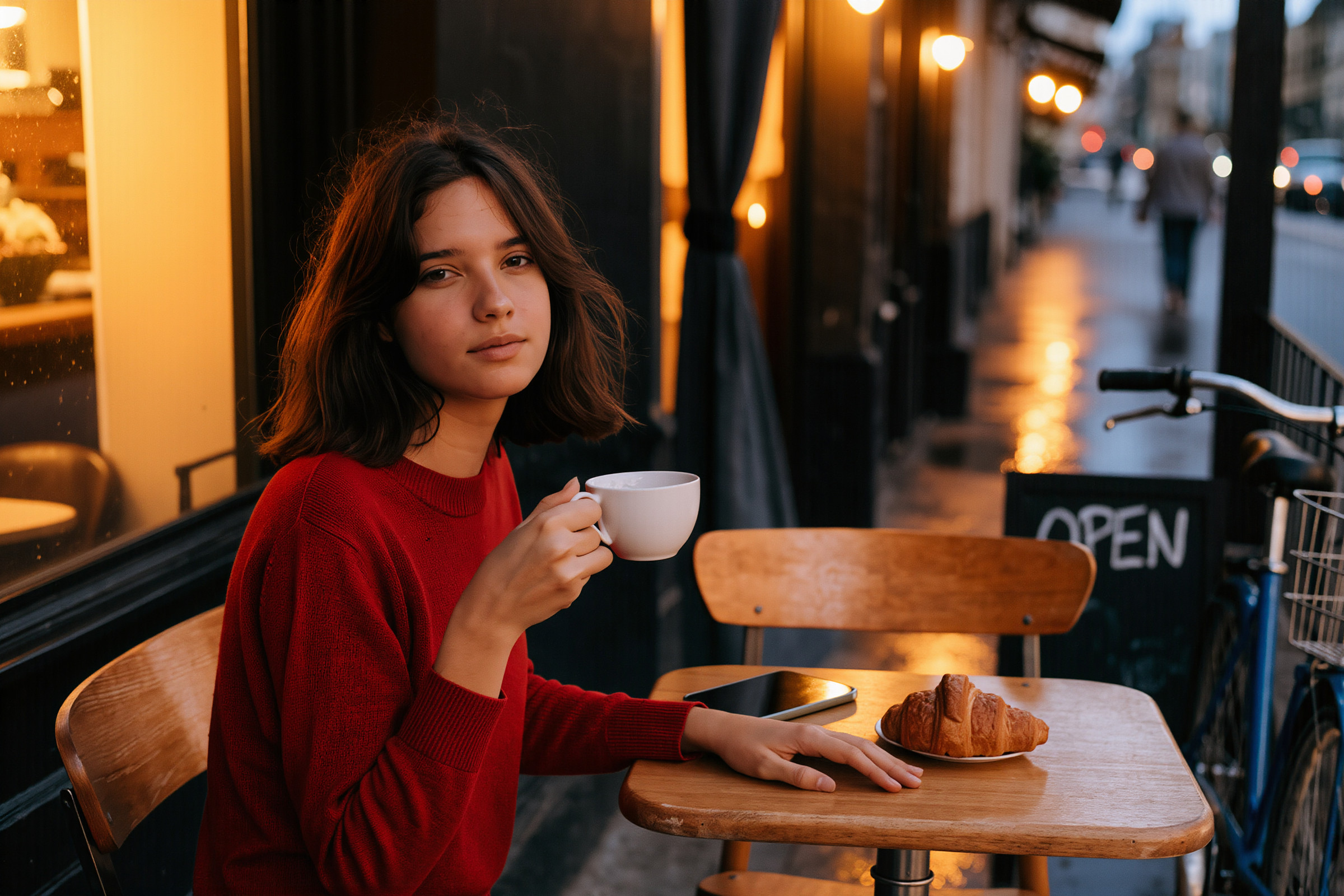
クロワッサンが犬に!? 他にもちょっと怪しいところがありますが、夜の雰囲気は良いですね
Ideogram 4.5
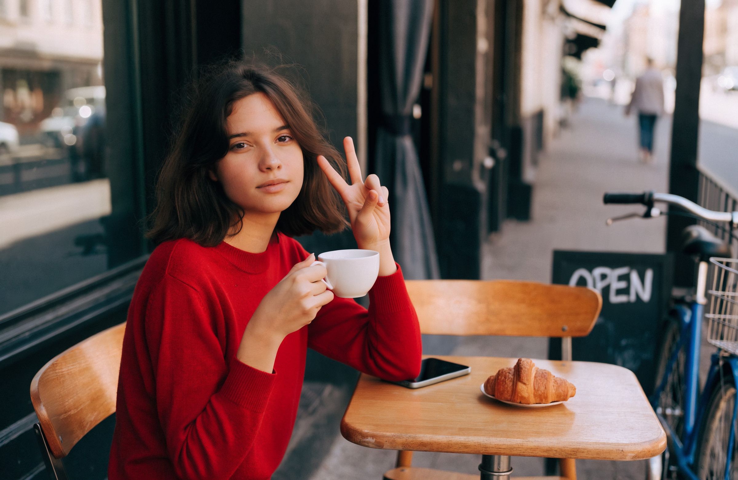
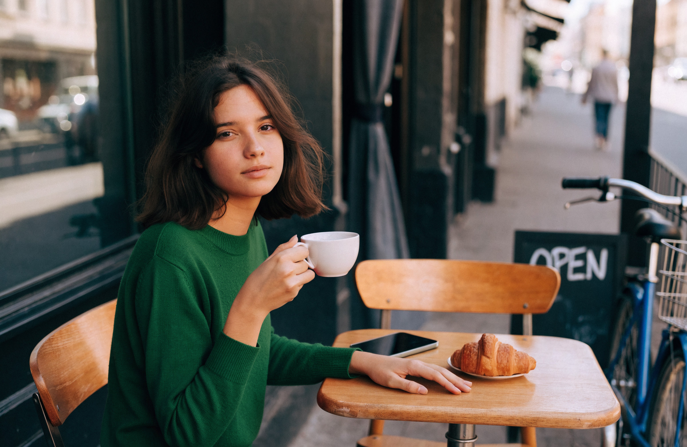
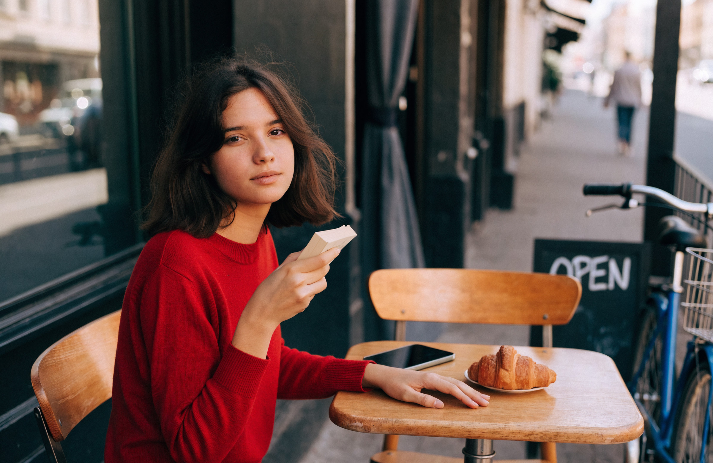
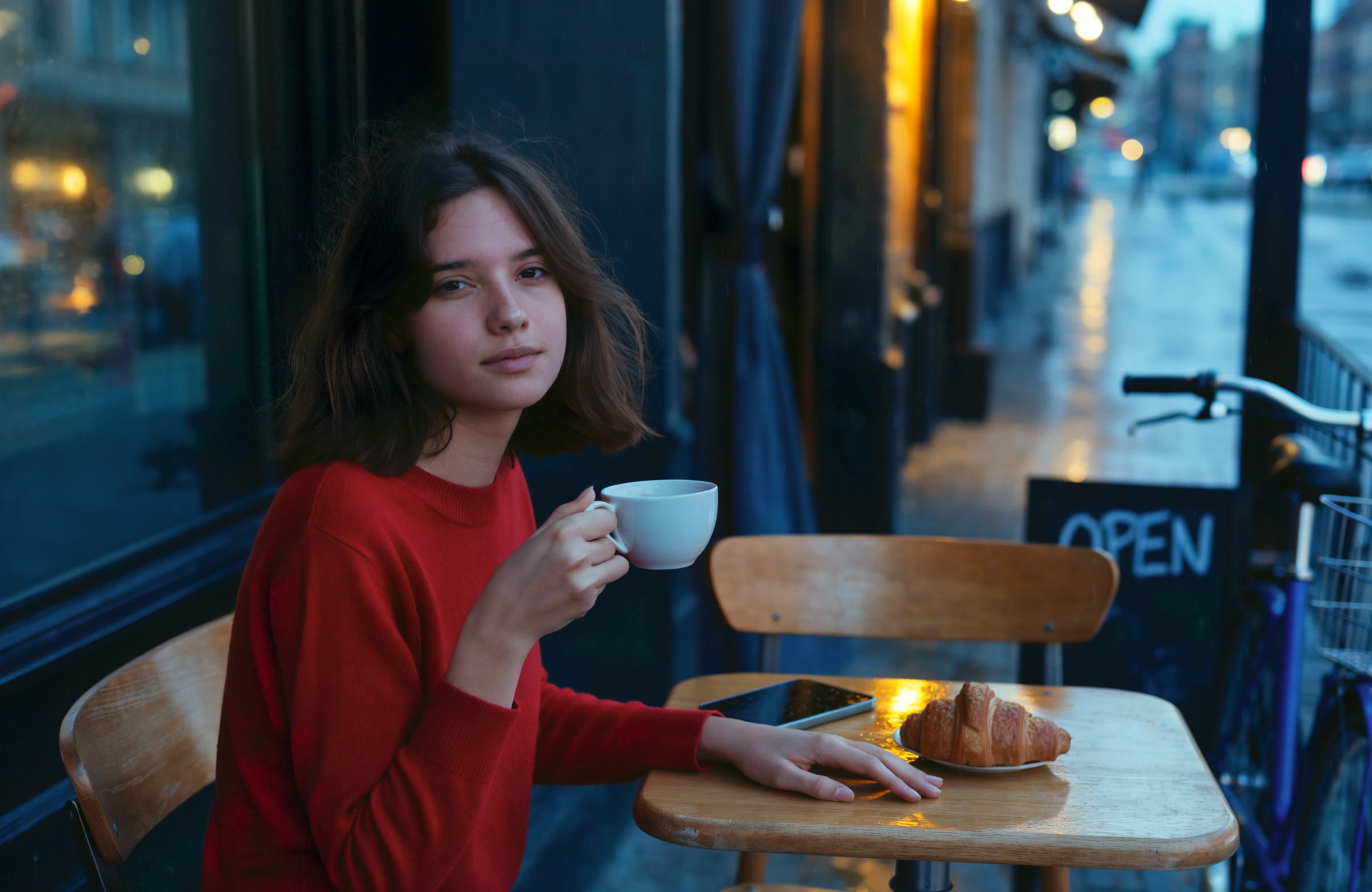
Ideogramも本への持ち替えとかがちょっと不自然に見えますが、夜の色の出し方とか良いですね
この記事のサムネイルも作ってもらった
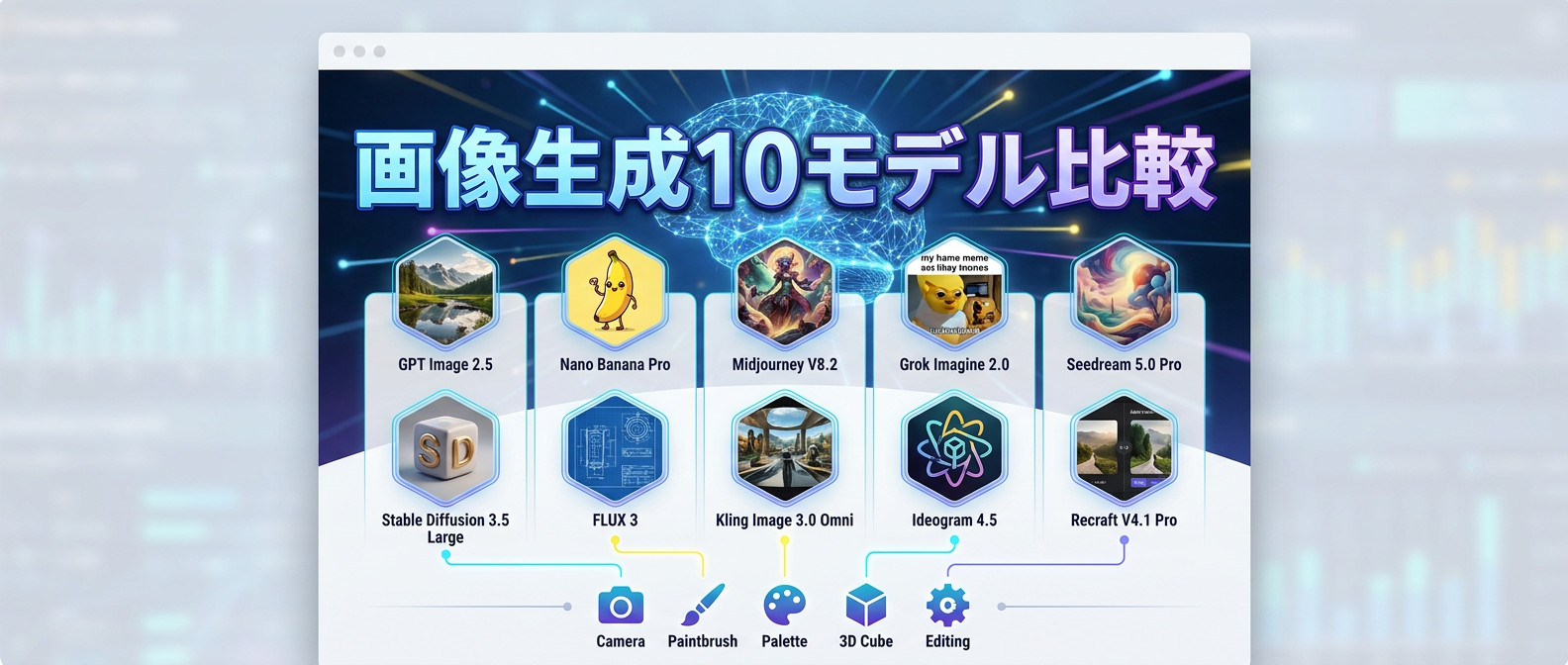
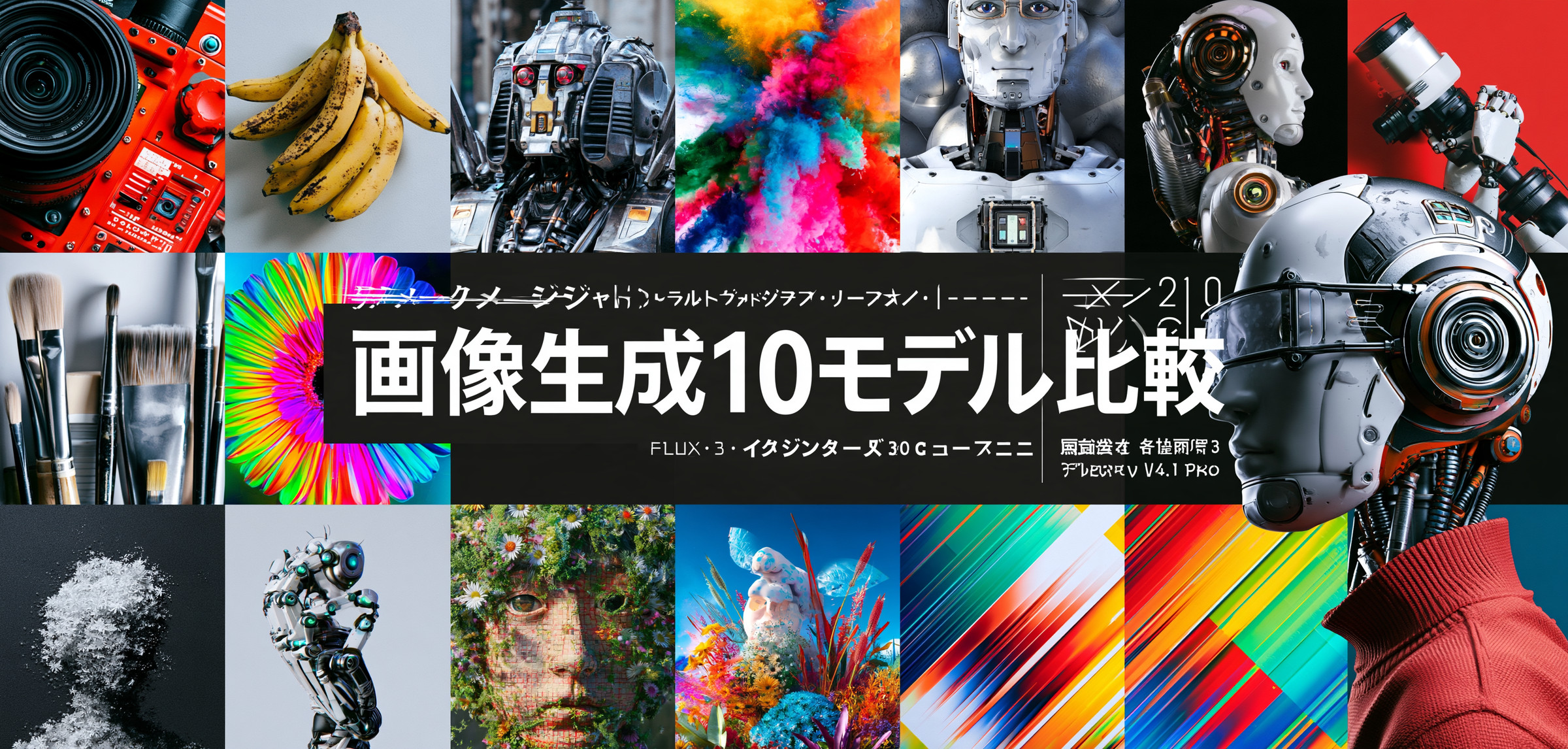
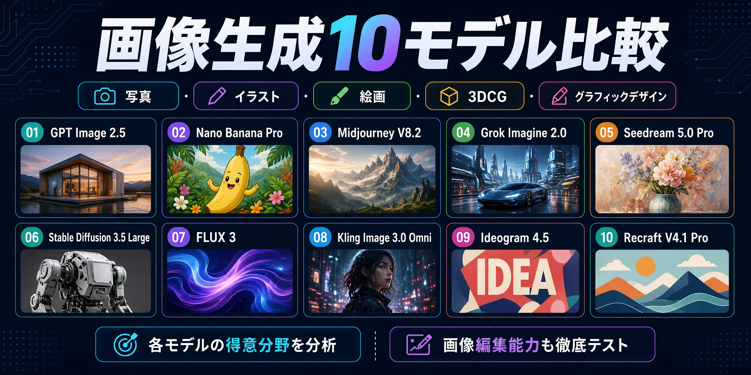
最後に、この記事のサムネイル(アイキャッチ画像)も、全モデルに作ってもらいました。伝えたのはタイトルと記事の中身、比べたモデルの名前だけで、デザインや文字組みは全部お任せです。この中で一番良いと思ったものを、実際にこの記事のサムネイルに使っています。
このブログのサムネイルは 900×430 で、トップページでは左右の端が切れて表示されます。そこで、縦横比は各モデルで選べる中から 900×430 に近いもの(2:1 や 21:9 など)を指定し、プロンプトでも「大事な部分は横幅の中央 80% に収めて」と頼みました。とはいえ、そう頼んだというだけで、できあがった画像はどれも切り取らずにそのまま載せています。
使ったプロンプト(英語)
A blog thumbnail (eye-catch image) for a Japanese tech blog article titled "画像生成10モデル比較".
The article compares ten AI image generation models: GPT Image 2.5, Nano Banana Pro, Midjourney V8.2, Grok Imagine 2.0, Seedream 5.0 Pro, Stable Diffusion 3.5 Large, FLUX 3, Kling Image 3.0 Omni, Ideogram 4.5, and Recraft V4.1 Pro. It gives them the same prompts in photo, illustration, painting, 3DCG, and graphic design styles, asks each one for its specialty, and tests how well each can edit an image.
Include the title "画像生成10モデル比較", written exactly as given and clearly readable.
Keep the title and the key elements inside the central 80% of the width, because the left and right edges are cropped on the blog's top page, and leave some margin at the top and bottom.
Everything else is up to you: the design, layout, colors, imagery, typography, text size, and fonts. Please create a thumbnail with great taste.
日本語の意味
日本の技術ブログの記事「画像生成10モデル比較」の、サムネイル(アイキャッチ画像)。
記事では、10 の画像生成 AI(GPT Image 2.5、Nano Banana Pro、Midjourney V8.2、Grok Imagine 2.0、Seedream 5.0 Pro、Stable Diffusion 3.5 Large、FLUX 3、Kling Image 3.0 Omni、Ideogram 4.5、Recraft V4.1 Pro)を比べています。実写・イラスト・絵画・3DCG・グラフィックデザインで同じプロンプトを渡し、それぞれに得意なものを頼み、画像をどれだけうまく修正できるかも試しています。
タイトル「画像生成10モデル比較」を、書いたとおりに、はっきり読めるように入れてください。
ブログのトップページでは左右の端が切られるので、タイトルと大事な要素は横幅の中央 80% の中に収め、上下にも少し余白を取ってください。
それ以外は全部お任せです。デザイン・レイアウト・色・絵・文字組み・文字の大きさ・フォントまで。センスの良いサムネイルを作ってください。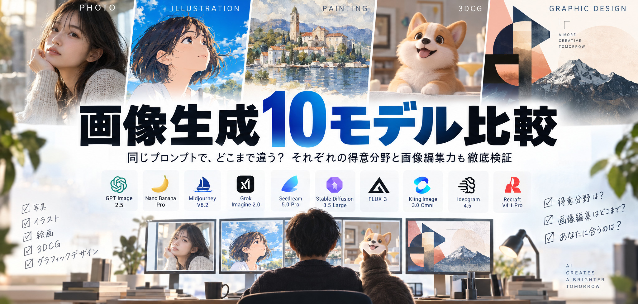
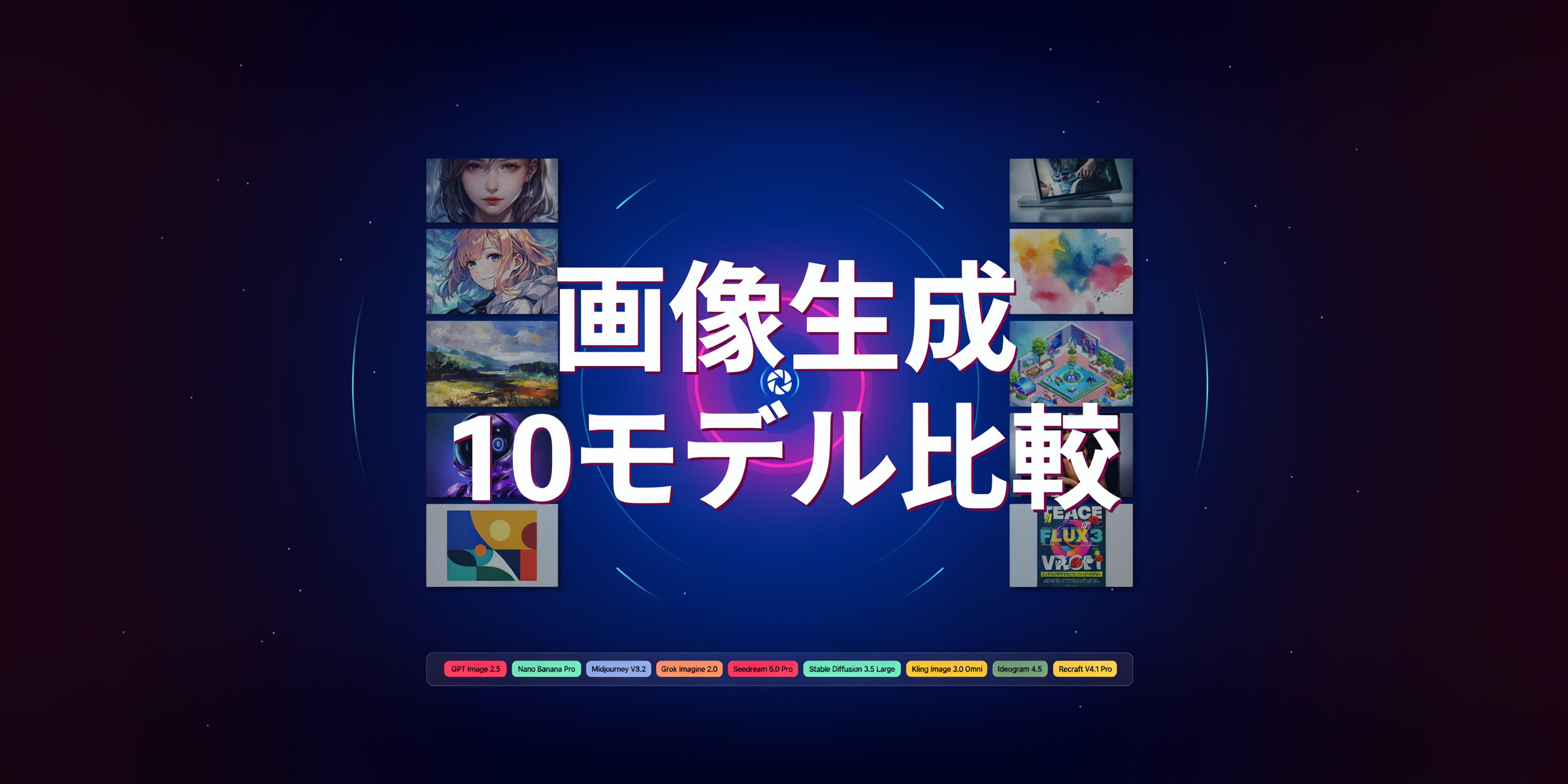
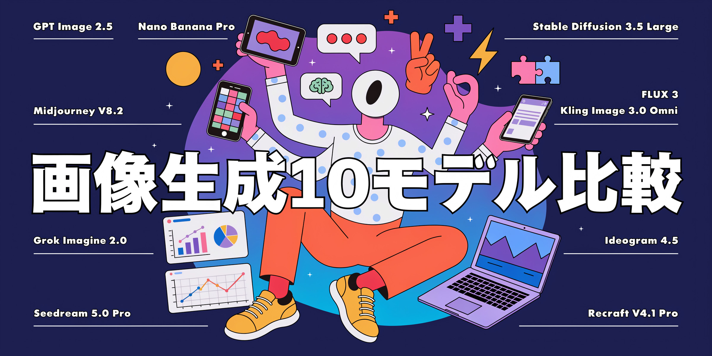
GPT Image 2.5、Grok、Seedream、FLUXは隙のないものを作ってくれたんですが、Recraftの個性に惹かれて採用としました。皆さんはどのサムネが好きでしょうか?
まとめ
個人的に一番よく使うのはGPT Image 2.5です。こちらの意図を汲み取ってくれやすいし、人物の同一性も高いからです。Midjourneyは他にはないセンスがあって好きだし、Grokも意外とやるじゃんと思った経験があったりしたんですが、今回今まであまり使っていなかったモデルを使ってみて、FLUX、Kling、Ideogramも気になる存在になりました。今後是非使ってみたいですね。
自分でも発見の多い比較でしたが、皆さんの参考にもなってくれていたら幸いです。
ここまで読んでいただきありがとうございました